

Question: If a designer decides to mix two different typefaces within a paragraph (or design) why should they choose two that have some contrast to each
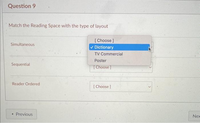
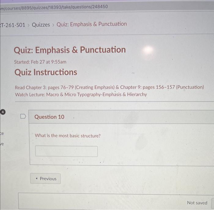
If a designer decides to mix two different typefaces within a paragraph (or design) why should they choose two that have some contrast to each other? What is "Degrees of visual prominence establish the order in which we see things?" What would be included in Secondary Level of Type? Click all that apply. Headline Subheads Captions Body Copy Pull Quotes Infographics In your own words describe/explain pacing in graphic design. Match the Reading Space with the type of layout Simultaneous Sequential Reader Ordered Read Chapter 3: pages 76-79 (Creating Emphasis) \& Chapter 9: pages 156-157 (Punctuation) Watch Lecture: Macro \& Micro Typography-Emphasis \& Hierarchy Question 10 What is the most basic structure? Not saved
Step by Step Solution
There are 3 Steps involved in it

Get step-by-step solutions from verified subject matter experts