

Question: (ii) Graph B presents an accurate picture, and graph A understates the decline. 6. Xbox sales: The following bar graph and time-series plot both present
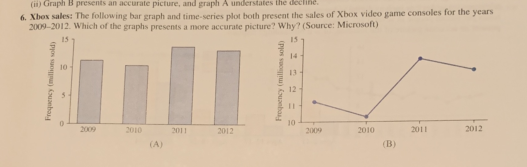

(ii) Graph B presents an accurate picture, and graph A understates the decline. 6. Xbox sales: The following bar graph and time-series plot both present the sales of Xbox video game consoles for the years 2009-2012. Which of the graphs presents a more accurate picture? Why? (Source: Microsoft) 15 15 14 10 13 Frequency (millions sold) Frequency (millions sold) 12 5 11 0 10 2009 2010 2011 2012 2009 2010 2011 2012 (A) (B)
Step by Step Solution
There are 3 Steps involved in it
1 Expert Approved Answer
Step: 1 Unlock

Question Has Been Solved by an Expert!
Get step-by-step solutions from verified subject matter experts
Step: 2 Unlock
Step: 3 Unlock