

Question: I'm confused by the pictures here Residential Fire Damage Claims, 2010-2020 14,000 12.000 10,000 8,000 Thousands of Dollars 6,000 - 4.000 2,000 2010 2015 2020
I'm confused by the pictures here
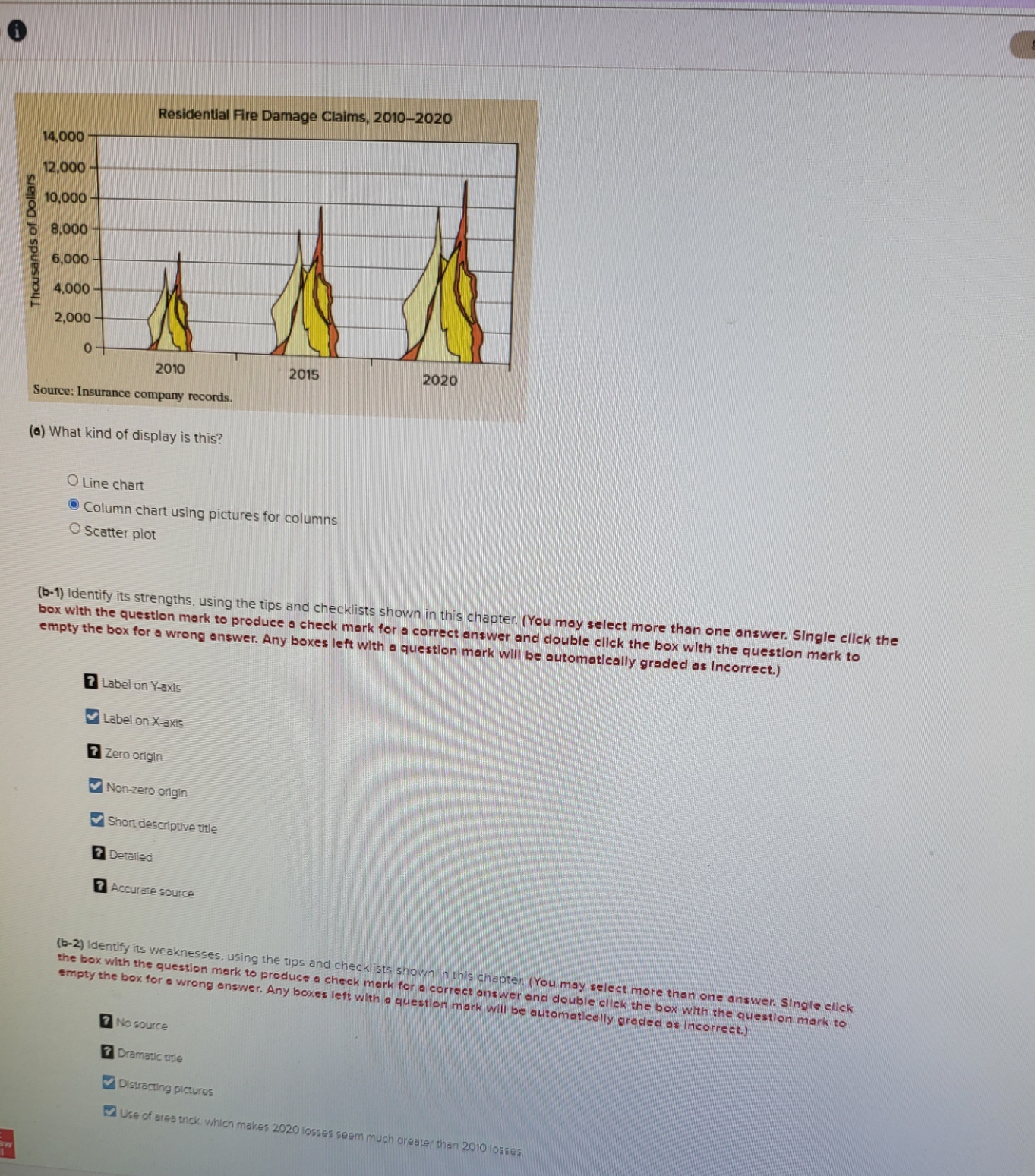
Residential Fire Damage Claims, 2010-2020 14,000 12.000 10,000 8,000 Thousands of Dollars 6,000 - 4.000 2,000 2010 2015 2020 Source: Insurance company records () What kind of display is this? Line chart Column chart using pictures for columns Scatter plot (b-1) Identify its strengths, using the tips and checklists shown in this chapter. (You may select more than one answer. Single click the box with the question mark to produce a check mark for a correct answer and double click the box with the question mark to empty the box for a wrong answer. Any boxes left with a question mark will be automatically graded as Incorrect.) 2 Label on Y-axis Label on X-axis 2 Zero origin Non-zero origin Short descriptive title 2 Detailed 7 Accurate source (b-2) Identify its weaknesses, using the tips and checklists shown in this chapter ( You may select more than one answer. Single click the box with the question mark to produce a check mark for a correct answer and double click the box with the question mark to empty the box for a wrong answer. Any boxes left with a question mark will be automatically graded as Incorrect.) 7 No source 7 Dramatic title Distracting pictures Use of ares trick. which makes 2020 losses seem much greater than 2010 losses
Step by Step Solution
There are 3 Steps involved in it
a Chart Identification The correct answer is Column chart using pictures for columns This is because ... View full answer

Get step-by-step solutions from verified subject matter experts