Question: In addition to the Connect Lab, include a short summary of the data from Labs 4-1 and 4-2. These are 2 separate reports. Refer to
In addition to the Connect Lab, include a short summary of the data from Labs 4-1 and 4-2. These are 2 separate reports. Refer to "Communication: More than Visuals"- section of chapter 4 when writing your summary.
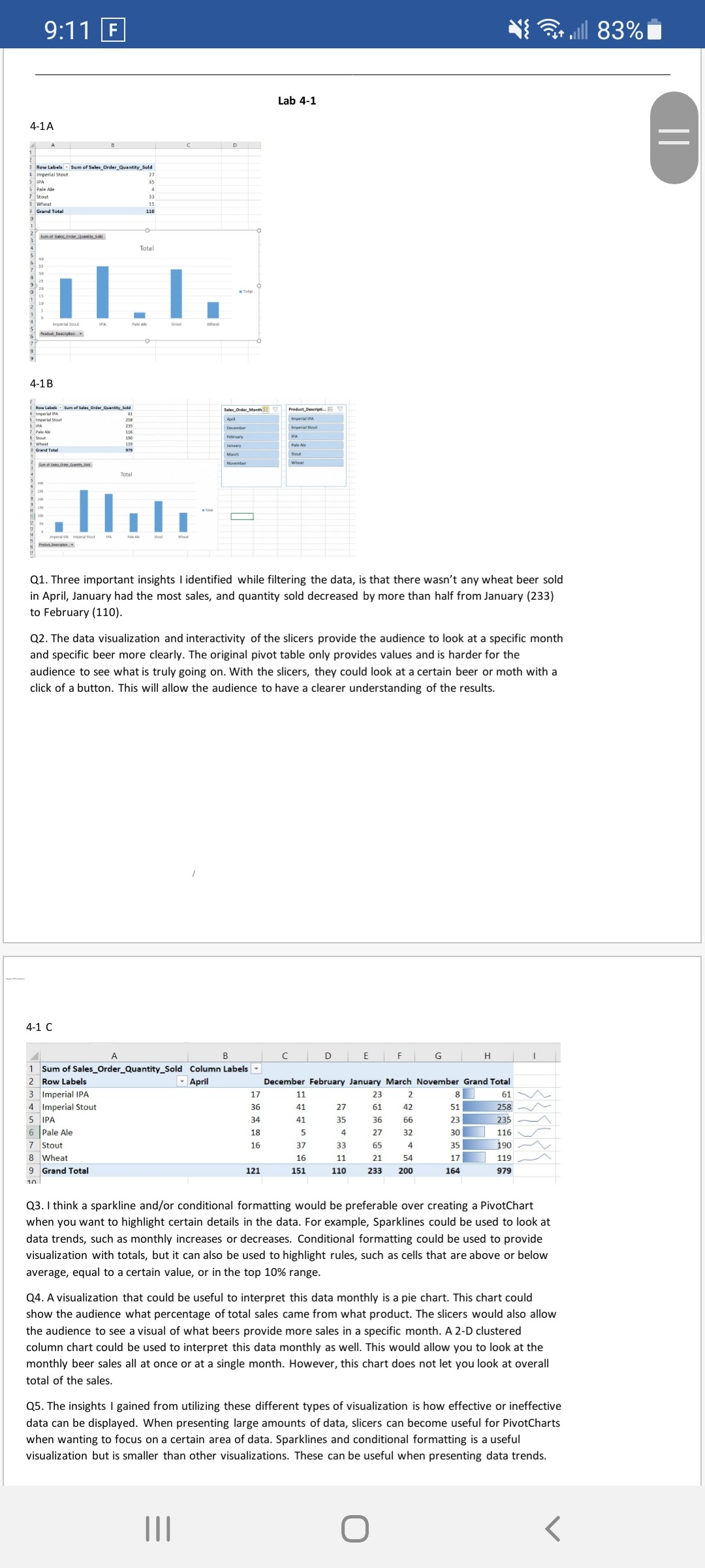
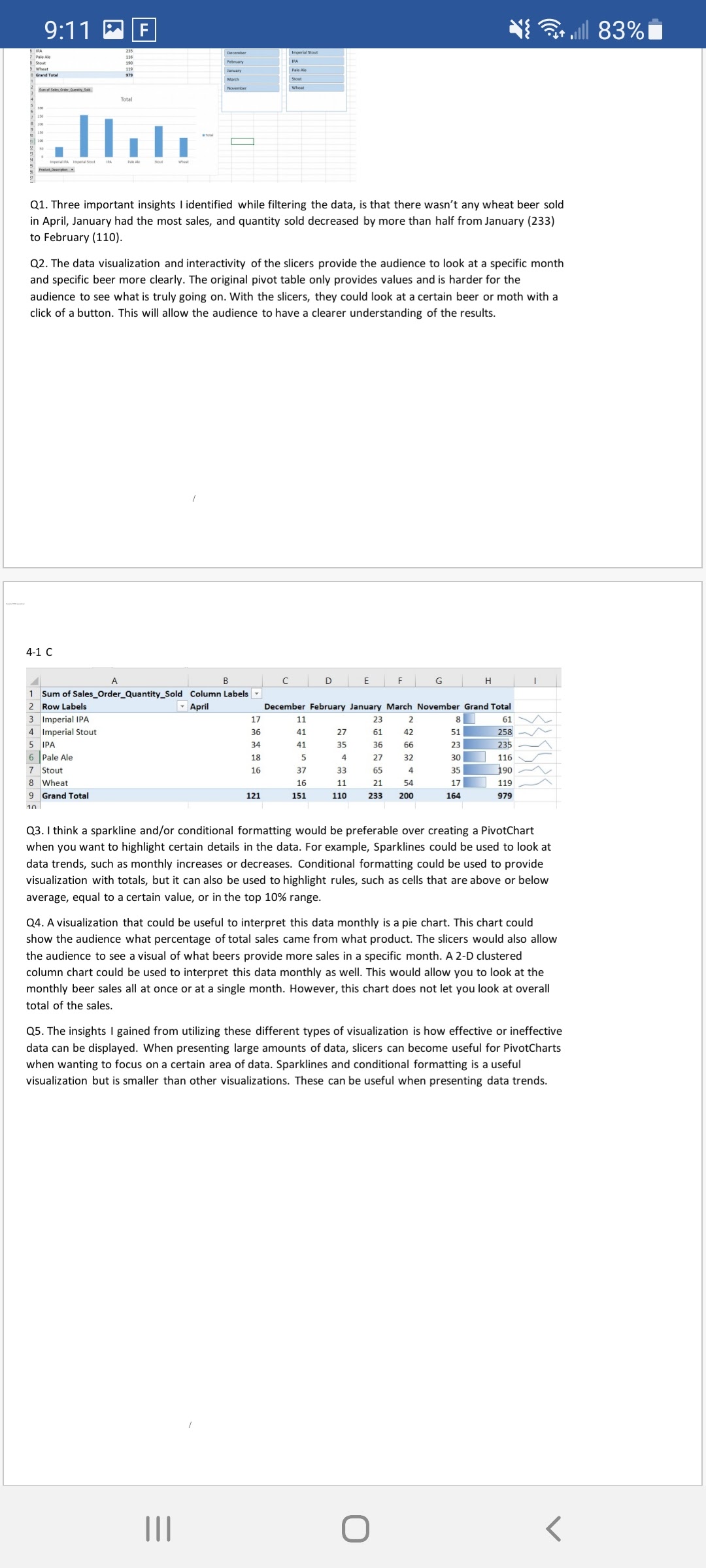
9:11 F till 83% Lab 4-1 4-1A = 3 Row Labels " Sum of Sales_Order_Quantity_Sold Imperial Stout Pale Ale Grand Total O Quantity.Sold Total 4-1 B Product_ Deseron.. Imperial Stout IPA Grand Total Pale Ale Stout wheat Total I Q1. Three important insights I identified while filtering the data, is that there wasn't any wheat beer sold in April, January had the most sales, and quantity sold decreased by more than half from January (233) to February (110). Q2. The data visualization and interactivity of the slicers provide the audience to look at a specific month and specific beer more clearly. The original pivot table only provides values and is harder for the audience to see what is truly going on. With the slicers, they could look at a certain beer or moth with a click of a button. This will allow the audience to have a clearer understanding of the results. 4-1 C A B C D E F G H 1 Sum of Sales_Order_Quantity_Sold Column Labels 2 Row Labels April December February January March November Grand Total 3 Imperial IPA 17 11 23 2 8 61 4 Imperial Stout 36 41 21 51 258- 5 IPA 34 41 35 36 66 23 235 6 Pale Ale 18 4 27 32 30 116 7 Stout 16 37 33 65 35 190 8 Wheat 16 11 21 54 17 119 9 Grand Total 121 151 110 233 200 164 979 Q3. I think a sparkline and/or conditional formatting would be preferable over creating a PivotChart when you want to highlight certain details in the data. For example, Sparklines could be used to look at data trends, such as monthly increases or decreases. Conditional formatting could be used to provide visualization with totals, but it can also be used to highlight rules, such as cells that are above or below average, equal to a certain value, or in the top 10% range. Q4. A visualization that could be useful to interpret this data monthly is a pie chart. This chart could show the audience what percentage of total sales came from what product. The slicers would also allow the audience to see a visual of what beers provide more sales in a specific month. A 2-D clustered column chart could be used to interpret this data monthly as well. This would allow you to look at the monthly beer sales all at once or at a single month. However, this chart does not let you look at overall total of the sales. Q5. The insights I gained from utilizing these different types of visualization is how effective or ineffective data can be displayed. When presenting large amounts of data, slicers can become useful for PivotCharts when wanting to focus on a certain area of data. Sparklines and conditional formatting is a useful visualization but is smaller than other visualizations. These can be useful when presenting data trends. Os , u w m uu-t '- 1 IM- "r [1 l\" on...\" m - , 1 m 1 l-F. 7 ' ___... ___ . Tom \\ r s , , .. 'I :l u u I a... m m n n Q1. Three important insights I identified while filtering the data, is that there wasn't any wheat beer sold in April, January had the most sales, and quantity sold decreased by more than half from January (233) to February (110). Q2. The data visualization and interactivity of the slicers provide the audience to look at a specific month and specific beer more clearly. The original pivot table only provides values and is harder for the audience to see what is truly going on. With the slicers, they could look at a certain beer or moth with a click of a button. This will allow the audience to have a clearer understanding of the results. 4-1 C .4 A a l c I D E l r l G H l l 1 Sumadee-_Order_uantv_old Column use-L 2 mum Tllpli mummew m umb- amateur 3 lmperiellFA 17 11 23 2 an 61 \\A, L lmperialSlout 36 41 27 61 42 mm} W 5 (FA 34 41 as as 56 23-3 _/\\ i Pale Ale 1e 5 a 27 32 sum 11E \\_/_ 7 Stout 1s 37 3: es 4 35 -:isu x"v lithe\" 16. 31. 2.1. 54 17 E, .119. r\" 9 cmndroul 121 151 m as m m 9' 1n Q3. I think a sparkline andfor conditional formatting would be preferable over creating a PivotChart when you want to highlight certain details in the data. For example, Sparklines could be used to look at data trends, such as monthly increases or decreases. Conditional formatting could be used to provide visualization with totals, but it can also be used to highlight rules, such as cells that areabove or below average, equal to a certain value, or in the top 10% range. 04. A visualization that could be useful to interpret this data monthly is a pie chart. This chart could show the audience what percentage of total sales came from what product. The slicers would also allow the audience to see a visual of what beers provide more sales in a specific month. A 2-D clustered column chart could be used to interpret this data monthly as well. This would allow you to look at the monthly beer sales all at once or at a single month. However, this chart does not let you look at overall total of the sales. Q5. The insights I gained from utilizing these different types of visualization is how effective or ineffective data can be displayed. When presenting large amounts of data, slicers can become useful for FivotCharts when wanting to focus on a certain area of data. Sparklines and conditional formatting is a useful visualization but is smaller than other visualizations. These can be useful when presenting data trends. III C)