

Question: In the graph in Question 1, the average income for all four groups rises fairly sharply between one's 20s and middle-age. Then income drops slightly
In the graph in Question 1, the average income for all four groups rises fairly sharply between one's 20s and middle-age. Then income drops slightly toward the end of one's career. Computing means across the groups and graphing them (see below), mean income is about $35,000 at age 25, $60,000 at age 45, and $50,000 at age 65. Draw a graph with four groups in which those are the means at those three ages, but none of the four groups show the pattern of: up sharply between 25 and 45, and down slightly between 45 and 65.
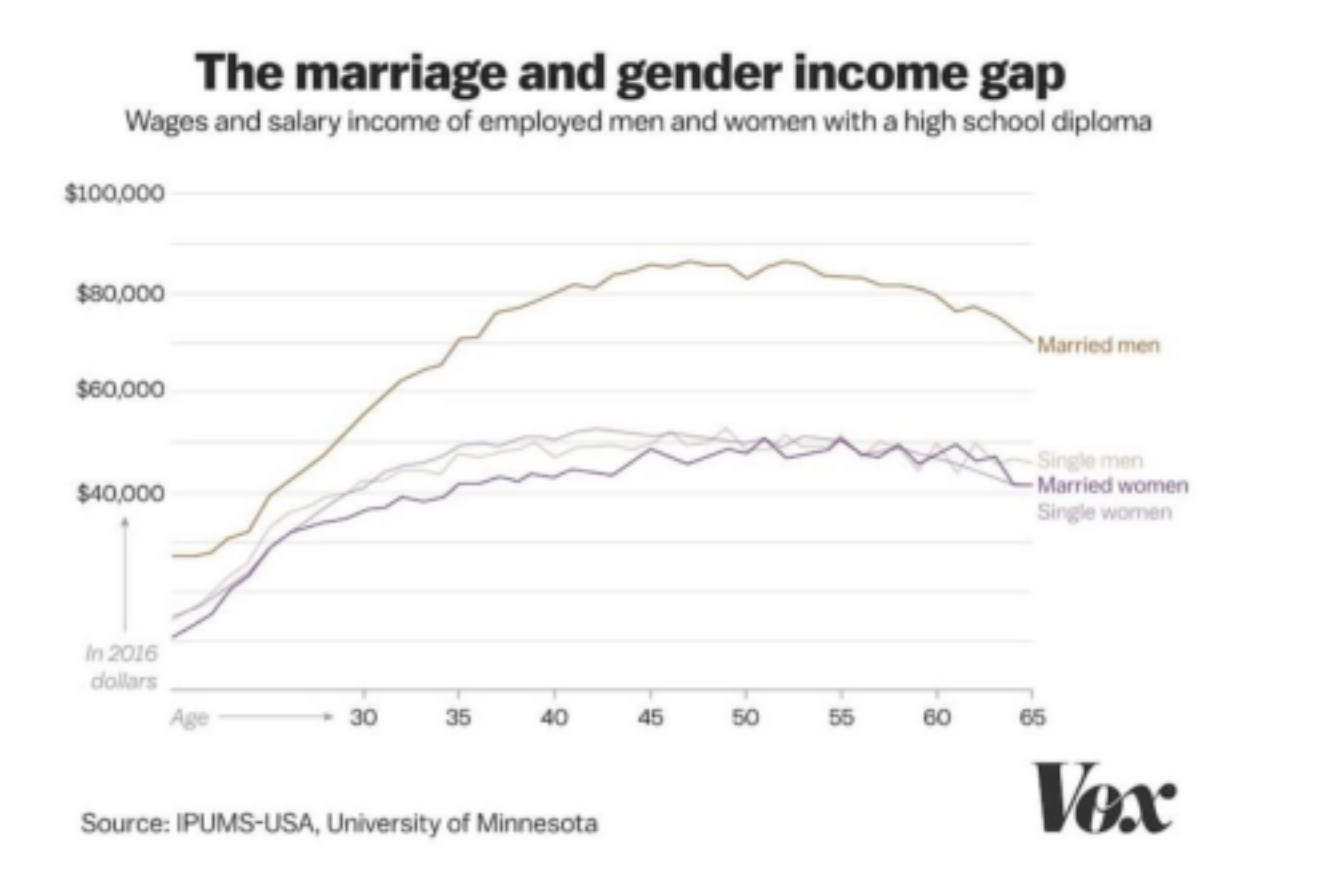
The marriage and gender income gap Wages and salary income of employed men and women with a high school diploma $100,000 $80,000 Married men $60,000 Single men Married women $40,000 Single women In 2016 dollars Age 30 35 40 45 50 56 60 65 Source: IPUMS-USA, University of Minnesota Vox
Step by Step Solution
There are 3 Steps involved in it

Get step-by-step solutions from verified subject matter experts