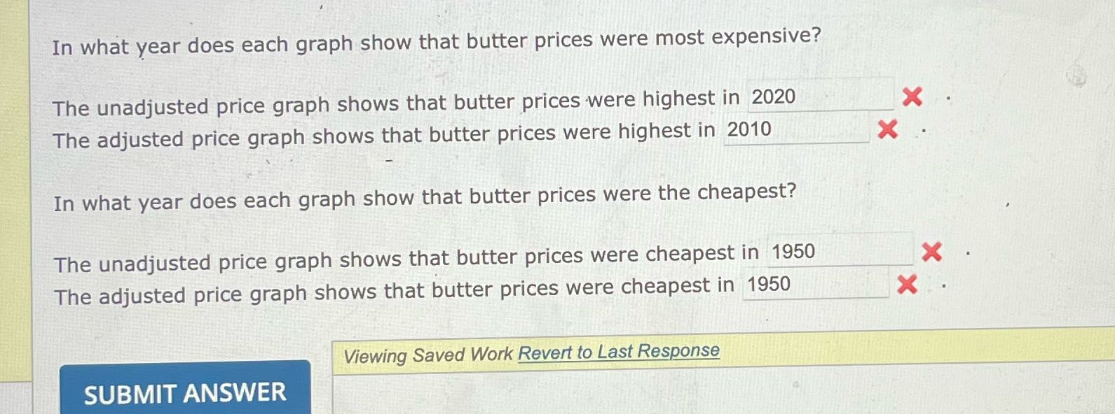
Question: In what year does each graph show that butter prices were most expensive? The unadjusted price graph shows that butter prices were highest in 2020
In what year does each graph show that butter
In what year does each graph show that butter prices were most expensive? The unadjusted price graph shows that butter prices were highest in 2020 X The adjusted price graph shows that butter prices were highest in 2010 X In what year does each graph show that butter prices were the cheapest? The unadjusted price graph shows that butter prices were cheapest in 1950 X The adjusted price graph shows that butter prices were cheapest in 1950 X Viewing Saved Work Revert to Last Response SUBMIT

Step by Step Solution

There are 3 Steps involved in it

1 Expert Approved Answer
Step: 1 Unlock blur-text-image
Question Has Been Solved by an Expert!

Get step-by-step solutions from verified subject matter experts

Step: 2 Unlock
Step: 3 Unlock

Students Have Also Explored These Related Accounting Questions!