

Question: Instructions Define - You are being assigned one warmup problem and one application problem. Do all problems in one script file: Class_12_App.m. Include comment statements
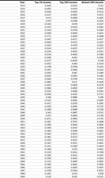
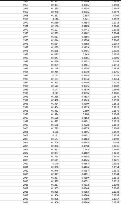
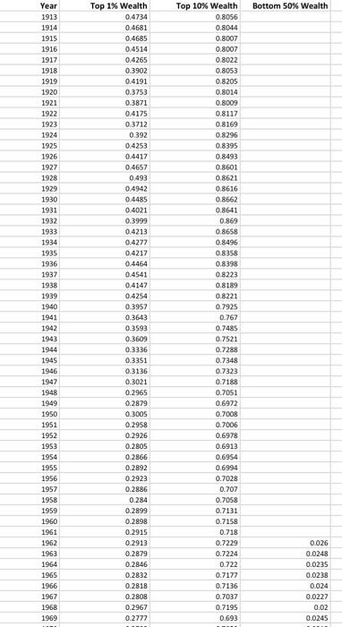
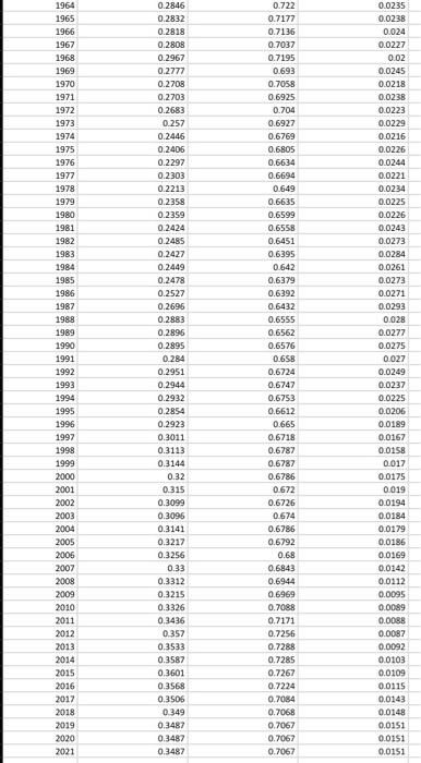
Instructions Define - You are being assigned one warmup problem and one application problem. Do all problems in one script file: "Class_12_App.m". Include comment statements to help organize your script file. Represent - In the following problems, you will create some figures; use good graphing practices. Adjust marker/line sizes and font sizes as needed. Plan - Create a script file named Class_12_App.m - Outline the steps your program will take by adding comment statements to your script file. Implement - Complete the problems in the script file. Evaluate - To evaluate the application problem, open the data with excel and create income share vs time plot to verify the plot you have in MATLAB (Part 1 of the application problem). In addition, calculate the statistical parameters to verify your MATLAB results (Part 3 of the application problem), Include a PDF copy of the spreadsheet in your assignment submission (it is not necessary to print all the data but be sure to make sure that the plot and parameters are visible). Document - Publish the script file to pdf by clicking the publish button or by typing the following command into the Command Window. publish ('Class_12_App', 'pde') The script file name must match what is in the single quotes in the publish command. - Submit the following: - Script file, plot, \& command window output PDF generated above - Evaluate step excel sheet in PDF form for the application problem only. Warmup Problem Use the linspace () function to generate a vector x of 1000 elements from 5 to 5, then calculate two new vectors y1 and y2 using the relationships y1=cos(x) and y2=2sin(xpi/2). Plot y1 and y2 versus x on the same graph as a theoretical relationship. Follow good graphing practices: label your axes (as " y1 and y2 and " "x") and include the title: " y1=cos(x) and y2=2sin(xpi/2). Be sure to differentiate the line styles between the two plots. Application Problem Background In this problem, you are asked to analyze income and wealth data from the U.S. This data has been sourced from the World Inequality Database :. You can use this database to look up data sets of various indicators from countries around the world. Here, you will practice loading data from an Excel sheet, visualizing the data by creating plots and analyze the data in MATLAB. Problem Statement Two Excel data files-US_Income_Inequality_Data.xlsx and US_Wealth_Inequality_Dato.xlsx are provided: US_Income_Inequality_Data.xlsx consists of the following 4 columns of data. Col 1: Year from 1913 to 2021 Col 2: Income of the top 1% as a percentage of the population Col 3: Income of the top 10% as a percentage of the population Col 4: Income of the bottom 50% as a percentage of the population US_Wealth_Inequality_Data.xisx consists of the following 4 columns of data: Col 1: Year from 1913 to 2021 Col 2: Wealth of the top 1% as a percentage of the population Col 3: Wealth of the top 10% as a percentage of the population Col 4: Wealth of the bottom 50% as a percentage of the population Use the readmatrix command to load the two Excel files and suitably store the income and wealth data. 1. Create a figure using the figure function. Use subplot to display two graphs in one figure window: the first showing income share for each of the three groups of the U.S. population over the years, and the second showing the wealth share for the three groups over the years. Be sure to use good graphing practices. 2. Next, using array indexing, extract the data for income share during your lifetime (from the year you were born until 2021) and plot the three groups of the U.S. population in a new figure window for that time range. 3. Lastly, use the built-in functions to find the maximum, minimum, and mean of the bottom 50% share of income over the years 1913 to 2021 and print these values to the command window using an fprintf statement. * Note that data for the bottom 50\% of U.S. Population for wealth was not collected until 1962. Instructions Define - You are being assigned one warmup problem and one application problem. Do all problems in one script file: "Class_12_App.m". Include comment statements to help organize your script file. Represent - In the following problems, you will create some figures; use good graphing practices. Adjust marker/line sizes and font sizes as needed. Plan - Create a script file named Class_12_App.m - Outline the steps your program will take by adding comment statements to your script file. Implement - Complete the problems in the script file. Evaluate - To evaluate the application problem, open the data with excel and create income share vs time plot to verify the plot you have in MATLAB (Part 1 of the application problem). In addition, calculate the statistical parameters to verify your MATLAB results (Part 3 of the application problem), Include a PDF copy of the spreadsheet in your assignment submission (it is not necessary to print all the data but be sure to make sure that the plot and parameters are visible). Document - Publish the script file to pdf by clicking the publish button or by typing the following command into the Command Window. publish ('Class_12_App', 'pde') The script file name must match what is in the single quotes in the publish command. - Submit the following: - Script file, plot, \& command window output PDF generated above - Evaluate step excel sheet in PDF form for the application problem only. Warmup Problem Use the linspace () function to generate a vector x of 1000 elements from 5 to 5, then calculate two new vectors y1 and y2 using the relationships y1=cos(x) and y2=2sin(xpi/2). Plot y1 and y2 versus x on the same graph as a theoretical relationship. Follow good graphing practices: label your axes (as " y1 and y2 and " "x") and include the title: " y1=cos(x) and y2=2sin(xpi/2). Be sure to differentiate the line styles between the two plots. Application Problem Background In this problem, you are asked to analyze income and wealth data from the U.S. This data has been sourced from the World Inequality Database :. You can use this database to look up data sets of various indicators from countries around the world. Here, you will practice loading data from an Excel sheet, visualizing the data by creating plots and analyze the data in MATLAB. Problem Statement Two Excel data files-US_Income_Inequality_Data.xlsx and US_Wealth_Inequality_Dato.xlsx are provided: US_Income_Inequality_Data.xlsx consists of the following 4 columns of data. Col 1: Year from 1913 to 2021 Col 2: Income of the top 1% as a percentage of the population Col 3: Income of the top 10% as a percentage of the population Col 4: Income of the bottom 50% as a percentage of the population US_Wealth_Inequality_Data.xisx consists of the following 4 columns of data: Col 1: Year from 1913 to 2021 Col 2: Wealth of the top 1% as a percentage of the population Col 3: Wealth of the top 10% as a percentage of the population Col 4: Wealth of the bottom 50% as a percentage of the population Use the readmatrix command to load the two Excel files and suitably store the income and wealth data. 1. Create a figure using the figure function. Use subplot to display two graphs in one figure window: the first showing income share for each of the three groups of the U.S. population over the years, and the second showing the wealth share for the three groups over the years. Be sure to use good graphing practices. 2. Next, using array indexing, extract the data for income share during your lifetime (from the year you were born until 2021) and plot the three groups of the U.S. population in a new figure window for that time range. 3. Lastly, use the built-in functions to find the maximum, minimum, and mean of the bottom 50% share of income over the years 1913 to 2021 and print these values to the command window using an fprintf statement. * Note that data for the bottom 50\% of U.S. Population for wealth was not collected until 1962
Step by Step Solution
There are 3 Steps involved in it

Get step-by-step solutions from verified subject matter experts