

Question: Is this a good answer Search the internet for articles, either popular or academic, that contain data visualizations you believe are good or excellent visualizations.
Is this a good answer
Search the internet for articles, either popular or academic, that contain data visualizations you believe are good or excellent visualizations. Explain why the visualization is good and is effective in communicating its intent and information.
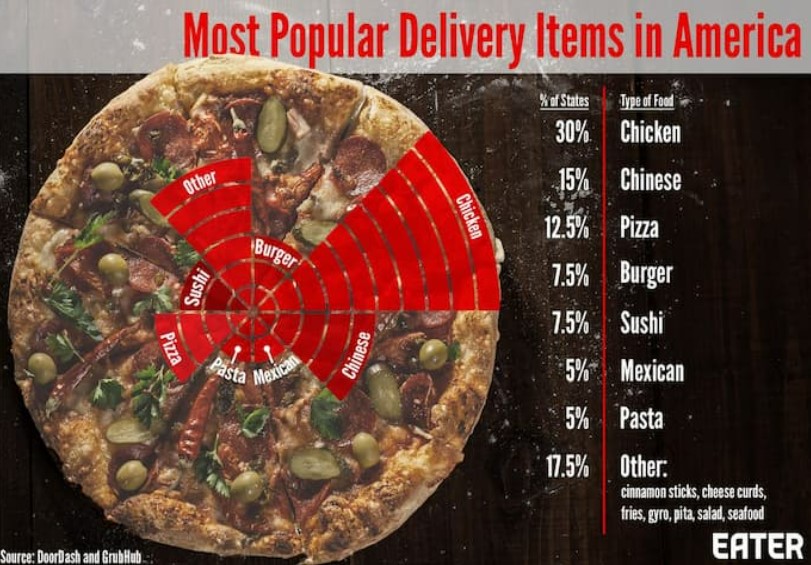
The purpose of data visualization is to be able to communicate and the significance of the data and the best way to do so is communicate through visual aids and this can be done through various charts (pie, bar, scatter plots), and maps. Of the choices withing this article I found one that took data from the most common foods that are order for delivery throughout the United States. To visualize this data, Eater used a specific type of pie chart known as a spie chart. Spie charts are essentially pie charts in which you can vary the height of each segment to further visualize differences in data (HBS, 2017). They used options such as chicken, Chinese, pizza, burger, sushi, Mexican, pasta and other and they provided the percentage of those that purchased it. What was fun about this chart is they used a pizza as the pie chart and were able to communicate the amount to give a visual idea of the totals.
\f
Step by Step Solution
There are 3 Steps involved in it

Get step-by-step solutions from verified subject matter experts