

Question: Is this answer acceptable for a good graph I came across a recruiter's post on LinkedIn that showed the following graph, which I would consider
Is this answer acceptable for a good graph
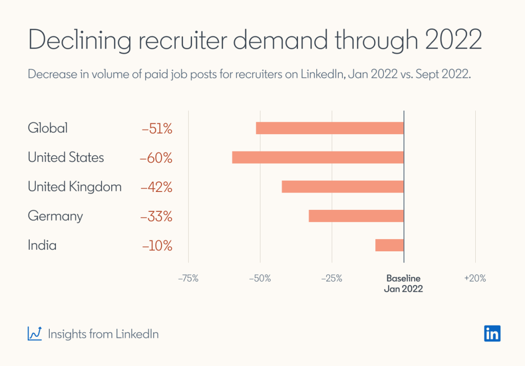
I came across a recruiter's post on LinkedIn that showed the following graph, which I would consider to be good and effective. Misleading graphs are sometimes deliberately misleading and sometimes it's just a case of people not understanding the data behind the graph they create (Hertz, 2019). In this case, all the main data needed is included, it is labeled properly and the scale is neither too big nor small. I also believe it to be effective since it provides the reader with enough information through its graph title, axis titles, and other notions which makes the graph easy to understand independently of the text in the LinkedIn article. I think that if a stranger looked at it, they would be able to catch an idea of what the graph is referring to. I also liked that the data is not clumped in one region instead its distributed across. Overall, this graph about the recruiting industry serves as visual aid to anyone even prior to reading the full article.
\f
Step by Step Solution
There are 3 Steps involved in it

Get step-by-step solutions from verified subject matter experts