

Question: its a matlab question, The answer has to exactly same as the figure, thank you Suppose we enter the following two vectors in Matlab: satisfaction_class1
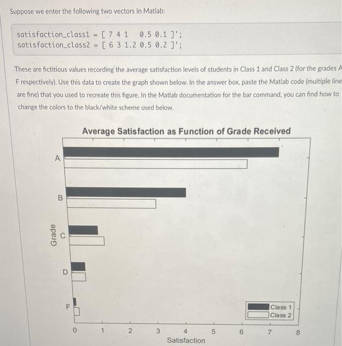
Suppose we enter the following two vectors in Matlab: satisfaction_class1 = [ 7 4 1 0.5 0.1 ]'s satisfaction_class2 [ 6 3 1.2 0.5 0.2 ]'; These are fictitious values recording the average satisfaction levels of students in Class 1 and Class 2 (for the grades A Frespectively). Use this data to create the graph shown below. In the answer box, paste the Matlab code (multiple line are fine) that you used to recreate this figure. In the Matlab documentation for the bar command, you can find how to change the colors to the black/white scheme used below. Average Satisfaction as Function of Grade Received A B Grade D Class 1 Class 2 0 2 3 5 02 7 8 00 Satisfaction
Step by Step Solution
There are 3 Steps involved in it

Get step-by-step solutions from verified subject matter experts