

Question: Just like demand, supply can also be shown in a chart and graph. Below is a supply curve schedule for Ipads and a supply
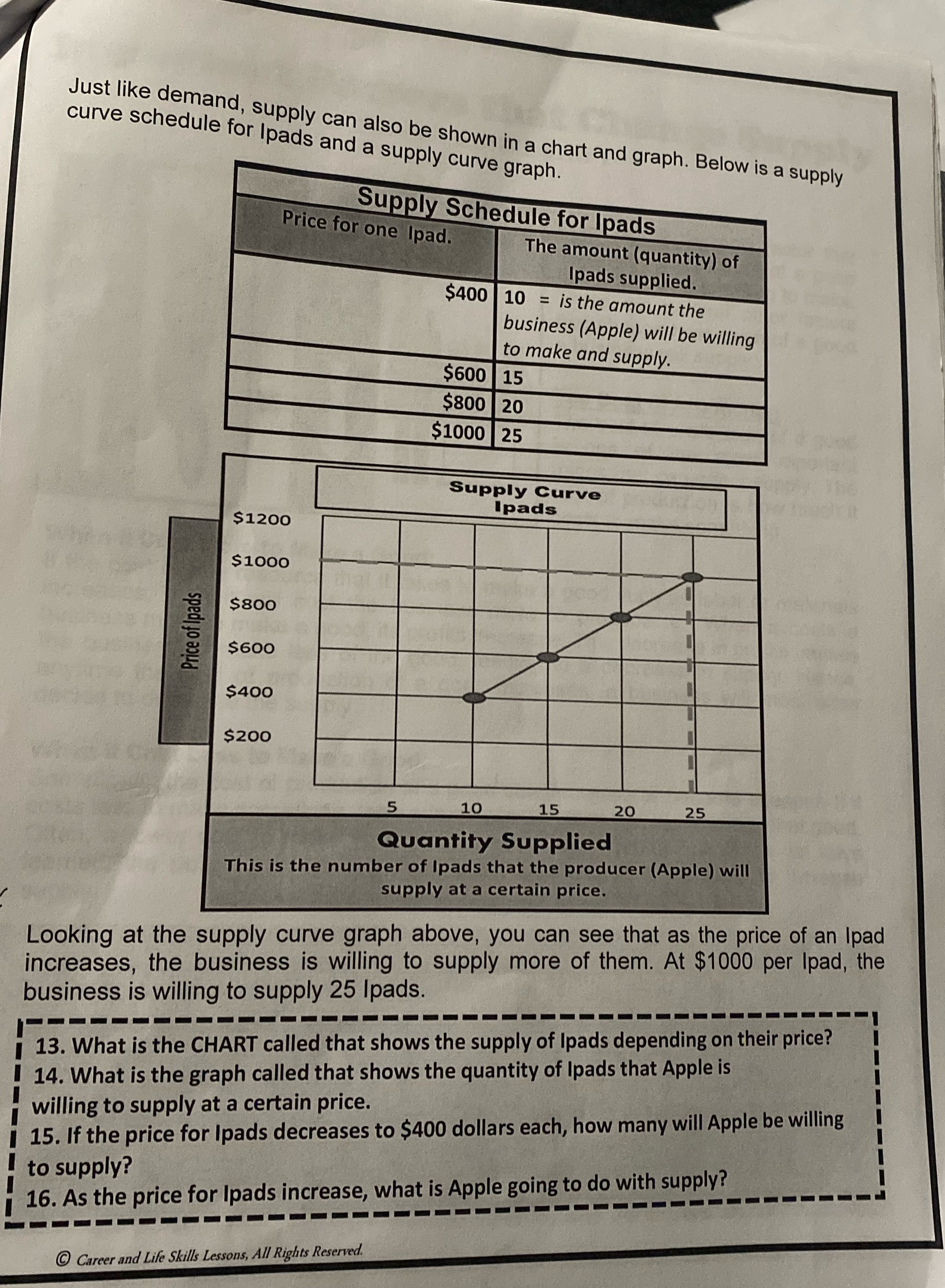
Just like demand, supply can also be shown in a chart and graph. Below is a supply curve schedule for Ipads and a supply curve graph. Supply Schedule for Ipads Price for one Ipad. The amount (quantity) of Ipads supplied. $400 10 = is the amount the business (Apple) will be willing to make and supply. Price of Ipads $1200 $1000 $800 $600 $400 $200 5 $600 15 $800 20 $1000 25 Supply Curve Ipads 10 15 20 25 Quantity Supplied This is the number of Ipads that the producer (Apple) will supply at a certain price. Looking at the supply curve graph above, you can see that as the price of an Ipad increases, the business is willing to supply more of them. At $1000 per Ipad, the business is willing to supply 25 Ipads. 13. What is the CHART called that shows the supply of Ipads depending on their price? 14. What is the graph called that shows the quantity of Ipads that Apple is willing to supply at a certain price. 15. If the price for Ipads decreases to $400 dollars each, how many will Apple be willing to supply? 16. As the price for Ipads increase, what is Apple going to do with supply? Career and Life Skills Lessons, All Rights Reserved.
Step by Step Solution
There are 3 Steps involved in it

Get step-by-step solutions from verified subject matter experts