Question: Leigh, Environmental Services director, has compiled some data over the past three weeks on cleaning delays. She has collected the number of cleaning delays per


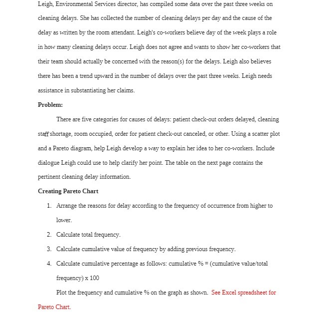
Leigh, Environmental Services director, has compiled some data over the past three weeks on cleaning delays. She has collected the number of cleaning delays per day and the cause of the delay as written by the room attendant. Leigh's co-workers believe day of the week plays a role in how many cleaning delays occur. Leigh does not agree and wants to show her co-workers that their team should actually be concerned with the reason(s) for the delays. Leigh also believes there has been a trend upward in the number of delays over the past three weeks. Leigh needs assistance in substantiating her claims. Problem: There are five categories for causes of delays: patient check-out orders delayed, cleaning staff shortage, room occupied, order for patient check-out canceled, or other. Using a scatter plot and a Pareto diagram, help Leigh develop a way to explain her idea to her co-workers. Include dialogue Leigh could use to help clarify her point. The table on the next page contains the pertinent cleaning delay information. Creating Pareto Chart 1. Arrange the reasons for delay according to the frequency of occurrence from higher to lower. 2. Calculate total frequency. 3. Calculate cumulative value of frequency by adding previous frequency. 4. Calculate cumulative percentage as follows: cumulative % = (cumulative value/total frequency) x 100 Plot the frequency and cumulative % on the graph as shown. See Excel spreadsheet for Pareto Chart
Step by Step Solution
There are 3 Steps involved in it

Get step-by-step solutions from verified subject matter experts


