

Question: LessonSummary When plotting points from a supply schedule, remember that price goes along the y-axis and quantity is on the x-axis.The graph of a supply
LessonSummary
When plotting points from a supply schedule, remember that price goes along the y-axis and quantity is on the x-axis.The graph of a supply curve slopes upward because as price increases, quantity supplied increases.Supply is represented by the whole curve.A specific point on the curve representsquantity supplied.The acronym ROTTEN will help you remember the reasons the whole supply curve may shift, resulting in a change in quantity supplied at all price levels.
Create a Graph
Now that you are familiar with the way a supply curve is graphed, you will create your own graph to submit to your instructor.
Step 2:Create a supply graph.
- Correctly label the x-axis and y-axis with the terms price and quantity.
- Assign values for price and quantity along each axis.Consider the numbers in your data table and the size of your graph.For example, you may want to make price in increments of 25.
- Create a title for your graph by choosing a good or service for the data to represent.
- Using the data table from Step 1, plot a supply curve and label the curve "S."
Step 3:Add a curve to your graph that represents anincreasein supply.Label the new curve "S1."
Step 4:In a few sentences, explain a situation that could have resulted in the supply increase.Be sure to:
- Make your situation specific to the product or service you chose in Step 2.
- Use at least one factor from the acronym ROTTEN in your explanation.
Step 5:Add another curve to your graph that represents adecreasein supply.Label the new curve "S2."
Step 6:In a few sentences, explain a situation that could have resulted in the supply decrease.Be sure to:
- Make your situation specific to the product or service you chose in Step 2.
- Use at least one factor from the acronym ROTTEN in your explanation.
Suggestions for Creating and Submitting Graphs
There are many tools you may use to create and submit your graph.Here are a few options for you to consider.Once you have saved your graph image to your hard drive, you can copy it into the same word processing document that contains the rest of your assignment or attach it as a separate file.If you have questions, please contact your instructor for additional guidance.
| Tool | How to Save Image for Submission |
|---|---|
| Graphing calculator (one that has the capability to transfer images) | Transfer the image file to your computer, then save the image as a file on your hard drive. |
| Graph or plain paper (sketch by hand) | Take a close-up digital photo or scan your graph, then save the image as a file on your hard drive. |
| Online graph generator | Save the image from the generator program to your hard drive.Check with your instructor to see if this option is available. |
| Spreadsheet software (Excel, Numbers, etc.) | Many spreadsheet programs have graph-generating capability.Check your computer or ask your instructor about online options. |
01.05Supply
Please view therubricbefore completing and submitting this activity.
- Complete the reading for thislesson, remembering to take notes.
- Complete the Label the Supply Graph self-check.
- Submit your supply graph and explanations of shifts to "01.05Supply"assignment.
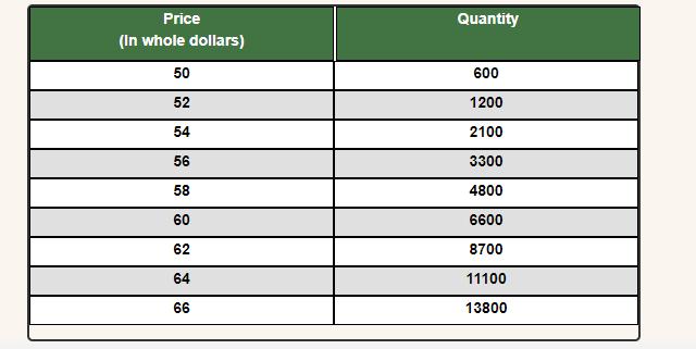
Price Quantity (In whole dollars) 50 600 52 1200 54 2100 56 3300 58 4800 60 6600 62 8700 64 11100 66 13800
Step by Step Solution
There are 3 Steps involved in it

Get step-by-step solutions from verified subject matter experts