Question: Let's further explore the relationship between per capita GDP and population, as we did in Activity 3 in Homework 1. This week, we will see

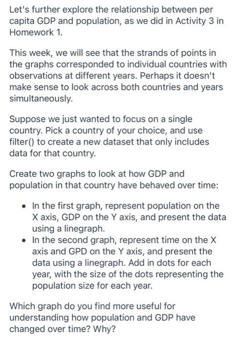
Let's further explore the relationship between per capita GDP and population, as we did in Activity 3 in Homework 1. This week, we will see that the strands of points in the graphs corresponded to individual countries with observations at different years. Perhaps it doesn't make sense to look across both countries and years simultaneously. Suppose we just wanted to focus on a single country. Pick a country of your choice, and use filter() to create a new dataset that only includes data for that country. Create two graphs to look at how GDP and population in that country have behaved over time: - In the first graph, represent population on the X axis, GDP on the Y axis, and present the data using a linegraph. - In the second graph, represent time on the X axis and GPD on the Y axis, and present the data using a linegraph. Add in dots for each year, with the size of the dots representing the population size for each year. Which graph do you find more useful for understanding how population and GDP have changed over time? Why
Step by Step Solution
There are 3 Steps involved in it

Get step-by-step solutions from verified subject matter experts


