

Question: Math 110 Homework #3 Graphs and Graphing When describing graphs, first carefully read the title and axes labelspay attention to units. Then ask yourself the
Math 110 Homework #3 Graphs and Graphing
When describing graphs, first carefully read the title and axes labelspay attention to units. Then ask yourself the following questionswhat does each graph tell you about the topic? What is interesting or noteworthy? What conclusions can be drawn? Why did the author make this graph? What information was the author intending to convey? Could any additional calculations be done to better understand the data? In addition to answering these questions, use the guidelines listed for each graph type to write a full paragraph description of the graphs below.
Scatter Graphs
The best description of a scatter graph does the following:
- tells the story of the graph from left to right giving specific values and dates for the first data point, the last data point, any relevant high points and low points
- explains the overall trend seen on the graph
- includes at least one relevant calculation(absolute change, percent change, ratio, etc)to better describe the data, the trends, or changes in the data
- ends with some meaningful conclusion or take away
- uses terminology correctly
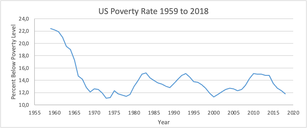
1. Write a thorough description of this scatter graph using the guidelines above. [3 pts]
If you dont see the poverty rate graph below, open the Homework 3 pdf on Blackboard, but enter your answers into this word file.
(Hold your cursor over points on the graph to see the year and the exact value for the rate)
Bar or Column Graph
The best description of a bar graph does the following:
- explains the topic of the graph
- gives specific values for at least some of the categories
- includes at least one relevant calculation (absolute difference, percent larger than, ratio, etc) to better describe the data or compare categories in the data
- includes some meaningful observations and a conclusion or take away
- uses terminology correctly
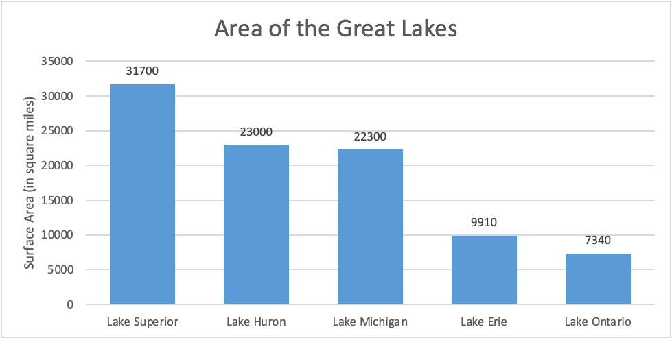
2. Write a thorough description of this bar graph using the guidelines above. [3 pts]
Pie Graph
The best description of a pie graph does the following:
- explains the topic of the graph
- gives specific values for at least some of the categories
- includes at least one relevant calculation(absolute difference, percent larger than, ratio, etc) to better describe the data or compare categories in the data
- includes some meaningful observations and a conclusion or take away
- uses terminology correctly
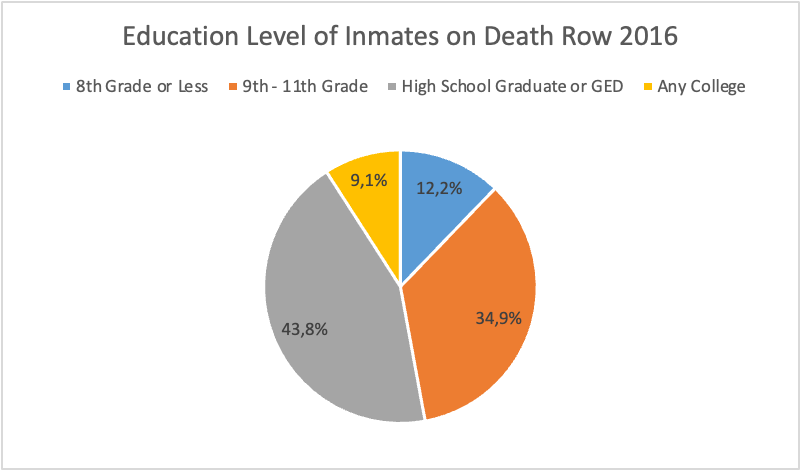
3. Write a thorough description of this pie graph using the guidelines above. [3 pts]
4.Open the Cause of Death file.
a. Calculate the percent change from 1999 to 2018 in the number of deaths from each cause listed. Make an appropriate graph of the causes and their percent changes. (It may look a bit strange since some of the percent changes may be negative). Copy and paste graph here. [4 points]
b. Write a paragraph with a thorough description of the data and your graph. [3 pts]
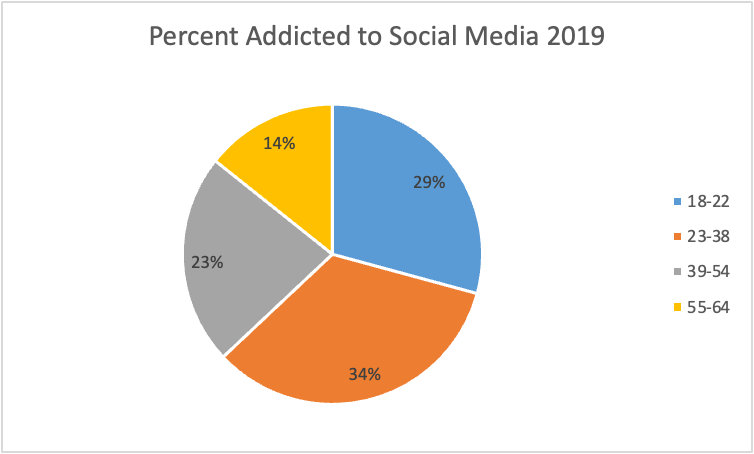
5. Open the file Addicted to Social Mediafile. Examine the data carefully.
a. The following graph was made from the data in this file. Give two reasons that a pie graph is not the appropriate type of graph for this data set. [2 pts]
b. Make a graph of the data that is appropriate and paste it here. [2 pts]
c.Write a paragraph with a thorough description of the data and your graph. Include as part of your description a calculation that compares the highest to the lowest. [3 pts]
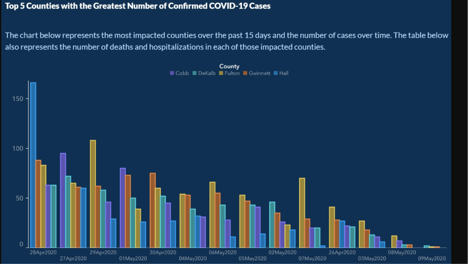
6. The graph below was originally published on the Georgia Department of Health website in early May 2020. It was later deleted and replaced. Examine the graph carefully. Besides not labeling the axes, there are two major problems with the graph. Name one and explain what misleading impression it creates. Bonus point if you can name both of them. [2 pts]
7. Your Data Analysis Project Data [5 pts]
Open your most recent Data Analysis Project file and investigate all of the data!
a. Make one graph (either scatter, pie, or column) from one of the data sets. (You many need to do calculations with the data before making your graph). Copy and paste graph here.
b. Write a thorough description of the data and the graph. Included in your description should be at least one relevant calculation to describe change or compare values.
Save your Excel file and submit with your homework assignment.
Area of the Great Lakes US Poverty Rate 1959 to 2018 Percent Addicted to Social Media 2019 Education Level of Inmates on Death Row 2016
Step by Step Solution
There are 3 Steps involved in it

Get step-by-step solutions from verified subject matter experts