

Question: Module 9 9:1 & 9:2 Worksheet 9.2: Graphing QuotasPeanuts! Draw a correctly labeled graph that shows a hypothetical supply and demand curve for the peanut
Module 9 9:1 & 9:2
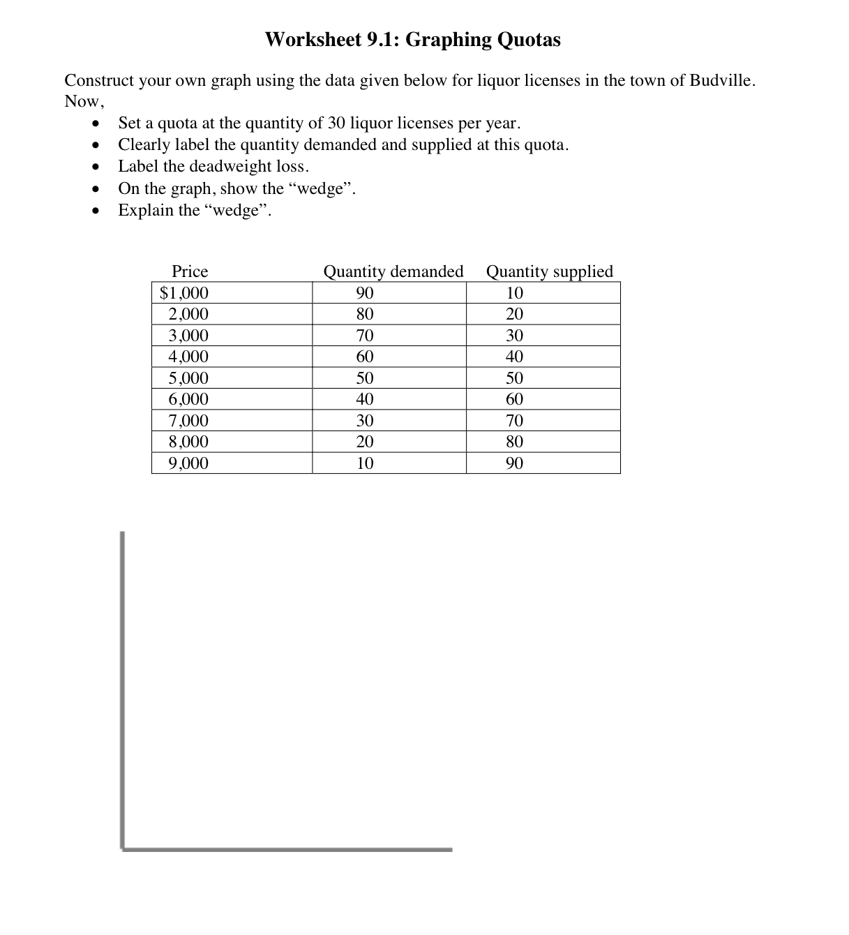
Worksheet 9.2: Graphing QuotasPeanuts! Draw a correctly labeled graph that shows a hypothetical supply and demand curve for the peanut market in the US. 1. Show the equilibrium at $50 and 100 tons of peanut. 2. Illustrate the line that would show a quota of 150 tons of peanuts. What effect would this have in the market? 3. Draw the line that would show a quota of 50 tons of peanuts. What do we call the area that is created by this quota? 4. With a quota of 50 tons of peanuts, would the demand price be higher or lower than equilibrium? 5. With a quota of 150 tons, would the supply price be higher or lower than equilibrium? Worksheet 9.1: Graphing Quotas Now, Construct your own graph using the data given below for liquor licenses in the town of Budville. Set a quota at the quantity of 30 liquor licenses per year. . . Clearly label the quantity demanded and supplied at this quota. Label the deadweight loss. On the graph, show the "wedge". Explain the "wedge". Price Quantity demanded $1,000 Quantity supplied 90 2,000 10 80 20 3,000 70 30 4,000 60 40 5.000 50 50 6,000 40 60 7,000 30 70 8,000 20 80 9.000 10 90
Step by Step Solution
There are 3 Steps involved in it

Get step-by-step solutions from verified subject matter experts