

Question: Name: Class: Date: Data Analysis and Graphing itreduction Many of the experiments conducted in science are quantitative, meaning they incorporate numerical measurements. nd match it
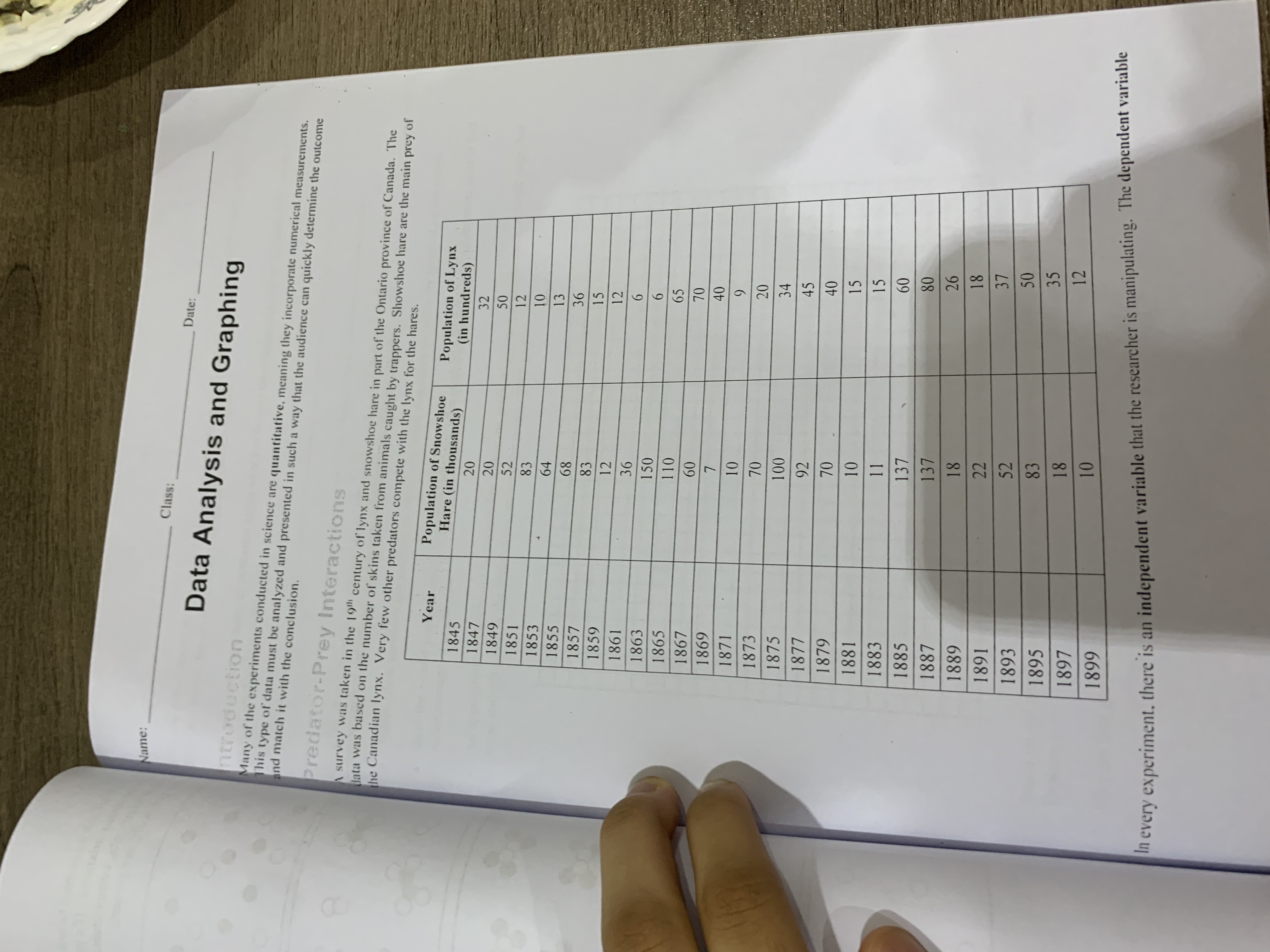
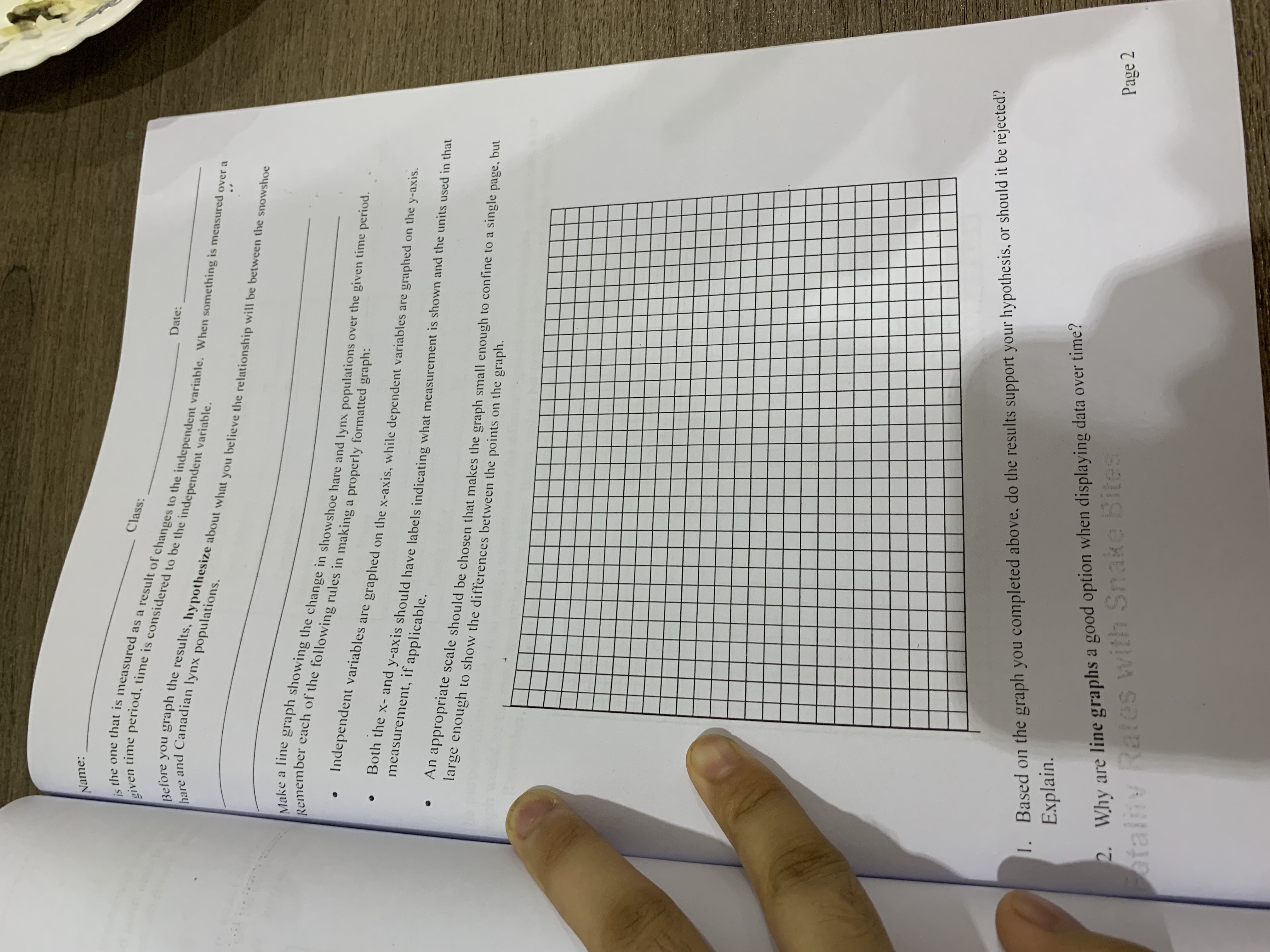
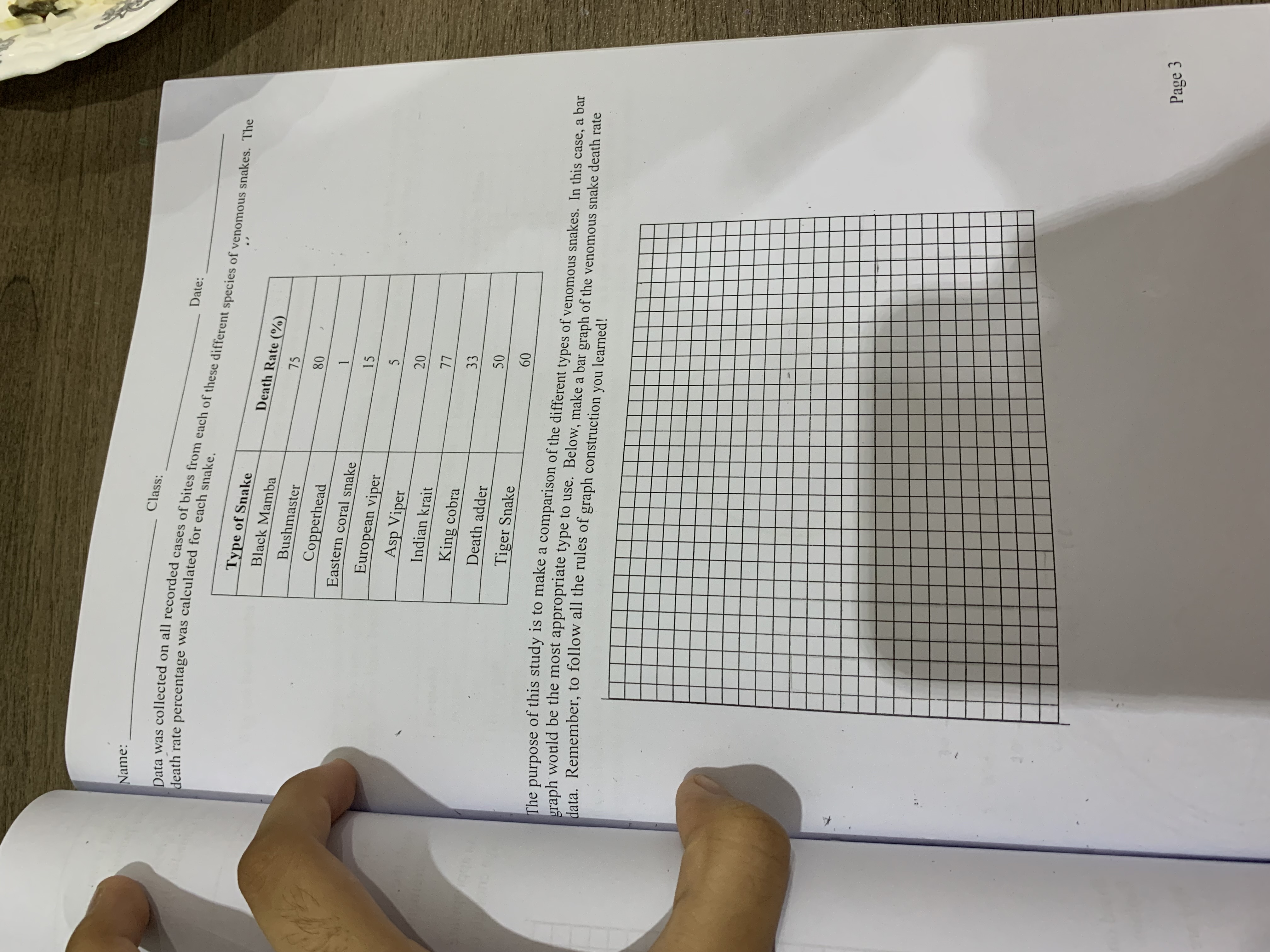
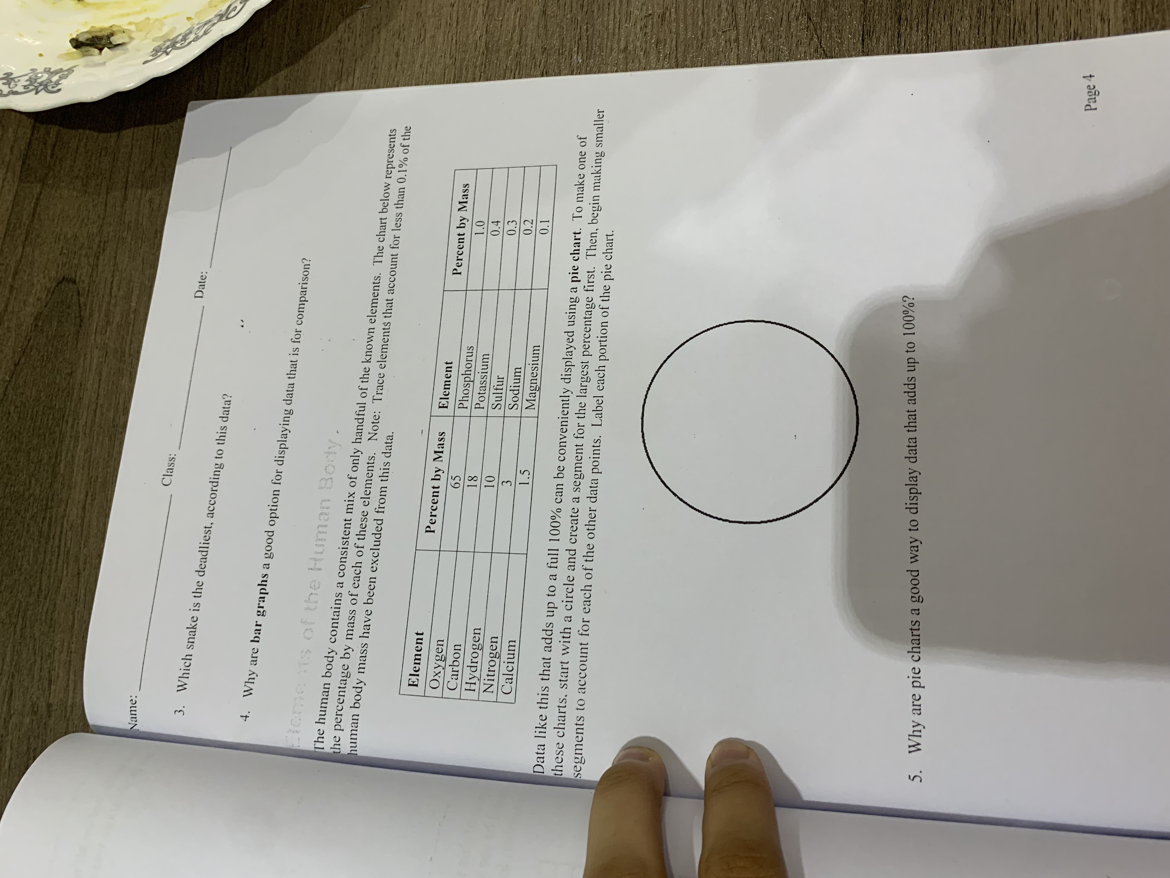 Name: Class: Date: Data Analysis and Graphing itreduction Many of the experiments conducted in science are quantitative, meaning they incorporate numerical measurements. nd match it with the conclusion. This type of' data must be analyzed and presented in such a way that the audience can quickly determine the outcome Predator-Prey Interactions A survey was taken in the 190 century of lynx and snowshoe hare in part of the Ontario province of Canada. The lata was based on the number of skins taken from animals caught by trappers. Showshoe hare are the main prey of he Canadian lynx. Very few other predators compete with the lynx for the hares. Year Population of Snowshoe 1845 Hare (in thousands) Population of Lynx 1847 20 (in hundreds) 1849 20 32 1851 52 50 185 83 12 1855 64 10 68 13 1857 36 1859 83 15 1861 12 12 1863 36 1865 150 6 110 6 1867 65 60 1869 7 70 1871 40 10 1873 9 70 20 1875 100 34 1877 92 45 1879 70 40 1881 10 15 1883 11 15 1885 137 60 1887 137 80 1889 18 26 1891 22 18 1893 52 37 1895 83 50 1897 18 35 1899 10 12 In every experiment. there is an independent variable that the researcher is manipulating. The dependent variableName: Class: Date: He one that is measured as a result of changes to the independent variable. When something is measured over a Liven time period. time is considered to be the independent variable. .fore you graph the results, hypothesize about what you believe the relationship will be between the snowshoe hare and Canadian lynx populations. Make a line graph showing the change in showshoe hare and lynx populations over the given time period. Remember each of the following rules in making a properly formatted graph: Independent variables are graphed on the x-axis, while dependent variables are graphed on the y-axis. Both the x- and y-axis should have labels indicating what measurement is shown and the units used in that measurement, if applicable. An appropriate scale should be chosen that makes the graph small enough to confine to a single page, but large enough to show the differences between the points on the graph. Based on the graph you completed above. do the results support your hypothesis, or should it be rejected? 1 . Page 2 Explain. 2. Why are line graphs a good option when displaying data over time? ofalny Rates with Snake BitesName: Class: Date: Data was collected on all recorded cases of bites from each of these different species of venomous snakes. The death rate percentage was calculated for each snake. Type of Snake Death Rate (%) Black Mamba 75 Bushmaster 80 Copperhead 1 Eastern coral snake 15 European viper 5 Asp Viper 20 Indian krait 77 King cobra 33 Death adder 50 Tiger Snake 60 The purpose of this study is to make a comparison of the different types of venomous snakes. In this case, a bar graph would be the most appropriate type to use. Below, make a bar graph of the venomous snake death rate data. Remember, to follow all the rules of graph construction you learned! Page 3Name: Class: Date: 3. Which snake is the deadliest, according to this data? 4. Why are bar graphs a good option for displaying data that is for comparison? Cloments of the Human Body. The human body contains a consistent mix of only handful of the known elements. The chart below represents the percentage by mass of each of these elements. Note: Trace elements that account for less than 0.1% of the human body mass have been excluded from this data. Element Percent by Mass Element Oxygen Percent by Mass 65 Carbon Phosphorus 1.0 18 Potassium 0.4 Hydrogen 10 Sulfur 0.3 Nitrogen Sodium 0.2 Calcium 1.5 Magnesium 0.1 Data like this that adds up to a full 100% can be conveniently displayed using a pie chart. To make one of these charts, start with a circle and create a segment for the largest percentage first. Then, begin making smaller segments to account for each of the other data points. Label each portion of the pie chart. 5. Why are pie charts a good way to display data that adds up to 100%? Page 4
Step by Step Solution
There are 3 Steps involved in it

Get step-by-step solutions from verified subject matter experts