

Question: Need help writing VBA code 3. Generate a Histogram (Frequency Chart) Once you have the application working, use values bctween 1 and 100, and a
Need help writing VBA code
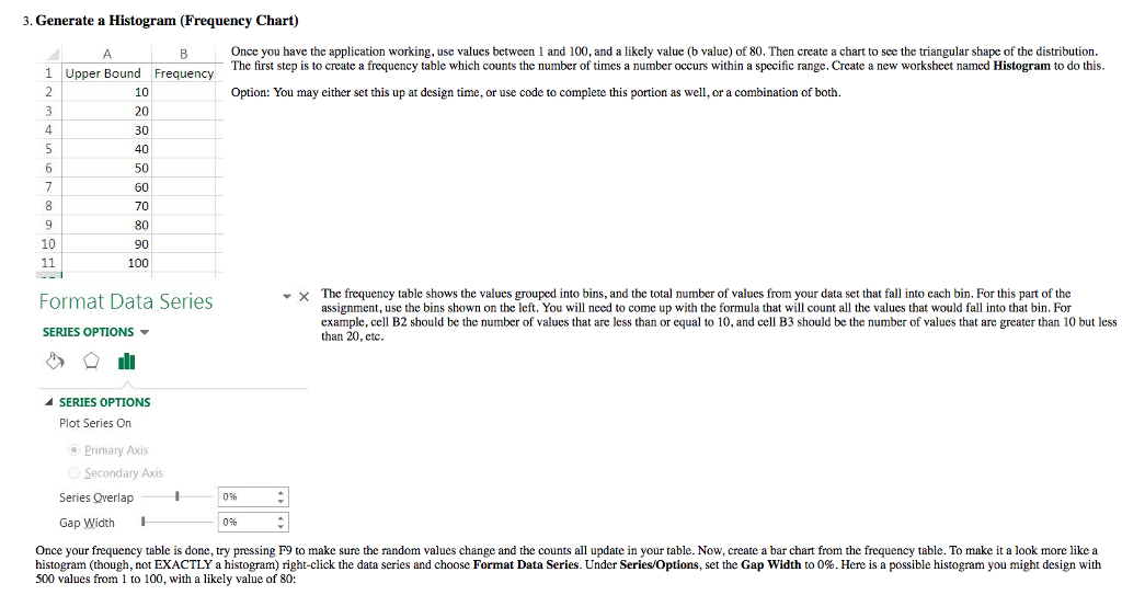
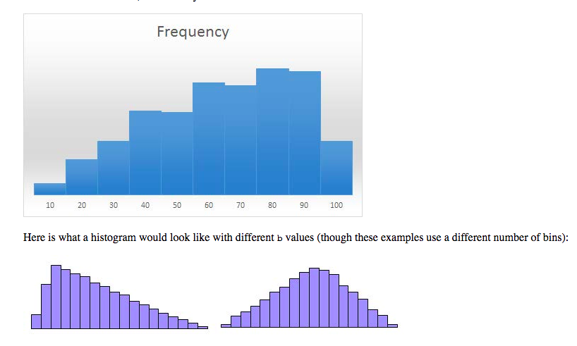
3. Generate a Histogram (Frequency Chart) Once you have the application working, use values bctween 1 and 100, and a likely value (b value) of 80. Then create a chart to sce the triangular shape of the distribution. The first step is to create a frequency table which counts the number of times a number occurs within a specific range. Create a new worksheet named Histogram to do this. 1 Upper Bound Frequency 10 20 30 40 50 60 Option: You may either set this up at design time, or use code to complete this portion as well, or a combination of both. 4 10 90 100 The frequency table shows the values grouped into bins, and the total number of values from your data set that fall into each bin. For this part of the assignment, use the bins shown on the left. You will nced to come up with the formula that will count all the values that would fall into that bin. For example, cell B2 should be the number of values that are less than or equal to 10, and cell B3 should be the number of values that are greater than 10 but less than 20, etc. Format Data Series SERIES OPTIONS SERIES OPTIONS Plot Series On Primary Axis Secondary Axis Series Qverlap 096 Gap Width 0% Once your frequency table is done, try pressing F9 to make sure the random values change and the counts all update in your table. Now, create a bar chart from the frequency table. To make it a look more like a histogram though not EXACTLY a histogram right-click the data series and choose Format Data Series. Under Series Options, set the Gap Width to 0%. Here is a possible histogram you might design with 500 values from 1 to 100, with a likely value of 80
Step by Step Solution
There are 3 Steps involved in it

Get step-by-step solutions from verified subject matter experts