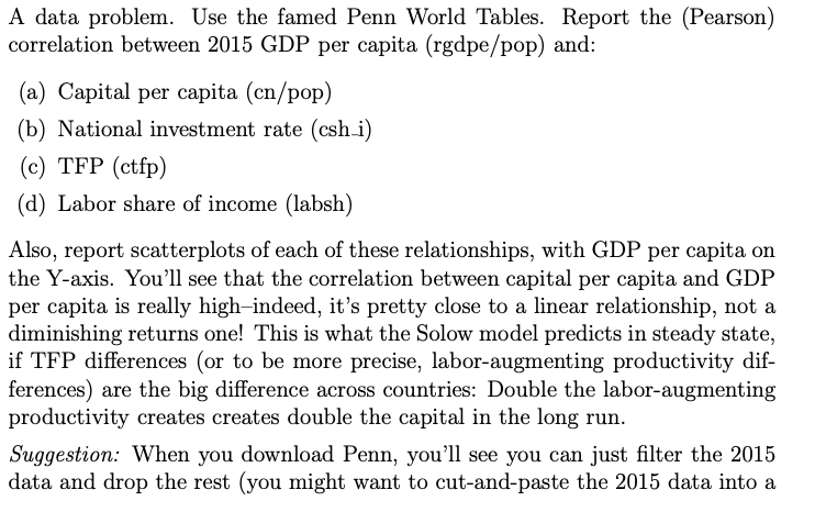
Question: new sheet, since the filter tool seems to just hide the other observations). That's probably the easiest way to set up the data before creating


new sheet, since the filter tool seems to just hide the other observations). That's probably the easiest way to set up the data before creating the correlations and scatterplots. I used Excel. A data problem. Use the famed Penn World Tables. Report the (Pearson) correlation between 2015 GDP per capita (rgdpe/pop) and: (a) Capital per capita (cn/pop) (b) National investment rate (csh i) (c) TFP (ctfp) (d) Labor share of income (labsh) Also, report scatterplots of each of these relationships, with GDP per capita on the Y-axis. You'll see that the correlation between capital per capita and GDP per capita is really high-indeed, it's pretty close to a linear relationship, not a diminishing returns one! This is what the Solow model predicts in steady state, if TFP differences (or to be more precise, labor-augmenting productivity dif- ferences) are the big difference across countries: Double the labor-augmenting productivity creates creates double the capital in the long run. Suggestion: When you download Penn, you'll see you can just filter the 2015 data and drop the rest (you might want to cut-and-paste the 2015 data into a
Step by Step Solution
There are 3 Steps involved in it

Get step-by-step solutions from verified subject matter experts


