

Question: Note that although the below graphs may seem like graphs from an Economics course, they are not so. These graphs are the ones we looked
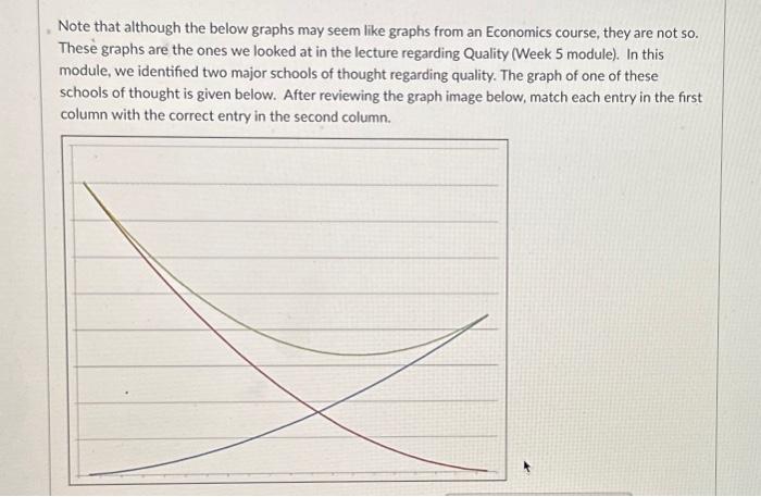
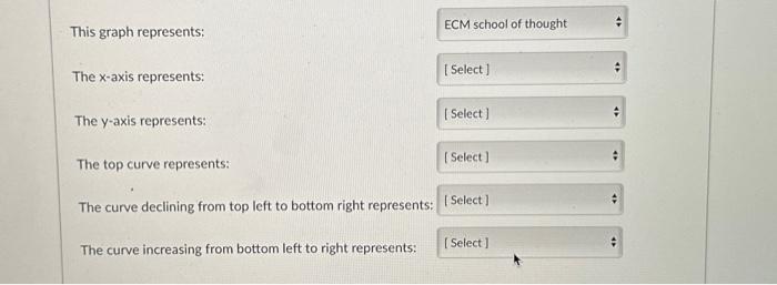
Note that although the below graphs may seem like graphs from an Economics course, they are not so. These graphs are the ones we looked at in the lecture regarding Quality (Week 5 module). In this module, we identified two major schools of thought regarding quality. The graph of one of these schools of thought is given below. After reviewing the graph image below, match each entry in the first column with the correct entry in the second column. This graph represents: The x-axis represents: The y-axis represents: The top curve represents: The curve declining from top left to bottom right represents: The curve increasing from bottom left to right represents
Step by Step Solution
There are 3 Steps involved in it

Get step-by-step solutions from verified subject matter experts