

Question: On the Data Visualization - Student tab in your Excel spreadsheet, update the price per unit for all four products for Office Warehouse Inc. with
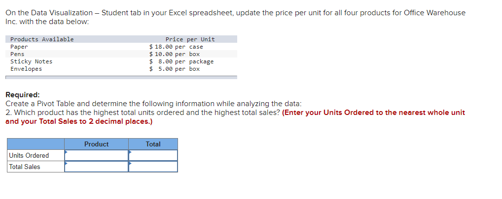
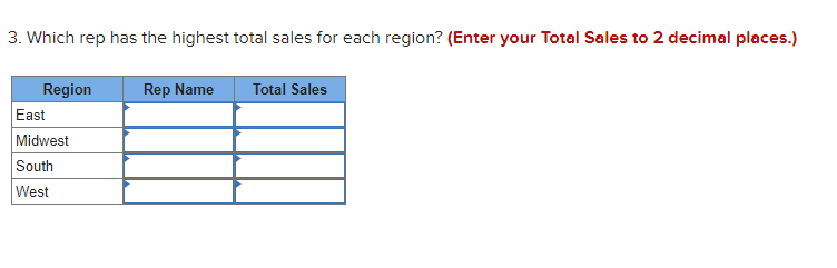
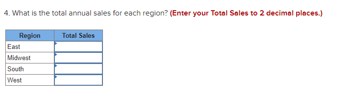
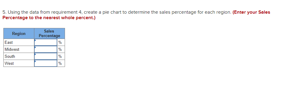
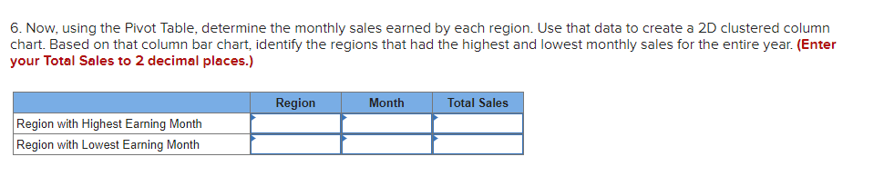
On the Data Visualization - Student tab in your Excel spreadsheet, update the price per unit for all four products for Office Warehouse Inc. with the data below: Products Available Paper Pens Sticky Notes Envelopes Price per Unit $ 18.00 per case $ 10.00 per box $ 8.00 per package $ 5.00 per box Required: Create a Pivot Table and determine the following information while analyzing the data: 2. Which product has the highest total units ordered and the highest total sales? (Enter your Units Ordered to the nearest whole unit and your Total Sales to 2 decimal places.) Product Total Units Ordered Total Sales 3. Which rep has the highest total sales for each region? (Enter your Total Sales to 2 decimal places.) Rep Name Total Sales Region East Midwest South West 4. What is the total annual sales for each region? (Enter your Total Sales to 2 decimal places.) Total Sales Region East Midwest South West 5. Using the data from requirement 4, create a pie chart to determine the sales percentage for each region. (Enter your Sales Percentage to the nearest whole percent.) Region East Midwest South West Sales Percentage % % % % 6. Now, using the Pivot Table, determine the monthly sales earned by each region. Use that data to create a 2D clustered column chart. Based on that column bar chart, identify the regions that had the highest and lowest monthly sales for the entire year. (Enter your Total Sales to 2 decimal places.) Region Month Total Sales Region with Highest Earning Month Region with Lowest Earning Month On the Data Visualization - Student tab in your Excel spreadsheet, update the price per unit for all four products for Office Warehouse Inc. with the data below: Products Available Paper Pens Sticky Notes Envelopes Price per Unit $ 18.00 per case $ 10.00 per box $ 8.00 per package $ 5.00 per box Required: Create a Pivot Table and determine the following information while analyzing the data: 2. Which product has the highest total units ordered and the highest total sales? (Enter your Units Ordered to the nearest whole unit and your Total Sales to 2 decimal places.) Product Total Units Ordered Total Sales 3. Which rep has the highest total sales for each region? (Enter your Total Sales to 2 decimal places.) Rep Name Total Sales Region East Midwest South West 4. What is the total annual sales for each region? (Enter your Total Sales to 2 decimal places.) Total Sales Region East Midwest South West 5. Using the data from requirement 4, create a pie chart to determine the sales percentage for each region. (Enter your Sales Percentage to the nearest whole percent.) Region East Midwest South West Sales Percentage % % % % 6. Now, using the Pivot Table, determine the monthly sales earned by each region. Use that data to create a 2D clustered column chart. Based on that column bar chart, identify the regions that had the highest and lowest monthly sales for the entire year. (Enter your Total Sales to 2 decimal places.) Region Month Total Sales Region with Highest Earning Month Region with Lowest Earning Month
Step by Step Solution
There are 3 Steps involved in it

Get step-by-step solutions from verified subject matter experts