

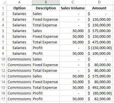
Orton Company distributes one product that sells for $11.50 per unit and incurs variable expenses of $8.25
Question:
Orton Company distributes one product that sells for $11.50 per unit and incurs variable expenses of $8.25 per unit. Its monthly fixed expense is $80,000. The company currently pays its sales representatives a sales commission of $1.75 per unit sold; however, it is considering replacing these sales commissions with sales salaries of $70,000 per month. Orton would like your help in creating a cost-volume-profit (CVP) graph and a profit graph for both compensation scenarios up to a sales volume of 50,000 units.
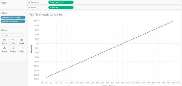
Create a profit graph based on the company’s existing commission-based compensation scheme for its sales representatives:
- Click on “new sheet” at the bottom of the workbook and change the name of the newly created “Sheet 3” to “Profit Graph Commissions”
- On the left-hand side under “Measures”, double click on “Amount”
- On the left-hand side under “Measures”, double click on “Sales Volume”
- A scatterplot with one data point will be created. This is because Tableau assumes you want to plot the sums of the two measures.
- To show all measures go to the “Analysis” dropdown at the top menu bar and uncheck the box next to “Aggregate measures”
- Under the “Marks” card area, click on the drop down that currently says “Automatic” and modify it to “Line”
- We want to evaluate only “Profits” at this point, so on the left-hand side under “Dimensions” (sometimes labeled as Tables), click on “Description” and drag and drop it into the “Filters” box (above the “Marks” card)
- The “Filter” window will open, check the box next to “Profit” only, and click “OK”
- We want to evaluate only “Commissions” at this point, so on the left-hand side under “Dimensions” (sometimes labeled as Tables), click on “Option” and drag and drop it into the “Filters” box (above the “Marks” card)
- The “Filter” window will open, check the box next to “Commissions” only, and click “OK”
- To improve viewing, locate the “Standard” dropdown option in the menu bar at the top of the screen. Click on that dropdown and choose “Entire View.”
- Your visualization should appear as follows:
Required:
(Note that for all questions below you may select more than one answer. Single click the box with the question mark to produce a check mark for a correct answer and double click the box with the question mark to empty the box for a wrong answer. Any boxes left with a question mark will be automatically graded as incorrect.)
4a. The point where the blue line intersects the Y-axis (the vertical axis) indicates which of the following statements is true?
check all that apply 1
- The company’s total expense at all sales volumes between zero and 50,000 units is $80,000.
- The company’s total fixed expense at all sales volumes between zero and 50,000 units is $80,000.
- The company’s total variable expense at all sales volumes between zero and 50,000 units is $80,000.
- The company’s total contribution margin at all sales volumes between zero and 50,000 units is $80,000.
4b. For each increase of one unit on the X-axis (the horizontal axis), the amount on the Y-axis (the vertical axis) increases by:
check all that apply 2
- The contribution margin per unit.
- The selling price per unit.
- The profit margin per unit.
- The variable expense per unit.
4c. If the selling price per unit decreased and the variable expense per unit and total fixed expense remained unchanged, then which of the following statements is true?
check all that apply 3
- The line shown in the profit graph would shift to a V-shape.
- The line shown in the profit graph would not change.
- The line shown in the profit graph would steepen.
- The line shown in the profit graph would flatten out.
Expert Answer:


Fundamental Managerial Accounting Concepts
ISBN: 978-0078025655
7th edition
Authors: Thomas Edmonds, Christopher Edmonds, Bor-Yi Tsay, Philip Old
