

Question: Pacific Trails Resort Case Study In this chapter's case study, you will use the existing Pacific Trails Resort (Chapter 6) website as a starting point
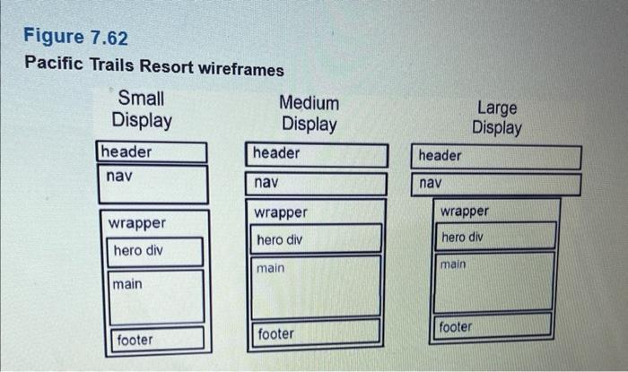
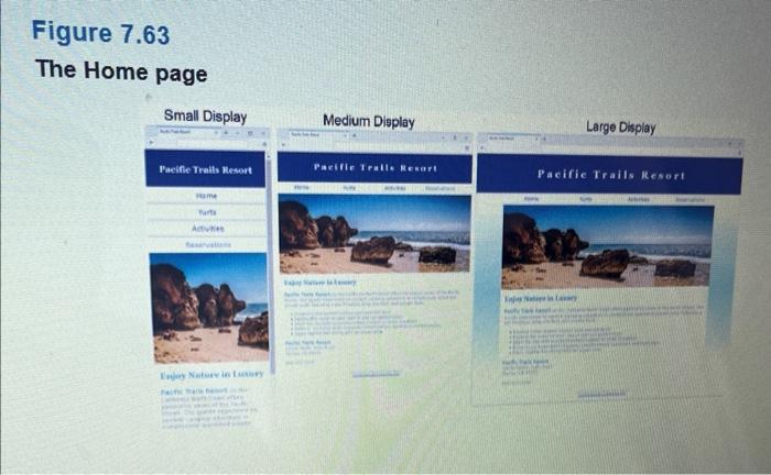
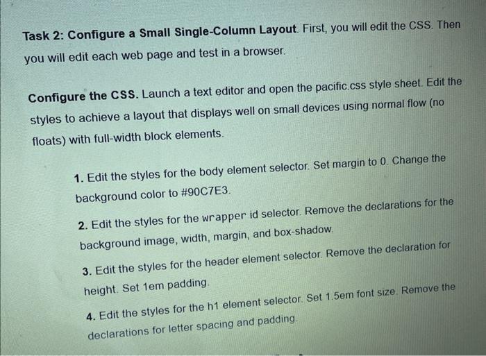
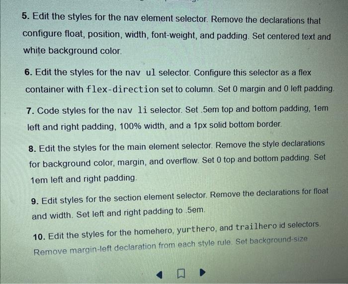
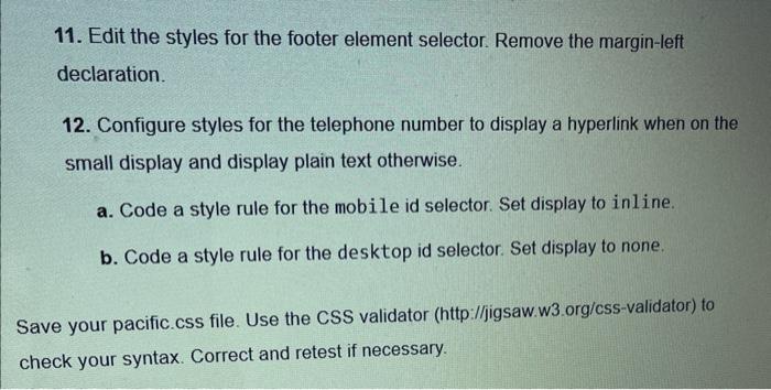
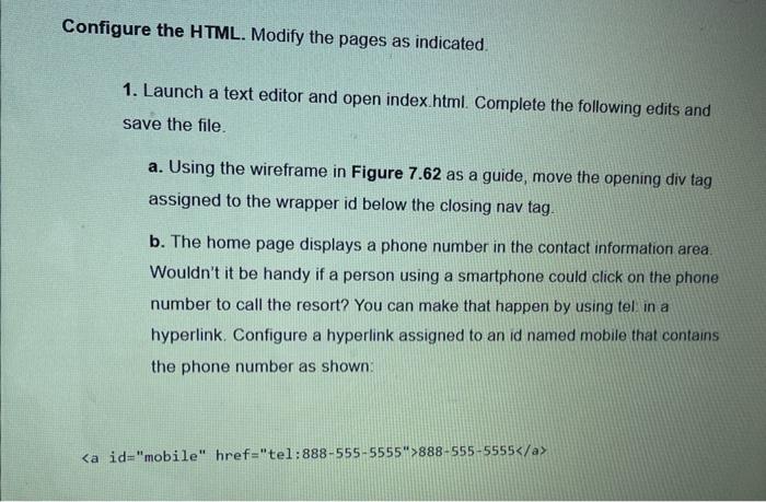
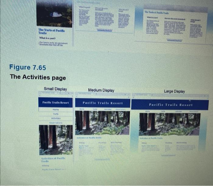
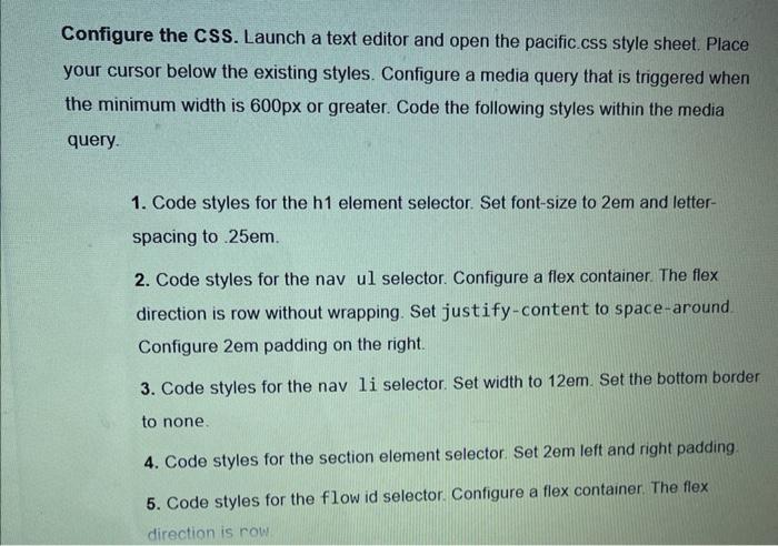

Pacific Trails Resort Case Study In this chapter's case study, you will use the existing Pacific Trails Resort (Chapter 6) website as a starting point to create a new responsive version of the website that utilizes media queries. The new design has full width header element, a full width nav element, and an 80% width centered div that contains the main element and footer element. You'll practice a Mobile First strategy for responsive design. First, you will configure a page layout that works well in smartphones (test with a small browser window). Then you'll resize the browser viewport to be larger until the design "breaks" and code media queries and additional CSS as needed. Figure 7.62 shows wireframes for three different layouts. The Home page displays will be similar to Figure 7.63. Pacific Trails Resort wireframes Figure 7.63 The Home page You have four tasks in this case study: 1. Create a new folder for the Pacific Trails Resort website. 2. Configure the HTML and CSS needed for pleasing display of a single-column (smartphone) display. 3. Configure the HTML and CSS needed for pleasing display of the web pages on medium sized mobile devices. 4. Configure the CSS needed for a pleasing display of the web pages on large mobile devices and desktops. Task 1: Create a folder called pacific7 to contain your Pacific Trails Resort website files. Copy the files from the Chapter 6 Case Study pacific 6 folder into the pacific 7 folder. Task 2: Configure a Small Single-Column Layout. First, you will edit the CSS. Then you will edit each web page and test in a browser. Configure the CSS. Launch a text editor and open the pacific.css style sheet. Edit the styles to achieve a layout that displays well on small devices using normal flow (no floats) with full-width block elements. 1. Edit the styles for the body element selector. Set margin to 0 . Change the background color to #90C7E3. 2. Edit the styles for the wrapper id selector. Remove the declarations for the background image, width, margin, and box-shadow. 3. Edit the styles for the header element selector. Remove the declaration for height. Set 1em padding. 4. Edit the styles for the 1 element selector. Set 1.5m font size. Remove the declarations for letter spacing and padding. 5. Edit the styles for the nav element selector. Remove the declarations that configure float, position, width, font-weight, and padding. Set centered text and white background color. 6. Edit the styles for the nav ul selector. Configure this selector as a flex container with flex-direction set to column. Set 0 margin and 0 left padding. 7. Code styles for the nav 1i selector. Set .5em top and bottom padding, 1em left and right padding, 100% width, and a 1px solid bottom border. 8. Edit the styles for the main element selector. Remove the style declarations for background color, margin, and overflow. Set 0 top and bottom padding. Set 1em left and right padding. 9. Edit styles for the section element selector. Remove the declarations for float and width. Set left and right padding to .5em. 10. Edit the styles for the homehero, yurthero, and trailhero id selectors. Remove margin-left declaration from each style rule Set background-size 11. Edit the styles for the footer element selector. Remove the margin-left declaration. 12. Configure styles for the telephone number to display a hyperlink when on the small display and display plain text otherwise. a. Code a style rule for the mobile id selector. Set display to inline. b. Code a style rule for the desktop id selector. Set display to none. ve your pacific.css file. Use the CSS validator (http:/l/igsaw.w3.org/css-validator) to eck your syntax. Correct and retest if necessary. onfigure the HTML. Modify the pages as indicated. 1. Launch a text editor and open index.html. Complete the following edits and save the file. a. Using the wireframe in Figure 7.62 as a guide, move the opening div tag assigned to the wrapper id below the closing nav tag. b. The home page displays a phone number in the contact information area. Wouldn't it be handy if a person using a smartphone could click on the phone number to call the resort? You can make that happen by using tel in a hyperlink. Configure a hyperlink assigned to an id named mobile that contains the phone number as shown: But wait a minute, a telephone link could confuse those visiting the site with a desktop browser. Code another phone number directly after the hyperlink. Code a span element assigned to an id named desktop around the phone number as shown: id="desktop">8885555555/span c. Code a viewport meta tag in the head section that configures the width to the device-width and sets the initial-scale to 10 2. Launch a text editor and open yurts.html. Using the wireframe in Figure 7.62 as a guide, move the opening div tag assigned to the wrapper id below the closing nav tag. Add a viewport meta tag to head section in the same manner as the Home page Save the file 3. Launch a text editor and open activities.html. Using the wireframe in Figure 7.62 as a guide, move the opening div tag assigned to the wrapper id below the closing nav tag. Add a viewport meta tag to head section in the same manner as the Home page. Save the file. Test the web pages. Display your index.html file in a browser. This layout is intended for narrow mobile screens. Resize your browser to be narrower until your display is similar to the Small Display shown in Figure 7.63, which simulates mobile display. Test the yurts. html and activities. html files in a similar manner. Task 3: Configure a Medium Layout. Edit the CSS and web pages to configure a more pleasing display on a wider viewport, setting 600px as the breakpoint for the first media query. You will configure flexbox layout for two areas: the main navigation and the columns of information on the content pages. When you test your web pages and trigger the media query, the layout in the Medium Display wireframe in Figure 7.62 will ho implemented and your pages should look similar to the Medium Display in Figures Figure 7.65 The Activities page Configure the CSS. Launch a text editor and open the pacific.css style sheet. Place your cursor below the existing styles. Configure a media query that is triggered when the minimum width is 600px or greater. Code the following styles within the media query. 1. Code styles for the h1 element selector. Set font-size to 2em and letterspacing to 25em. 2. Code styles for the nav ul selector. Configure a flex container. The flex direction is row without wrapping. Set justify-content to space-around Configure 2em padding on the right. 3. Code styles for the nav 1i selector. Set width to 12em. Set the bottom border to none. 4. Code styles for the section element selector. Set 2em left and right padding. 5. Code styles for the flow id selector. Configure a flex container. The flex direction is row 6. Code styles for the mobile id selector. Set display to none. 7. Code styles for the desktop id selector. Set display to inline. 8. Code styles for the homehero, yurthero, and trailhero id selectors. Set background-size to 100%100% Save your pacific.css file. Use the CSS validator (http.//jigsaw.w3.org/css-validator) to check your syntax. Correct and retest if necessary. Configure the HTML. You need to rework the content area on the Yurts and Activities pages. 1. Launch a text editor and open yurts. html. Code a div assigned to an id named flow that contains all section elements. Save the file 2. Launch a text editor and open activities html Code a div assigned to an id named f low that contains all section elements. Save the file. Test the web pages. Display your index. html file in a browser. You should be able to resize your browser viewport and obtain a display similar to the Medium Display in Figure 7.63. Test the yurts.html and activities.html files in a similar manner. Task 4: Configure a Large Layout. Edit the CSS to configure a second media query with a 1024px breakpoint. When you test your web pages and trigger the media query, the layout in the Large Display wireframe in Figure 7.62 will be implemented and your pages should look similar to the Large Display in Figures 7.63, 7.64, and 7.65. Configure the CSS. Launch a text editor and open the pacific.css style sheet. Place your cursor below the existing styles. Configure a media query that is triggered when the minimum width is 1024px or greater. Code the following styles within the media query. 1. Code styles for the body element selector. Configure a linear gradient as the background image that displays the color white for 20% of the viewport height, 1. Code styles for the body element selector. Configure a linear gradient as the background image that displays the color white for 20% of the viewport height, transitions to light blue, and transitions back to white. The CSS for the linear gradient follows: Iinear-gradient (to bottom, \#FFFFFF 20\%, \#90C7E3 60\%, \#FFFFFF 100\%); 2. Code styles for the nav ul selector. Set 10% right and left padding. 3. Code styles for the \#wrapper id selector. Set the area to be horizontally centered (hint: margin: auto;) with 80% width. Save your pacific css file. Use the CSS validator (http:l/jigsaw.w3.org/css-validator) to check your syntax. Correct and retest if necessary. Pacific Trails Resort Case Study In this chapter's case study, you will use the existing Pacific Trails Resort (Chapter 6) website as a starting point to create a new responsive version of the website that utilizes media queries. The new design has full width header element, a full width nav element, and an 80% width centered div that contains the main element and footer element. You'll practice a Mobile First strategy for responsive design. First, you will configure a page layout that works well in smartphones (test with a small browser window). Then you'll resize the browser viewport to be larger until the design "breaks" and code media queries and additional CSS as needed. Figure 7.62 shows wireframes for three different layouts. The Home page displays will be similar to Figure 7.63. Pacific Trails Resort wireframes Figure 7.63 The Home page You have four tasks in this case study: 1. Create a new folder for the Pacific Trails Resort website. 2. Configure the HTML and CSS needed for pleasing display of a single-column (smartphone) display. 3. Configure the HTML and CSS needed for pleasing display of the web pages on medium sized mobile devices. 4. Configure the CSS needed for a pleasing display of the web pages on large mobile devices and desktops. Task 1: Create a folder called pacific7 to contain your Pacific Trails Resort website files. Copy the files from the Chapter 6 Case Study pacific 6 folder into the pacific 7 folder. Task 2: Configure a Small Single-Column Layout. First, you will edit the CSS. Then you will edit each web page and test in a browser. Configure the CSS. Launch a text editor and open the pacific.css style sheet. Edit the styles to achieve a layout that displays well on small devices using normal flow (no floats) with full-width block elements. 1. Edit the styles for the body element selector. Set margin to 0 . Change the background color to #90C7E3. 2. Edit the styles for the wrapper id selector. Remove the declarations for the background image, width, margin, and box-shadow. 3. Edit the styles for the header element selector. Remove the declaration for height. Set 1em padding. 4. Edit the styles for the 1 element selector. Set 1.5m font size. Remove the declarations for letter spacing and padding. 5. Edit the styles for the nav element selector. Remove the declarations that configure float, position, width, font-weight, and padding. Set centered text and white background color. 6. Edit the styles for the nav ul selector. Configure this selector as a flex container with flex-direction set to column. Set 0 margin and 0 left padding. 7. Code styles for the nav 1i selector. Set .5em top and bottom padding, 1em left and right padding, 100% width, and a 1px solid bottom border. 8. Edit the styles for the main element selector. Remove the style declarations for background color, margin, and overflow. Set 0 top and bottom padding. Set 1em left and right padding. 9. Edit styles for the section element selector. Remove the declarations for float and width. Set left and right padding to .5em. 10. Edit the styles for the homehero, yurthero, and trailhero id selectors. Remove margin-left declaration from each style rule Set background-size 11. Edit the styles for the footer element selector. Remove the margin-left declaration. 12. Configure styles for the telephone number to display a hyperlink when on the small display and display plain text otherwise. a. Code a style rule for the mobile id selector. Set display to inline. b. Code a style rule for the desktop id selector. Set display to none. ve your pacific.css file. Use the CSS validator (http:/l/igsaw.w3.org/css-validator) to eck your syntax. Correct and retest if necessary. onfigure the HTML. Modify the pages as indicated. 1. Launch a text editor and open index.html. Complete the following edits and save the file. a. Using the wireframe in Figure 7.62 as a guide, move the opening div tag assigned to the wrapper id below the closing nav tag. b. The home page displays a phone number in the contact information area. Wouldn't it be handy if a person using a smartphone could click on the phone number to call the resort? You can make that happen by using tel in a hyperlink. Configure a hyperlink assigned to an id named mobile that contains the phone number as shown: But wait a minute, a telephone link could confuse those visiting the site with a desktop browser. Code another phone number directly after the hyperlink. Code a span element assigned to an id named desktop around the phone number as shown: id="desktop">8885555555/span c. Code a viewport meta tag in the head section that configures the width to the device-width and sets the initial-scale to 10 2. Launch a text editor and open yurts.html. Using the wireframe in Figure 7.62 as a guide, move the opening div tag assigned to the wrapper id below the closing nav tag. Add a viewport meta tag to head section in the same manner as the Home page Save the file 3. Launch a text editor and open activities.html. Using the wireframe in Figure 7.62 as a guide, move the opening div tag assigned to the wrapper id below the closing nav tag. Add a viewport meta tag to head section in the same manner as the Home page. Save the file. Test the web pages. Display your index.html file in a browser. This layout is intended for narrow mobile screens. Resize your browser to be narrower until your display is similar to the Small Display shown in Figure 7.63, which simulates mobile display. Test the yurts. html and activities. html files in a similar manner. Task 3: Configure a Medium Layout. Edit the CSS and web pages to configure a more pleasing display on a wider viewport, setting 600px as the breakpoint for the first media query. You will configure flexbox layout for two areas: the main navigation and the columns of information on the content pages. When you test your web pages and trigger the media query, the layout in the Medium Display wireframe in Figure 7.62 will ho implemented and your pages should look similar to the Medium Display in Figures Figure 7.65 The Activities page Configure the CSS. Launch a text editor and open the pacific.css style sheet. Place your cursor below the existing styles. Configure a media query that is triggered when the minimum width is 600px or greater. Code the following styles within the media query. 1. Code styles for the h1 element selector. Set font-size to 2em and letterspacing to 25em. 2. Code styles for the nav ul selector. Configure a flex container. The flex direction is row without wrapping. Set justify-content to space-around Configure 2em padding on the right. 3. Code styles for the nav 1i selector. Set width to 12em. Set the bottom border to none. 4. Code styles for the section element selector. Set 2em left and right padding. 5. Code styles for the flow id selector. Configure a flex container. The flex direction is row 6. Code styles for the mobile id selector. Set display to none. 7. Code styles for the desktop id selector. Set display to inline. 8. Code styles for the homehero, yurthero, and trailhero id selectors. Set background-size to 100%100% Save your pacific.css file. Use the CSS validator (http.//jigsaw.w3.org/css-validator) to check your syntax. Correct and retest if necessary. Configure the HTML. You need to rework the content area on the Yurts and Activities pages. 1. Launch a text editor and open yurts. html. Code a div assigned to an id named flow that contains all section elements. Save the file 2. Launch a text editor and open activities html Code a div assigned to an id named f low that contains all section elements. Save the file. Test the web pages. Display your index. html file in a browser. You should be able to resize your browser viewport and obtain a display similar to the Medium Display in Figure 7.63. Test the yurts.html and activities.html files in a similar manner. Task 4: Configure a Large Layout. Edit the CSS to configure a second media query with a 1024px breakpoint. When you test your web pages and trigger the media query, the layout in the Large Display wireframe in Figure 7.62 will be implemented and your pages should look similar to the Large Display in Figures 7.63, 7.64, and 7.65. Configure the CSS. Launch a text editor and open the pacific.css style sheet. Place your cursor below the existing styles. Configure a media query that is triggered when the minimum width is 1024px or greater. Code the following styles within the media query. 1. Code styles for the body element selector. Configure a linear gradient as the background image that displays the color white for 20% of the viewport height, 1. Code styles for the body element selector. Configure a linear gradient as the background image that displays the color white for 20% of the viewport height, transitions to light blue, and transitions back to white. The CSS for the linear gradient follows: Iinear-gradient (to bottom, \#FFFFFF 20\%, \#90C7E3 60\%, \#FFFFFF 100\%); 2. Code styles for the nav ul selector. Set 10% right and left padding. 3. Code styles for the \#wrapper id selector. Set the area to be horizontally centered (hint: margin: auto;) with 80% width. Save your pacific css file. Use the CSS validator (http:l/jigsaw.w3.org/css-validator) to check your syntax. Correct and retest if necessary
Step by Step Solution
There are 3 Steps involved in it

Get step-by-step solutions from verified subject matter experts
 Study Help