Question: Part 1. Marked for Completion Marked complete {1 point), mostly complete [0.5), or missing/incomplete (0). This real scientific paper below was recently awarded an lg


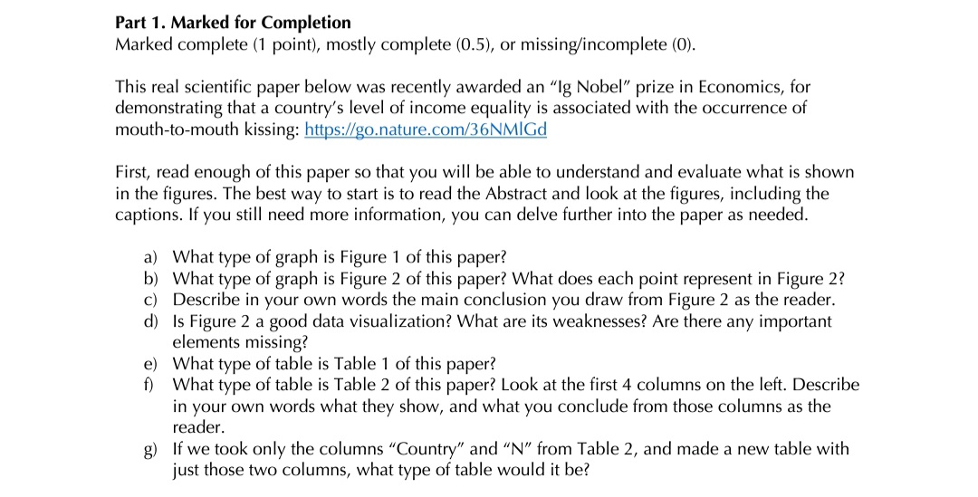
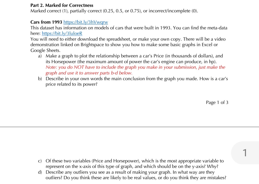
Part 1. Marked for Completion Marked complete {1 point), mostly complete [0.5), or missing/incomplete (0). This real scientific paper below was recently awarded an "lg Nobel\" prize in Economics, for demonstrating that a country's level of income equality is associated with the occurrence of mouthtomouth kissing: https:ngtLnaturecom ()NMICLLI First, read enough of this paper so that you will be able to understand and evaluate what is shown in the figures. The best way to start is to read the Abstract and look at the figures, including the captions. If you still need more information, you can delve further into the paper as needed. a) What type of graph is Figure 1 of this paper? b) What type of graph is Figure 2 of this paper? What does each point represent in Figure 2? c) Describe in your own words the main conclusion you draw from Figure 2 as the reader. d) Is Figure 2 a good data visualization? What are its weaknesses? Are there any important elements missing? e) What type of table is Table 1 of this paper? f) What type of table is Table 2 of this paper? Look at the first 4 columns on the left. Describe in your own words what they show, and what you conclude from those columns as the reader. g) If we took only the columns \"Country\" and \"N\" from Table 2, and made a new table with just those two columns, what type of table would it be? Part 2. Marked for Correctness Marked correct (1), partially correct (0.25, 0.5, or 0.75), or incorrect/incomplete (0). Cars from 1993 llll[)S'ltll.ly/ll'lqurw This dataset has information on models of cars that were built in 1993. You can find the meta-data herE: |..1..II.|.is.:f/hi..l_..|vt;5. lulusli You will need to either download the spreadsheet, or make your own copy. There will be a video demonstration linked on Brightspace to show you how to make some basic graphs in Excel or Google Sheets. a} Make a graph to plot the relationship between a car's Price (in thousands of dollars), and its Horsepower (the maximum amount of power the car's engine can produce, in hp). Note: you do NU'Jr have to include the graph you make in your submission, just make the graph and use it to answer parts h'u' below. b} Describe in your own words the main conclusion from the graph you made. How is a car's price related to its power? Page 1 of 3 c) Of these two variables (Price and Horsepower), which is the most appropriate variable to represent on the xaxis of this type of graph, and which should be on the yaxis? Why? d) Describe any outliers you see as a result of making your graph. In what way are they outliers? Do you think these are likely to be real values, or do you think they are mistakes
Step by Step Solution
There are 3 Steps involved in it

Get step-by-step solutions from verified subject matter experts


