

Question: PART 2 : Coding ( PYTHON ! ) SPECIFICATION Description: This program uses the covid _ comorbidities _ USsummary.csv data to print totals and create
PART : Coding PYTHON
SPECIFICATION
Description: This program uses the covidcomorbiditiesUSsummary.csv data to print totals and create a bar and pie charts showing the number of people who died because of comorbidities in COVID cases. It will also explore correlations between the different variables.
Input:
covidcomorbiditiesUSsummary.csv
Output:
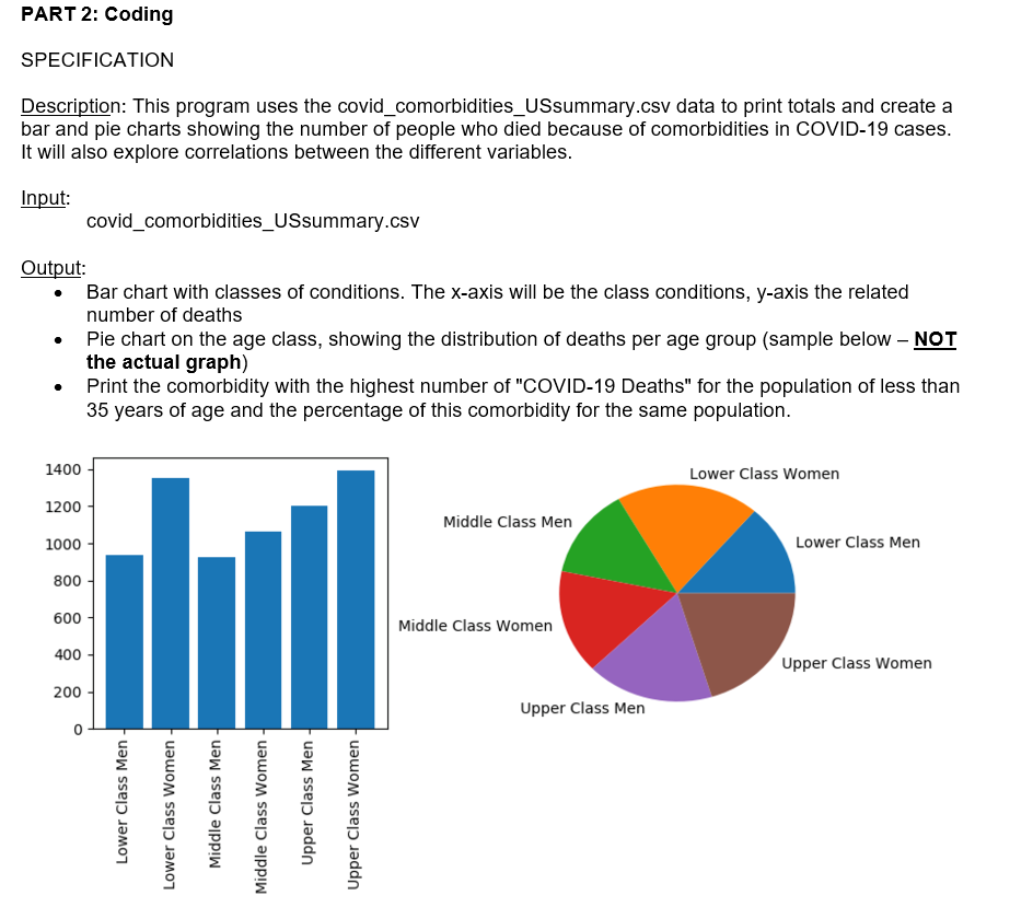
Bar chart with classes of conditions. The x axis will be the class conditions, y axis the related number of deaths
Pie chart on the age class, showing the distribution of deaths per age group sample below NOT the actual graph
Print the comorbidity with the highest number of "COVID Deaths" for the population of less than years of age and the percentage of this comorbidity for the same population.
Procedure:
Import the required libraries.
Read the data file into a pandas data structure.
Remove records with "Age Group" equal to either 'Not stated' or 'All Ages'.
Remove records with "Condition" equal to COVID
Remove the columns "Condition Group", "ICDcodes", "Number of Mentions".
Create the charts, as subplots.
Subplot left: bar chart
bar plot
x list of conditions
y values for each one of the groups. Name y axis as "Count"
do not overlap labels
PLEASE NOTE: the number of conditions can be high. You can have all of them in the
chart OR only the top There is no penalty or extra points either ways
Subplot right: pie chart. This is with the same y data as the bar chart
pie plot
label the wedges using the age categories
Add percentage values as second label to your pie chart
Insert a proper title to the main plot
Print:
the comorbidity with the highest number of deaths for the population of less than years of
age;
the percentage of the total deaths this comorbidity represents for the total deaths in the
same population.
Run a correlation analysis to determine relationships between variables. Either the original CSV file
or a pandas from the steps above can be used. Please keep in mind that correlation analysis is
working on numerical variables only. For this assignment, you can consider only the variables that
are numerical, without converting the categorical into numerical.
Write a pages docpdf report containing:
your own interpretation of your analysis graph included;
As nonmandatory requirement, a comparison of your findings with an analysis of COVID
comorbidities from ChatGPT or BardGemini There is no penalty or extra points for not
doingdoing this type of comparison
Step by Step Solution
There are 3 Steps involved in it
1 Expert Approved Answer
Step: 1 Unlock

Question Has Been Solved by an Expert!
Get step-by-step solutions from verified subject matter experts
Step: 2 Unlock
Step: 3 Unlock