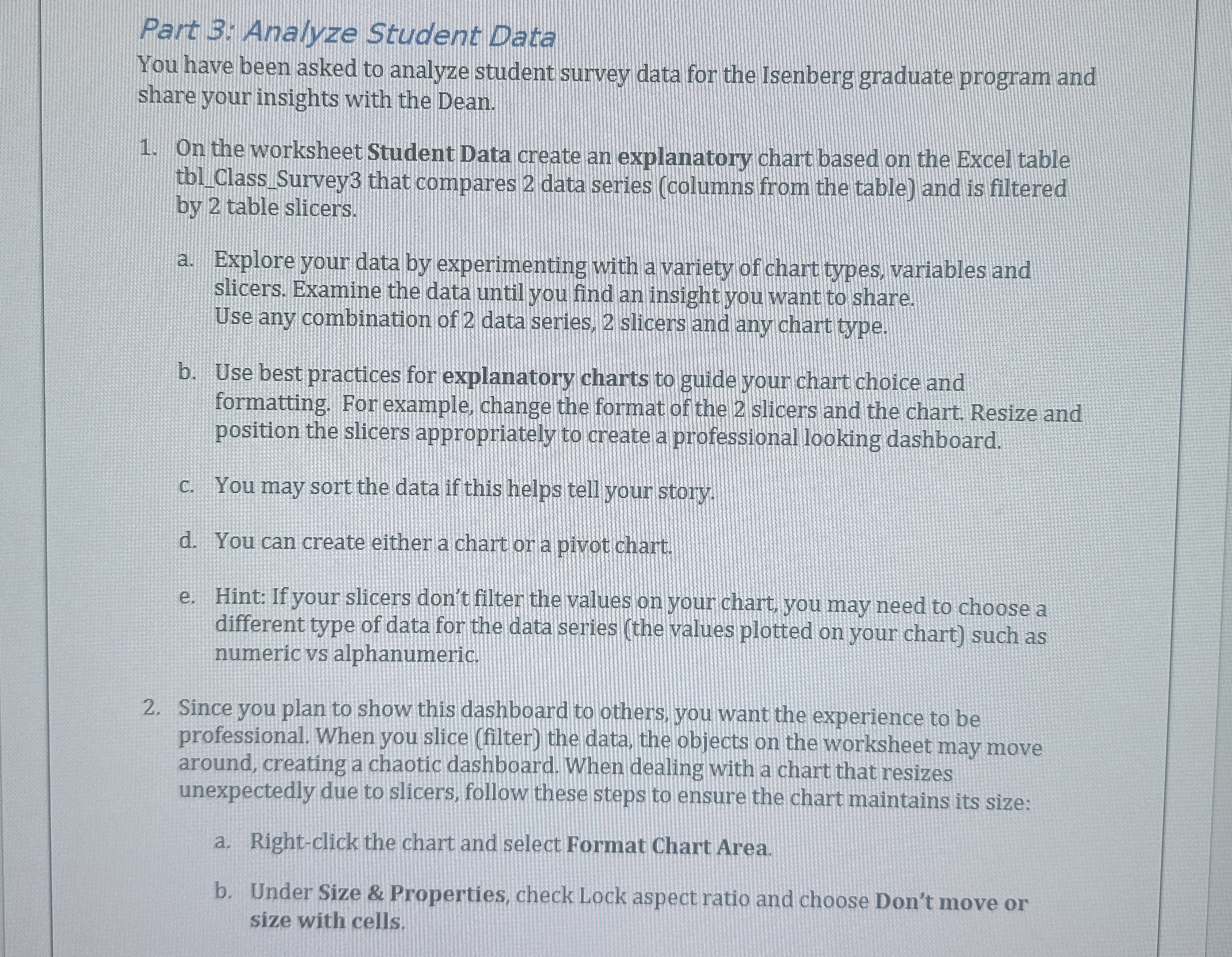
Question: Part 3 : Analyze Student Data You have been asked to analyze student survey data for the Isenberg graduate program and share your insights with
Part : Analyze Student Data
You have been asked to analyze student survey data for the Isenberg graduate program and
share your insights with the Dean.
On the worksheet Student Data create an explanatory chart based on the Excel table
tblClassSurvey that compares data series columns from the table and is filtered
by table slicers.
a Explore your data by experimenting with a variety of chart types, variables and
slicers. Examine the data until you find an insight you want to share.
Use any combination of data series, slicers and any chart type.
b Use best practices for explanatory charts to guide your chart choice and
formatting. For example, change the format of the slicers and the chart. Resize and
position the slicers appropriately to create a professional looking dashboard.
c You may sort the data if this helps tell your story.
d You can create either a chart or a pivot chart.
e Hint: If your slicers don't filter the values on your chart, you may need to choose a
different type of data for the data series the values plotted on your chart such as
numeric vs alphanumeric.
Since you plan to show this dashboard to others, you want the experience to be
professional. When you slice filter the data, the objects on the worksheet may move
around, creating a chaotic dashboard. When dealing with a chart that resizes
unexpectedly due to slicers, follow these steps to ensure the chart maintains its size:
a Rightclick the chart and select Format Chart Area.
b Under Size & Properties, check Lock aspect ratio and choose Don't move or
size with cells.

Step by Step Solution
There are 3 Steps involved in it
1 Expert Approved Answer
Step: 1 Unlock


Question Has Been Solved by an Expert!
Get step-by-step solutions from verified subject matter experts
Step: 2 Unlock
Step: 3 Unlock


