Question: Part 3: Data Visualization 3.1 Time-Series Visualization Plot the yearly trend of average Site Energy Use Intensity (EUT). Highlight any significant increases or decreases in
Part 3: Data Visualization 3.1 Time-Series
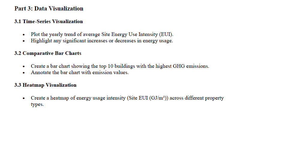
Part 3: Data Visualization 3.1 Time-Series Visualization Plot the yearly trend of average Site Energy Use Intensity (EUT). Highlight any significant increases or decreases in energy usage. 3.2 Comparative Bar Charts Create a bar chart showing the top 10 buildings with the highest GHG emissions. + Annotate the bar chart with emission values. 3.3 Heatmap Visualization s Create a heatmap of energy usage intensity (Site EUI (GJ/m?*)) across different property types

Step by Step Solution

There are 3 Steps involved in it

1 Expert Approved Answer
Step: 1 Unlock blur-text-image
Question Has Been Solved by an Expert!

Get step-by-step solutions from verified subject matter experts

Step: 2 Unlock
Step: 3 Unlock

Students Have Also Explored These Related Mathematics Questions!