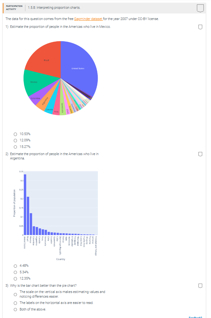
Question: PARTICIPATION ACTIVITY 1.5.8: Interpreting proportion charts. The data for this question comes from the free Gapminder dataset for the year 2007 under CC-BY license. 1)

PARTICIPATION ACTIVITY 1.5.8: Interpreting
PARTICIPATION ACTIVITY 1.5.8: Interpreting proportion charts. The data for this question comes from the free Gapminder dataset for the year 2007 under CC-BY license. 1) Estimate the proportion of people in the Americas who live in Mexico. 0 Brazil United States Colomb Argentias rada O 10.53% O 12.09% O 15.27% 2) Estimate the proportion of people in the Americas who live in O Argentina. 0.35 03 0.25 02 Proportion of population 1.15 ARCH Bolivia Chile Peru BLEUed | Brazil Jamaica SPinpugH Ecuador JOPONES 13 Argentina upeve Colombia Puerto Rico United States Trinidad and Tobago Country O 4.48% O 5.34% O 12.35%% 3) Why is the bar chart better than the pie chart? The scale on the vertical axis makes estimating values and noticing differences easier. O The labels on the horizontal axis are easier to read. O Both of the above

Step by Step Solution

There are 3 Steps involved in it

1 Expert Approved Answer
Step: 1 Unlock blur-text-image
Question Has Been Solved by an Expert!

Get step-by-step solutions from verified subject matter experts

Step: 2 Unlock
Step: 3 Unlock

Students Have Also Explored These Related Mathematics Questions!