

Question: Please answer only question 2. also would really appreciate little bit of explanation. question 1: Consider the RAH Waiting Times Table, and in particular, the
Please answer only question 2. also would really appreciate little bit of explanation.
question 1:
Consider the RAH Waiting Times Table, and in particular, the Waiting for a Bed category.
(a) Using Excel, build an appropriate histogram with this data. Include graph title and labels on the axis. Make sure the labels on your graph match those in the Table.
(b) Using Excel, graph the cumulative distribution function for the data. Again, make sure that the chart is correctly labelled and titled.
If you cannot create an Excel chart that reflects all aspects of the histogram or cumulative distribution function correctly, either because of the constraints of Excel or because of the way the data is given, then add an explanation of what details of your chart need to be corrected or improved and why.
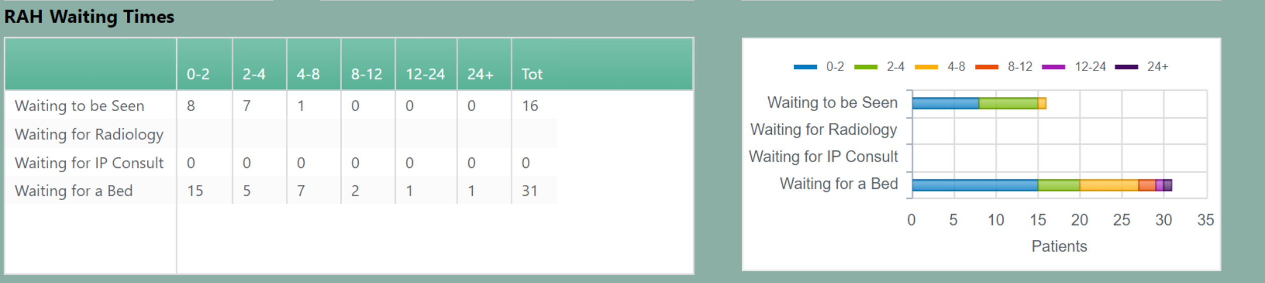
question 2:
The dashboard has next to the RAH Waiting Times Table a chart that contains a visualization of the RAH Waiting Times Table. That dashboard chart has one bar that depicts the Waiting for a Bed category.
The histogram you made in question 2 visualizes the same data as the part of the dash- board chart that shows that Waiting for a Bed category. Compare the use of a histogram with that of this particular form of a bar chart for this data by discussing their relative advantages and disadvantages.
RAH Waiting Times
Step by Step Solution
There are 3 Steps involved in it

Get step-by-step solutions from verified subject matter experts