

Question: please draw graph and explain A Aa Po EEVEEENT AaBbCcDd AaBbCcDd AaBbC( AaBbCc[ AaBbCcD, Aa B 1 Normal 1 No Spac... Heading 1 Heading 2
please draw graph and explain
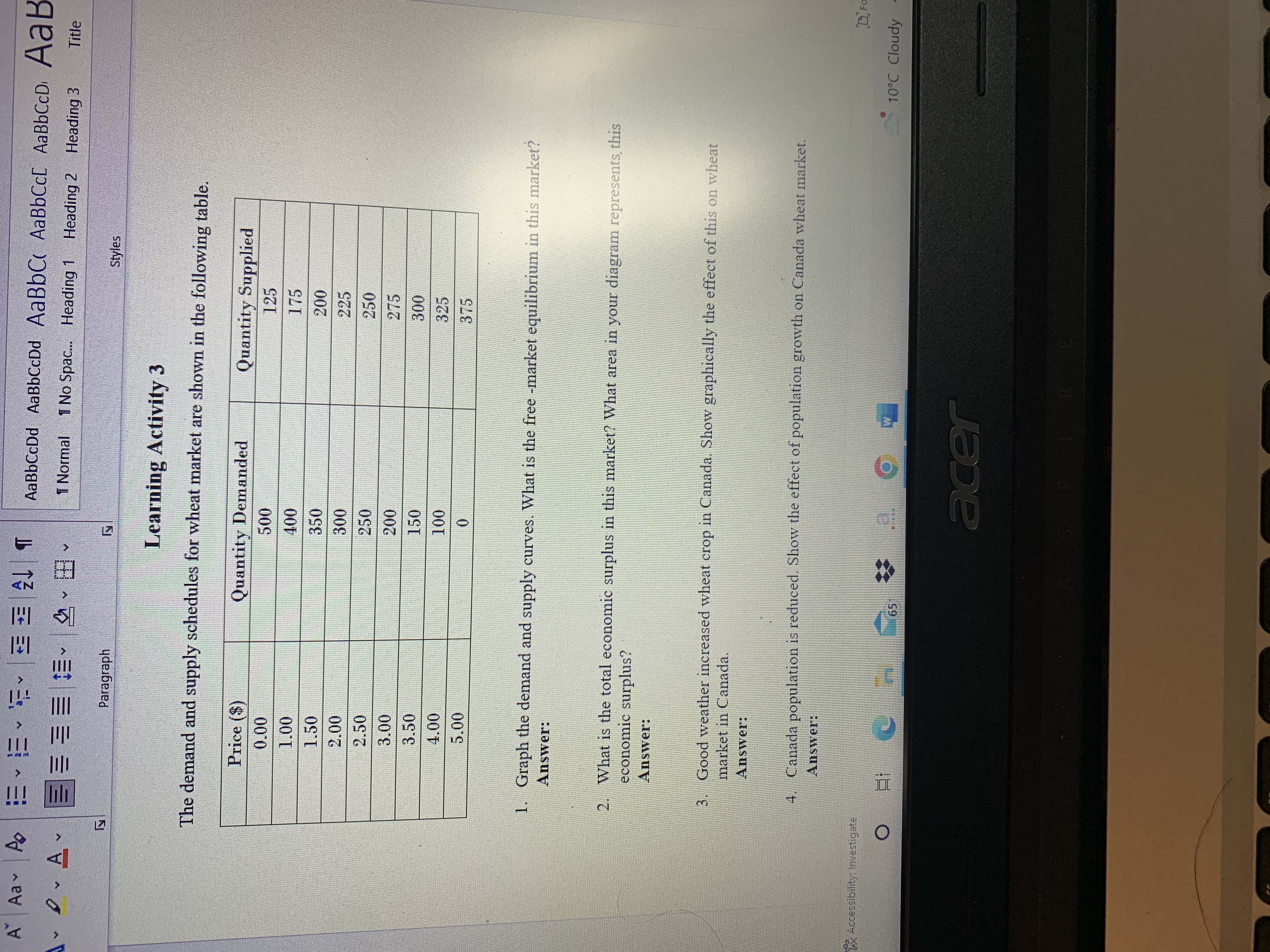
A Aa Po EEVEEENT AaBbCcDd AaBbCcDd AaBbC( AaBbCc[ AaBbCcD, Aa B 1 Normal 1 No Spac... Heading 1 Heading 2 Heading 3 Title Paragraph Styles Learning Activity 3 The demand and supply schedules for wheat market are shown in the following table. Price ($) Quantity Demanded Quantity Supplied 0.00 500 125 1.00 400 175 1.50 350 200 2.00 300 225 2.50 250 250 3.00 200 275 3.50 150 300 1.00 100 325 5.00 0 375 1. Graph the demand and supply curves. What is the free -market equilibrium in this market? Answer: 2. What is the total economic surplus in this market? What area in your diagram represents, this economic surplus? Answer: 3. Good weather increased wheat crop in Canada. Show graphically the effect of this on wheat market in Canada. Answer: 4. Canada population is reduced. Show the effect of population growth on Canada wheat market. Answer: Accessibility: Investigate O 1 65 W 10'C Cloudy acer
Step by Step Solution
There are 3 Steps involved in it

Get step-by-step solutions from verified subject matter experts