

Question: Please edit the code to show this data # create new figure fig, ax1 = plt.subplots(figsize=(9.5, 7.2), # width, height in inches dpi=110) # resolution
Please edit the code to show this data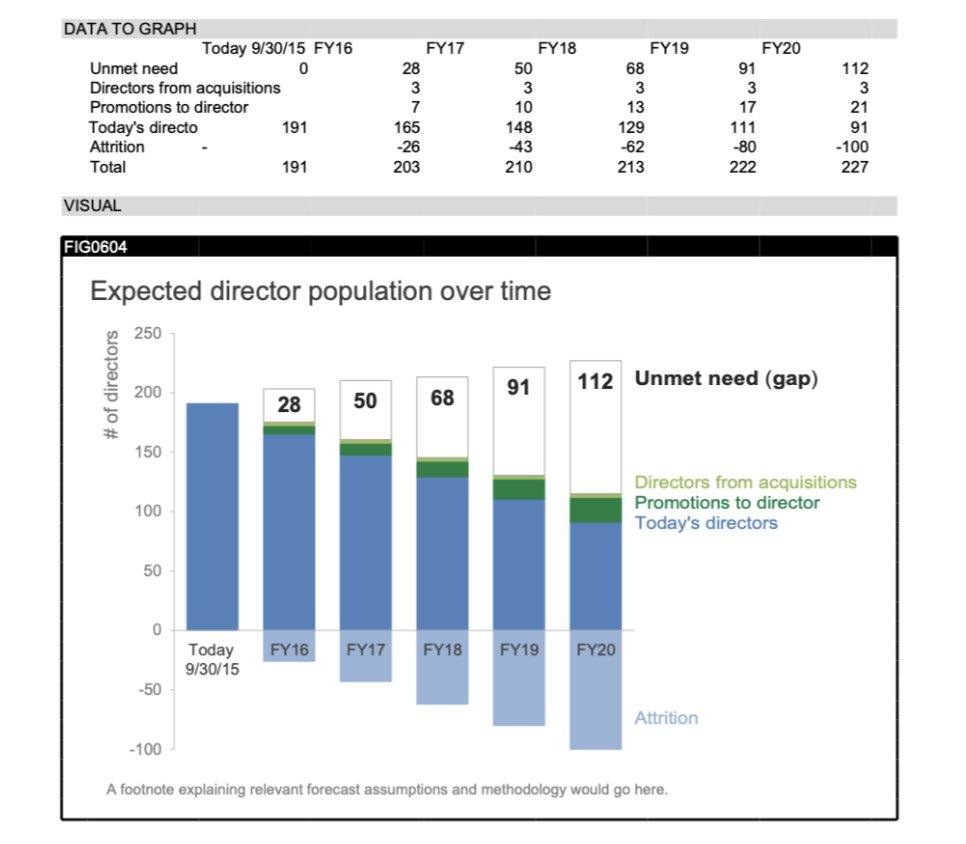
# create new figure fig, ax1 = plt.subplots(figsize=(9.5, 7.2), # width, height in inches dpi=110) # resolution of the figure
# tune the subplot layout by setting sides of the figure fig.subplots_adjust(left=0.103, right=0.7, top=0.881, bottom=0.096)
# set the data limits for the y,x-axis ax1.set_ylim([-100, 250]) ax1.set_xlim([-0.5, 5.4]) # move x axes to zero ax1.spines['bottom'].set_position('zero')
plt.bar(list(range(0, 6)), YA, width=0.68, color=BLUE4, edgecolor=BLUE4, linewidth=0.9) plt.bar(list(range(0, 6)), YT, width=0.68, color=BLUE2, edgecolor=BLUE2, linewidth=0.9) plt.bar(list(range(0, 6)), YP, width=0.68, bottom=YT, color=GREEN1, edgecolor=GREEN1, linewidth=0.9) plt.bar(list(range(0, 6)), YQ, width=0.68, bottom=YT + YP, color=GREEN2, edgecolor=GREEN2, linewidth=0.9) white_bars = plt.bar(list(range(0, 6)), YU, width=0.68, bottom=YT + YP + YQ, color='white', edgecolor=GRAY7, linewidth=0.9)
# add numerical data labels for bars for i, b in enumerate(white_bars): if YU[i] == 0: continue x = b.get_x() + b.get_width() / 2 # x-center of bar y = b.get_y() + b.get_height() - 20 # y-top of bar ax1.text(x, y, str(YU[i]), fontsize=20, fontweight='bold', horizontalalignment='center', color=GRAY2)
# add text for numerical data labels ax1.text(5.5, y, 'Unmet need (gap)', fontsize=20, fontweight='bold', color=GRAY2)
# add text labeling other bars ax1.text(5.5, 110, 'Directors from acquisitions', fontsize=16, color=GREEN2) ax1.text(5.5, 95, 'Promotions to director', fontsize=16, color=GREEN1) ax1.text(5.5, 80, 'Today''s directors', fontsize=16, color=BLUE2) ax1.text(5.5, -100, 'Attrition', fontsize=16, color=BLUE4)
# set properties for axes object (ticks for all issues with labels) plt.setp(ax1, xticks=list(range(0, 6)), xticklabels=X)
# remove chart border ax1.spines['top'].set_visible(False) ax1.spines['right'].set_visible(False) ax1.spines['bottom'].set_color(GRAY9) ax1.spines['left'].set_color(GRAY9) ax1.spines['left'].set_linewidth(1.5) ax1.spines['bottom'].set_linewidth(1.5)
# change y ticks color ax1.tick_params(axis='y', colors=GRAY9) # hide x ticks ax1.tick_params(bottom='off')
# configure x tick label appearance for item in ax1.get_xticklabels(): item.set_fontsize(16) item.set_color(GRAY4) # use trasformations to shift x tick labels slightly down offset = transforms.ScaledTranslation(0, -0.07, fig.dpi_scale_trans) item.set_transform(item.get_transform() + offset)
# configure y tick label appearance for item in ax1.get_yticklabels(): item.set_fontsize(16) item.set_color(GRAY7) # use trasformations to shift y tick labels slightly left offset = transforms.ScaledTranslation(-0.07, 0, fig.dpi_scale_trans) item.set_transform(item.get_transform() + offset)
# title the axis ax1.text(-1.4, 246, '# of directors', fontsize=17.5, rotation='vertical', color=GRAY7)
# add footnote with the data source plt.text(-1.45, -137, 'A footnote explaining relevant forecast assumptions' ' and methodology would go here.', fontsize=14.5, color=GRAY7)
# title the plot plt.text(-1.45, 280, 'Expected director population over time', fontsize=26, color=GRAY4)
Expected director population over time A footnote explaining relevant forecast assumptions and methodology would go here. Expected director population over time A footnote explaining relevant forecast assumptions and methodology would go here
Step by Step Solution
There are 3 Steps involved in it

Get step-by-step solutions from verified subject matter experts