

Question: Please help with this code. I've attached and example of how to start the problem to have an idea. a) For this problem, we will
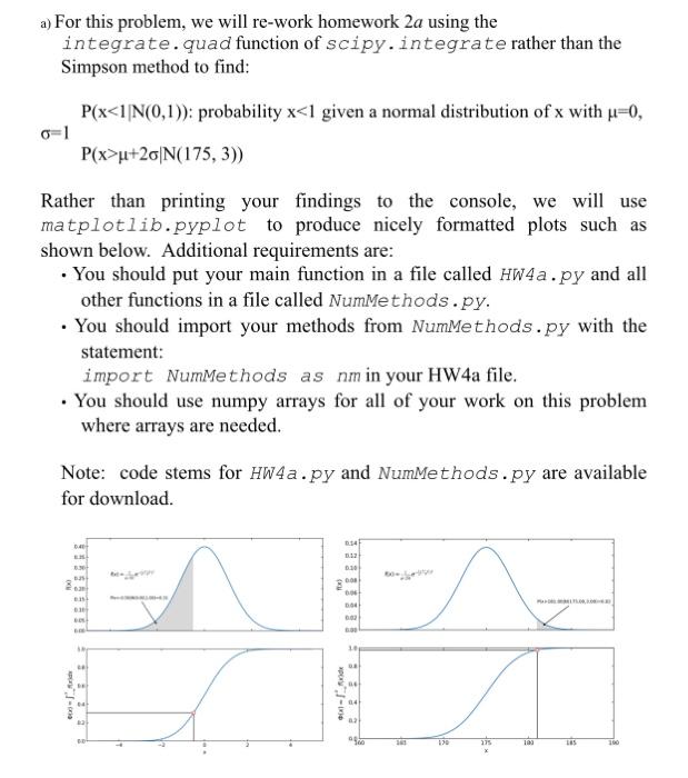
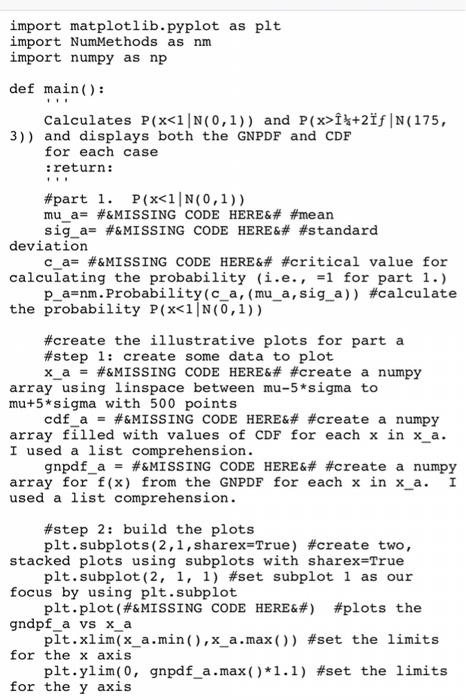
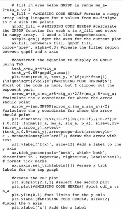
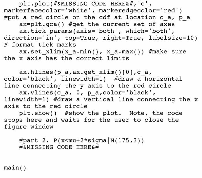
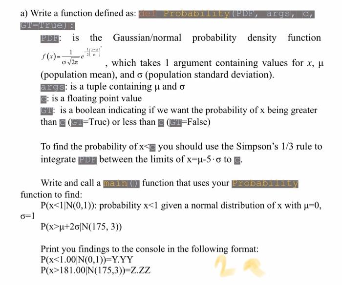
a) For this problem, we will re-work homework 2a using the integrate.quad function of scipy.integrate rather than the Simpson method to find: P(xu+26|N(175, 3)) Rather than printing your findings to the console, we will use matplotlib.pyplot to produce nicely formatted plots such as shown below. Additional requirements are: . You should put your main function in a file called HW4a.py and all other functions in a file called NumMethods.py. . You should import your methods from NumMethods.py with the statement: import NumMethods as nm in your HW4a file. . You should use numpy arrays for all of your work on this problem where arrays are needed. Note: code stems for HW4a.py and Nummethods.py are available for download. 0.4 1 120 100 LES import matplotlib.pyplot as plt import NumMethods as nm import numpy as np def main(): Calculates P(x}+2f |N(175, 3)) and displays both the GNPDF and CDF for each case :return: #part 1. P(x, connectionstyle="arc3")) #draw the arrow with text plt.ylabel('f(x), size=12) #add a label to the y axis ax.tick_params (axis='both', which='both', direction='in', top=True, right=True, labelsize=10) # format tick marks ax.xaxis.set_ticklabels(1) #erase x tick labels for the top graph #create the CDF plot plt.subplot(2,1,2) #select the second plot plt.plot (#&MISSING CODE HERE) #plot cdf_a vs X_a plt.ylim(0,1) #set limits for the y axis plt.ylabel(#&MISSING CODE HERE, size=12) #label the y axis plt.xlabel('x') #add the x label plt.plot (#&MISSING CODE HERE, 'o', markerfacecolor='white', markeredgecolor='red') #put a red circle on the cdf at location c_a, p_a ax=plt.gca() #get the current set of axes ax.tick_params (axis='both', which='both', direction='in', top=True, right=True, labelsize=10) # format tick marks ax.set_xlim(x_a.min(), x_a.max()) #make sure the x axis has the correct limits ax.hlines (p_a, ax.get_xlim()[0],c_a, color='black', linewidth=1) #draw a horizontal line connecting the y axis to the red circle ax.vlines (c_a, 0, p_a, color='black', linewidth=1) #draw a vertical line connecting the x axis to the red circle plt.show() #show the plot. Note, the code stops here and waits for the user to close the figure window #part 2. P(x
Step by Step Solution
There are 3 Steps involved in it

Get step-by-step solutions from verified subject matter experts