

Question: please I need help with this question What is the most effective way to categorize charts by data presentation purpose? The most commonly referenced diagram
please I need help with this question
What is the most effective way to categorize charts by data presentation purpose?
The most commonly referenced diagram uses four categories, and some others used more than four (for example learning materials 1b and 1c). What do you think of their categorizations?
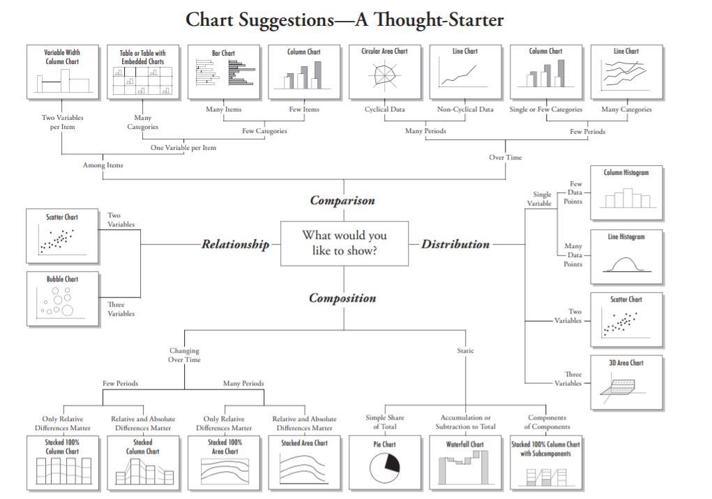
Chart SuggestionsA Thought-Starter Bar Chart Column Chart Circular Area Chart Line Chart Column Chart Line Chart Variable Width Column Chart Table or Table with Embedded Charts all Many Items Few Items Cyclical Dara Non-Cyclical Data Single or Few Categories Many Categories Two Variables per Item Many Categories Few Categories Many Periods Few Periods One Variable per Item Over Time Among Items Column Histogram Few - Data Points Single Variable Comparison Scatter Chart Two Variables Line Histogram Relationship What would you like to show? Distribution Many -Data Points Bubble Chart 000 0000 Composition Scatter Chart "Three Variables Two Variables - Static Changing Over Time 3D Area Chart Three Variables Few Periods Many Periods Simple Share of Total Only Relative Differences Matter Stacked 100% Column Chart Relative and Absolute Differences Matter Stacked Column Chart Only Relative Differences Matter Stacked 100% Area Chart Relative and Absolute Differences Matter Stacked Area Chart Accumulation of Subtraction to Total Waterfall Chart Components of Components Stacked 100% Column Chart with Subcomponents Pie Chart
Step by Step Solution
There are 3 Steps involved in it
1 Expert Approved Answer
Step: 1 Unlock

Question Has Been Solved by an Expert!
Get step-by-step solutions from verified subject matter experts
Step: 2 Unlock
Step: 3 Unlock