

Question: Please provide detailed answer for this project report. Method Month 2002 January February March April When the difference of two figures is to be shown
Please provide detailed answer for this project report.
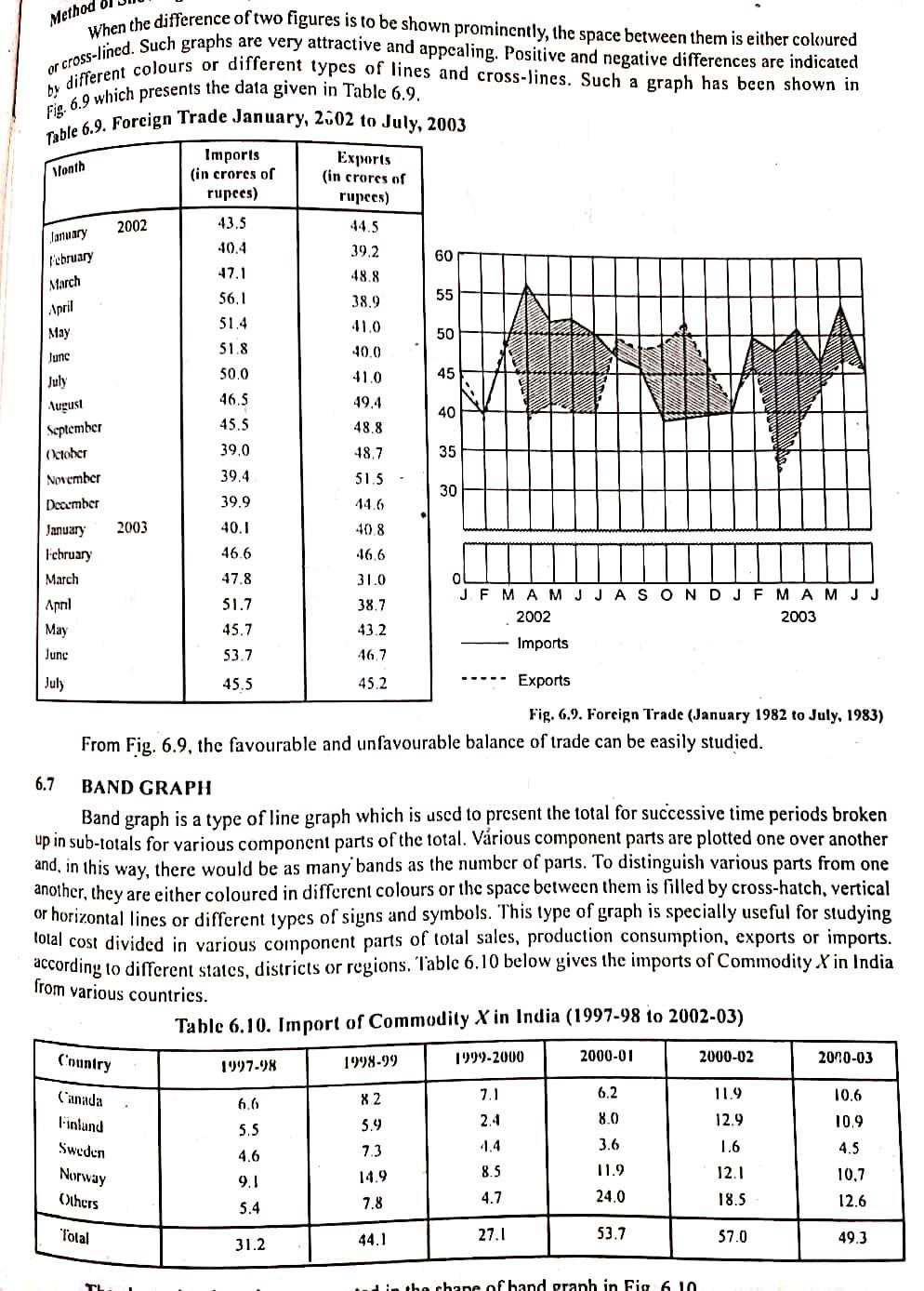
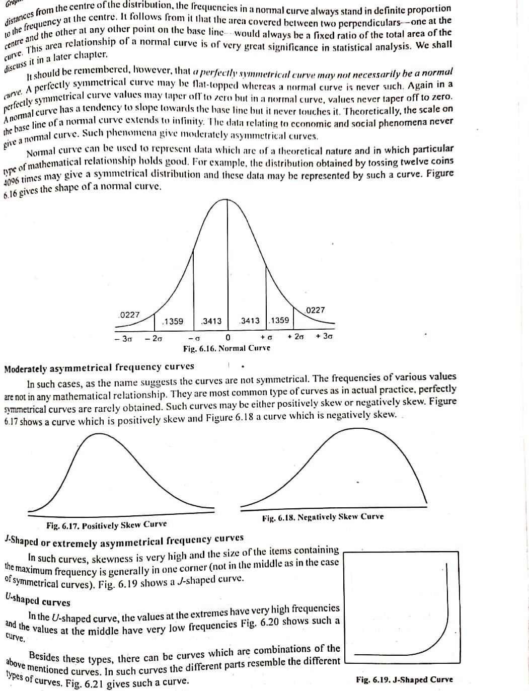
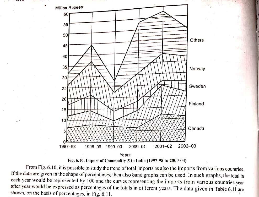
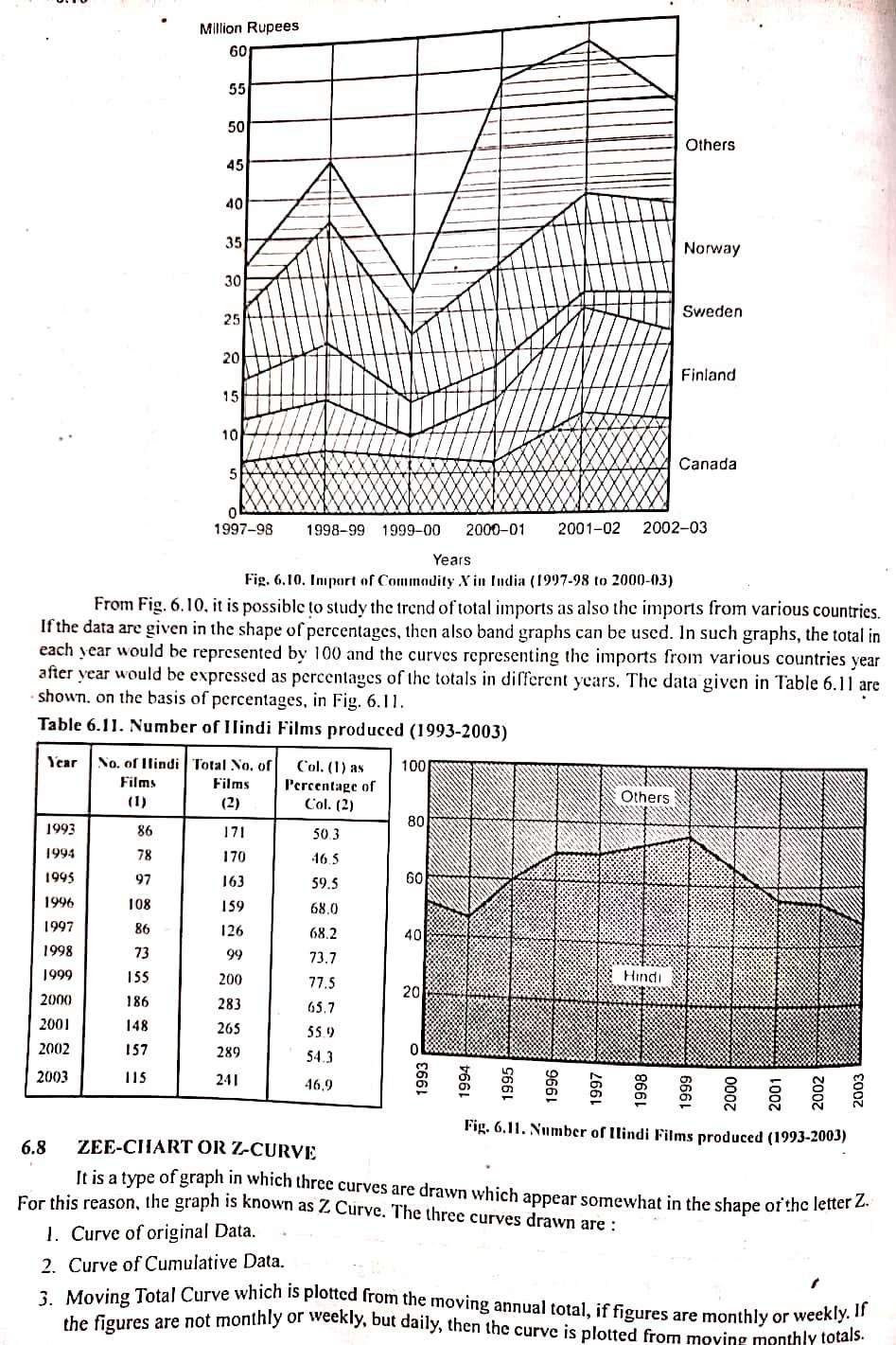
Method Month 2002 January February March April When the difference of two figures is to be shown prominently, the space between them is either coloured by different colours or different types of lines and cross-lines. Such a graph has been shown in or cross-lined. Such graphs are very attractive and appealing. Positive and negative differences are indicated Fig. 6.9 which presents the data given in Table 6.9. Table 6.9. Foreign Trade January, 2002 to July, 2003 Imports Exports (in crores or (in crores or rupees) rupees) ) 43.5 44.5 10.4 39.2 60 47.1 48.8 56.1 55 38.9 51.4 May 41.0 50 51.8 Junc 40.0 50.0 July 41.0 45 August 46.5 49.4 40 September 45.5 48.8 October 39.0 18.7 35 November 39.4 51.5 30 Dearmber 39.9 44.6 January 2003 40.1 40.8 l'ebruary 46.6 46,6 March 47.8 31.0 April 51.7 J F M A M J J A S O N DJ F M A M J J 38.7 2002 2003 May 45.7 43.2 Imports June 53.7 46.7 July 45.5 45.2 Exports Fig. 6.9. Foreign Trade (January 1982 to July, 1983) From Fig. 6.9, the favourable and unfavourable balance of trade can be easily studied. 6.7 BAND GRAPH Band graph is a type of line graph which is used to present the total for successive time periods broken up in sub-totals for various component parts of the total. Vrious component parts are plotted one over another and, in this way, there would be as many bands as the number of parts. To distinguish various parts from one another, they are either coloured in different colours or the space between them is filled by cross-hatch, vertical or horizontal lines or different types of signs and symbols. This type of graph is specially useful for studying lotal cost divided in various component parts of total sales, production consumption, exports or imports. according to different states, districts or regions. Tablc 6.10 below gives the imports of Commodity X in India from various countries. Table 6.10. Import of Commodity X in India (1997-98 to 2002-03) Country 1999-2000 1998-99 2000-01 2000-02 1997-98 2010-03 X2 7.1 6.2 11.9 6.6 10.6 10.9 2.4 8.0 5.5 Canada Finland Sweden Norway Others 3.6 5.9 7.3 14.9 7.8 12.9 1.6 12.1 4.6 8.5 9.1 11.9 24.0 4.5 10,7 12.6 4.7 18.5 5.4 Total 44.1 27.1 53.7 57.0 31.2 49.3 in the chape of hand granh in Fig6 10 w distances from the centre of the distribution, the frequencies in a normal curve always stand in definite proportion to the frequency at the centre. It follows from it that the area covered between two perpendiculars--one at the centre and the other al any other point on the base linc would always be a fixed ratio of the total area of the curve. This area relationship of a normal curve is of very great significance in statistical analysis. We shall discuss it in a later chapter. it should be remembered, however, that a perfectly summerrical curve may not necessarily be a normal cune. A perfectly symmetrical curve may be Mal-topped whicrcas a normal curve is never such. Again in a perfectly symmetrical curve values may taper oil to zero but in a normal curve, values never taper off to zero. A normal curve has a tendency to slope towards the base line but it never touches it. Thcorctically, the scale on the base line of a normal curve extends to infinity. The data relating to economic and social phenomena never give a normal curve. Such phenomena give moderately asymmetrical curves. Normal curve can be used to represent data which are of a theoretical nature and in which particular uipe of mathematical relationship holds good. For example, the distribution obtained by tossing twelve coins 6.16 gives the shape of a normal curve. 0227 0227 .1359 .3413 3413 1359 -20 + 30 - 30 0 +0 + 20 Fig. 6.16. Normal Curve Moderately asymmetrical frequency curves In such cases, as the name suggests the curves are not symmetrical. The frequencies of various values are not in any mathematical relationship. They are most common type of curves as in actual practice, perfectly symmetrical curves are rarely obtained. Such curves may be either positively skew or negatively skew. Figure 6.17 shows a curve which is positively skew and Figure 6.18 a curve which is negatively skew.. n Fig. 6.17. Positively Skew Curve Fig. 6.18. Negatively Skew Curve J-Shaped or extremely asymmetrical frequency curves In such curves, skewness is very high and the size of the items containing the maximum frequency is generally in one corner (not i the middle as in the case of symmetrical curves). Fig. 6.19 shows a J-shaped curve. U-shaped curves In the U-shaped curve, the values at the extremes have very high frequencies curve. and the values at the middle have very low frequencies Fig. 6.20 shows such a above mentioned curves. In such curves the different parts resemble the different Besides these types, there can be curves which are combinations of the types of curves. Fig. 6.21 gives such a curve. Fig. 6.19. J-Shaped Curve Million Rupees 60 55 50 Others 45 40 35 Norway 30 25 Sweden 20 Finland 15 10 Canada 5 1997-98 1998-99 1999-00 2000-01 2001-02 2002-03 Years Fig. 6.10. Import of Commodity X in India (1997-98 to 2000-03) From Fig. 6.10, it is possible to study the trend of total imports as also the imports from various countries. If the data are given in the shape of percentages, then also band graphs can be used. In such graphs, the total in each year would be represented by 100 and the curves representing the imports from various countries year after year would be expressed as percentages of the totals in different years. The data given in Table 6.11 are shown. on the basis of percentages, in Fig. 6.11. Million Rupees 60 55 50 Others 45 40 35 Norway 30 25 Sweden 20 Finland 15 10 Canada 5 1997-98 1998-99 1999-00 2000-01 2001-02 2002-03 Years Fig. 6.10. Import of Commodity X in India (1997-98 to 2000-03) From Fig. 6.10, it is possible to study the trend of total imports as also the imports from various countries. If the data are given in the shape of percentages, then also band graphs can be used. In such graphs, the total in each year would be represented by 100 and the curves representing the imports from various countries year after year would be expressed as percentages of the totals in different years. The data given in Table 6.11 are shown. on the basis of percentages, in Fig. 6.11. Table 6.11. Number of Ilindi Films produced (1993-2003) Year No. of llindi Total No. of Col.(1) as 100 Films Percentage of Others (1) (2) Col. (2) 80 1993 86 171 503 1994 78 170 16.5 1995 97 163 59.5 60 108 159 68,0 1997 126 68.2 1998 73 99 73.7 1999 155 200 77.5 20 2000 186 283 65.7 2001 148 265 55.9 2002 157 289 0 54.3 2003 115 241 46.9 1996 86 40 Hindi Fig. 6.11. Number of llindi Films produced (1993-2003) 6.8 ZEE-CIIARTOR Z-CURVE It is a type of graph in which three curves are drawn which appear somewhat in the shape of the letter Z. For this reason, the graph is known as Z Curve. The three curves drawn are : 1. Curve of original Data. 2. Curve of Cumulative Data. 3. Moving Total Curve which is plotted from the moving annual total, if figures are monthly or weekly. Ir the figures are not monthly or weekly, but daily, then the curve is plotted from moying monthly totalsStep by Step Solution
There are 3 Steps involved in it
1 Expert Approved Answer
Step: 1 Unlock

Question Has Been Solved by an Expert!
Get step-by-step solutions from verified subject matter experts
Step: 2 Unlock
Step: 3 Unlock