Question: please show all steps. thank you 3 8 8 eart your free one month trial of Microsoft 365 or sign in to activate an existing
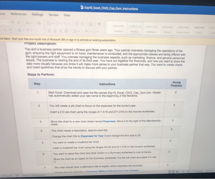
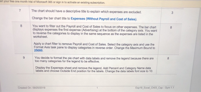
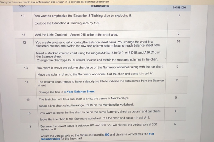
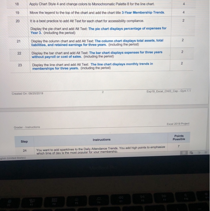
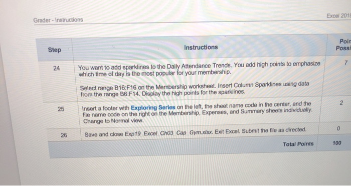
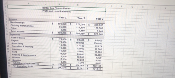
3 8 8 eart your free one month trial of Microsoft 365 or sign in to activate an existing subscription 7 The chart should have a descriptive title to explain which expenses are excluded. Change the bar chart title to Expenses (Without Payroll and Cost of Sales). You want to filter out the Payroll and Cost of Sales to focus on other expenses. The bar chart displays expenses the first expense (Advertising) at the bottom of the category axis. You want to reverse the categories to display in the same sequence as the expenses are listed in the worksheet Apply a chart filter to remove Payroll and Cost of Sales. Select the category axis and use the Format Axis task pane to display categories in reverse order. Change the Maximum Bound to 25000 You decide to format the pie chart with data labels and remove the legend because there are too many categories for the legend to be effective. Display the Expenses sheet and remove the legend. Add Percent and Category Name data labels and choose Outside End position for the labels. Change the data labels font size to 10 9 8 Created On: 09/20/2019 Exp19_Excel_Cho3_Cap - Gym 1.1 Start your free one month trial of Microsoft 365 or sign in to activate an existing subscription Step instructions Possible 10 2 You want to emphasize the Education & Training slice by exploding it. Explode the Education & Training slice by 12%. 11 2 12 10 Add the Light Gradient - Accent 2 fill color to the chart area. You create another chart showing the Balance sheet items. You change the chart to a clustered column and switch the row and column data to focus on each balance sheet item. Insert a stacked column chart using the ranges 14:04, A10:010, A15:015, and A16:016 on the Balance sheet Change the chart type to Clustered Column and switch the rows and columns in the chart. You want to move the column chart to be on the Summary worksheet along with the bar chart. Move the column chart to the Summary worksheet. Cut the chart and paste it in cell A1. The column chart needs to have a descriptive title to indicate the data comes from the Balance 5 13 2 14 sheet. 5 15 4 16 Change the title to 3-Year Balance Sheet. The last chart will be a line chart to show the trends in Memberships. Insert a line chart using the range 13:L15 on the Membership worksheet. You want to move the line chart to be on the same Summary sheet as column and bar charts. Move the line chart to the Summary worksheet. Cut the chart and paste it in cell A17. Because the lowest value is between 200 and 300, you will change the vertical axis at 200 instead of O. Adjust the vertical axis so the Minimum Bound is 200 and display a vertical axis title # of Memberships for the line chart. 5 17 18 4 19 4 20 2 Apply Chart Style 4 and change colors to Monochromatic Palette 8 for the line chart. Move the legend to the top of the chart and add the chart title 3-Year Membership Trends. It is a best practice to add Alt Text for each chart for accessibility compliance. Display the pie chart and add Alt Text: The pie chart displays percentage of expenses for Year 3. (including the period) Display the column chart and add Alt Text: The column chart displays total assets, total liabilities, and retained earnings for three years. (including the period) Display the bar chart and add Alt Text: The bar chart displays expenses for three years without payroll or cost of sales. (including the period) Display the line chart and add Alt Text: The line chart displays monthly trends in memberships for three years. (including the period) 21 2. 2 22 N 23 2 Exp19 Excel_Cho3_Cap - Gym 1.1 Created On: 09/20/2019 Excel 2019 Project Grador - Instructions Points Possible Instructions Step 7 24 You want to add sparklines to the Daily Attendance Trends. You add high points to emphasize which time of day is the most popular for your membership glish (United States) Excel 2018 Grader - Instructions Poin Possi Step Instructions 7 24 You want to add sparklines to the Daily Attendance Trends. You add high points to emphasize which time of day is the most popular for your membership. Select range B16:F16 on the Membership worksheet. Insert Column Sparklines using data from the range B6:F14. Display the high points for the sparklines. Insert a footer with Exploring Series on the left, the sheet name code in the center, and the file name code on the right on the Membership, Expenses, and Summary sheets individually. Change to Normal view Save and close Exp19 Excel Cho3 Cap Gym.xlsx. Exit Excel. Submit the file as directed. 2 25 0 26 Total Points 100 F G H 2 3 Better You Fitness Center Profit and Loss Statement 4 Year 1 Year 2 Year 3 $ $ $ 100,000 85,000 4,250 189,250 275,000 111,300 5,350 391,650 395,000 126,000 6,140 527,140 $ $ $ $ $ $ 5 Income 6 Memberships 7 Clothing Merchandise B Other 9 Total Income 10 Expenses 11 Cost of Sales 12 Payroll 13 Advertising 14 Education & Training 15 Insurance 16 Rent 17 Repairs & Maintenance 18 Utilities 19 Supplies 20 Total Operating Expenses 21 Net Operating Profit 22 23 24 25 75.000 75,000 15,270 10,000 15,000 25,000 5,000 12,000 3.000 235,270 (46,020) 92,500 180,000 17,163 12,000 15,000 25,000 10,000 13,200 3 200 368,063 23,587 65,000 250,000 15,879 10,000 15,000 25,000 3,000 14,520 3,800 402.199 124,941 $ $ $ $ S $ 3 8 8 eart your free one month trial of Microsoft 365 or sign in to activate an existing subscription 7 The chart should have a descriptive title to explain which expenses are excluded. Change the bar chart title to Expenses (Without Payroll and Cost of Sales). You want to filter out the Payroll and Cost of Sales to focus on other expenses. The bar chart displays expenses the first expense (Advertising) at the bottom of the category axis. You want to reverse the categories to display in the same sequence as the expenses are listed in the worksheet Apply a chart filter to remove Payroll and Cost of Sales. Select the category axis and use the Format Axis task pane to display categories in reverse order. Change the Maximum Bound to 25000 You decide to format the pie chart with data labels and remove the legend because there are too many categories for the legend to be effective. Display the Expenses sheet and remove the legend. Add Percent and Category Name data labels and choose Outside End position for the labels. Change the data labels font size to 10 9 8 Created On: 09/20/2019 Exp19_Excel_Cho3_Cap - Gym 1.1 Start your free one month trial of Microsoft 365 or sign in to activate an existing subscription Step instructions Possible 10 2 You want to emphasize the Education & Training slice by exploding it. Explode the Education & Training slice by 12%. 11 2 12 10 Add the Light Gradient - Accent 2 fill color to the chart area. You create another chart showing the Balance sheet items. You change the chart to a clustered column and switch the row and column data to focus on each balance sheet item. Insert a stacked column chart using the ranges 14:04, A10:010, A15:015, and A16:016 on the Balance sheet Change the chart type to Clustered Column and switch the rows and columns in the chart. You want to move the column chart to be on the Summary worksheet along with the bar chart. Move the column chart to the Summary worksheet. Cut the chart and paste it in cell A1. The column chart needs to have a descriptive title to indicate the data comes from the Balance 5 13 2 14 sheet. 5 15 4 16 Change the title to 3-Year Balance Sheet. The last chart will be a line chart to show the trends in Memberships. Insert a line chart using the range 13:L15 on the Membership worksheet. You want to move the line chart to be on the same Summary sheet as column and bar charts. Move the line chart to the Summary worksheet. Cut the chart and paste it in cell A17. Because the lowest value is between 200 and 300, you will change the vertical axis at 200 instead of O. Adjust the vertical axis so the Minimum Bound is 200 and display a vertical axis title # of Memberships for the line chart. 5 17 18 4 19 4 20 2 Apply Chart Style 4 and change colors to Monochromatic Palette 8 for the line chart. Move the legend to the top of the chart and add the chart title 3-Year Membership Trends. It is a best practice to add Alt Text for each chart for accessibility compliance. Display the pie chart and add Alt Text: The pie chart displays percentage of expenses for Year 3. (including the period) Display the column chart and add Alt Text: The column chart displays total assets, total liabilities, and retained earnings for three years. (including the period) Display the bar chart and add Alt Text: The bar chart displays expenses for three years without payroll or cost of sales. (including the period) Display the line chart and add Alt Text: The line chart displays monthly trends in memberships for three years. (including the period) 21 2. 2 22 N 23 2 Exp19 Excel_Cho3_Cap - Gym 1.1 Created On: 09/20/2019 Excel 2019 Project Grador - Instructions Points Possible Instructions Step 7 24 You want to add sparklines to the Daily Attendance Trends. You add high points to emphasize which time of day is the most popular for your membership glish (United States) Excel 2018 Grader - Instructions Poin Possi Step Instructions 7 24 You want to add sparklines to the Daily Attendance Trends. You add high points to emphasize which time of day is the most popular for your membership. Select range B16:F16 on the Membership worksheet. Insert Column Sparklines using data from the range B6:F14. Display the high points for the sparklines. Insert a footer with Exploring Series on the left, the sheet name code in the center, and the file name code on the right on the Membership, Expenses, and Summary sheets individually. Change to Normal view Save and close Exp19 Excel Cho3 Cap Gym.xlsx. Exit Excel. Submit the file as directed. 2 25 0 26 Total Points 100 F G H 2 3 Better You Fitness Center Profit and Loss Statement 4 Year 1 Year 2 Year 3 $ $ $ 100,000 85,000 4,250 189,250 275,000 111,300 5,350 391,650 395,000 126,000 6,140 527,140 $ $ $ $ $ $ 5 Income 6 Memberships 7 Clothing Merchandise B Other 9 Total Income 10 Expenses 11 Cost of Sales 12 Payroll 13 Advertising 14 Education & Training 15 Insurance 16 Rent 17 Repairs & Maintenance 18 Utilities 19 Supplies 20 Total Operating Expenses 21 Net Operating Profit 22 23 24 25 75.000 75,000 15,270 10,000 15,000 25,000 5,000 12,000 3.000 235,270 (46,020) 92,500 180,000 17,163 12,000 15,000 25,000 10,000 13,200 3 200 368,063 23,587 65,000 250,000 15,879 10,000 15,000 25,000 3,000 14,520 3,800 402.199 124,941 $ $ $ $ S $
Step by Step Solution
There are 3 Steps involved in it

Get step-by-step solutions from verified subject matter experts


