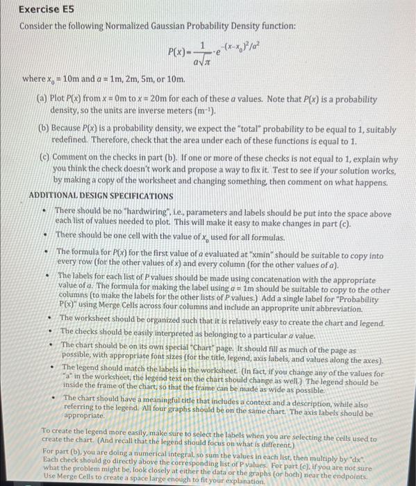
Question: please use excel, show formula sheet and values sheet Exercise E5 Consider the following Normalized Gaussian Probability Density function: P(x): av -e (x*8/02 where x.

Exercise E5 Consider the following Normalized Gaussian Probability Density function: P(x): av -e (x*8/02 where x. = 10m and a = 1m, 2m, 5m, or 10m. (a) Plot P(x) from x = Om to x = 20m for each of these a values. Note that P(x) is a probability density, so the units are inverse meters (m-'). (b) Because P(x) is a probability density, we expect the "total" probability to be equal to 1, suitably redefined. Therefore, check that the area under each of these functions is equal to 1. (C) Comment on the checks in part (b). If one or more of these checks is not equal to 1, explain why you think the check doesn't work and propose a way to fix it. Test to see if your solution works, by making a copy of the worksheet and changing something, then comment on what happens. ADDITIONAL DESIGN SPECIFICATIONS There should be no "hardwiring", Le, parameters and labels should be put into the space above each list of values needed to plot. This will make it easy to make changes in part (e). There should be one cell with the value of x, used for all formulas. The formula for P(x) for the first value of a evaluated at "min" should be suitable to copy into every row (for the other values of x) and every column (for the other values of a). The labels for each list of P values should be made using concatenation with the appropriate value of a. The formula for making the label using a = 1m should be suitable to copy to the other columns (to make the labels for the other lists of P values.) Add a single label for "Probability P(x)" using Merge Cells across four columns and include an approprite unit abbreviation. The worksheet should be organized such that it is relatively easy to create the chart and legend. The checks should be easily interpreted as belonging to a particular a value. The chart should be on its own special Chart" page. It should fill as much of the page as possible, with appropriate font sizes (for the title, legend, axis labels, and values along the axes). The legend should match the labels in the worksheet (In fact, if you change any of the values for "a" in the worksheet, the legend text on the chart should change as well.) The legend should be inside the frame of the chart, so that the frame can be made as wide as possible. The chart should have a meaningful title that includes a context and a description, while also referring to the legend. All four graphs should be on the same chart. The axis labels should be appropriate To create the legend more easily, make sure to select the labels when you are selecting the cells used to create the chart. (And recall that the legend should focus on what is different.) For part (b), you are doing a numerical integral, so sum the values in each list, then multiply by "dx Each check should go directly above the corresponding list of P values. For part (c), if you are not sure what the problem might be, look closely at either the data or the graphs (or both) near the endpoints. Use Merge Cells to create a space large enough to fit your explanation
Step by Step Solution
There are 3 Steps involved in it

Get step-by-step solutions from verified subject matter experts


