

Question: plot ROC in skit learn library with python 3.6 i'm trying to plot ROC with 5 fold cross validation for regression classifer but I don't
plot ROC in skit learn library with python 3.6
i'm trying to plot ROC with 5 fold cross validation for regression classifer but I don't know how to do it.
this cod draw ROC for split data
# read the data into a Pandas DataFrame import pandas as pd url = 'https://archive.ics.uci.edu/ml/machine-learning-databases/pima-indians-diabetes/pima-indians-diabetes.data' col_names = ['pregnant', 'glucose', 'bp', 'skin', 'insulin', 'bmi', 'pedigree', 'age', 'label'] pima = pd.read_csv(url, header=None, names=col_names)
# define X and y feature_cols = ['pregnant', 'insulin', 'bmi', 'age'] X = pima[feature_cols] y = pima.label
# split X and y into training and testing sets from sklearn.cross_validation import train_test_split X_train, X_test, y_train, y_test = train_test_split(X, y, random_state=0)
# train a logistic regression model on the training set from sklearn.linear_model import LogisticRegression logreg = LogisticRegression() logreg.fit(X_train, y_train)
y_pred_prob=logreg.predict_proba(X_test)[:,1]
# IMPORTANT: first argument is true values, second argument is predicted probabilities
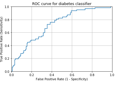
fpr, tpr, thresholds = metrics.roc_curve(y_test, y_pred_prob) plt.plot(fpr, tpr) plt.xlim([0.0, 1.0]) plt.ylim([0.0, 1.0]) plt.title('ROC curve for diabetes classifier') plt.xlabel('False Positive Rate (1 - Specificity)') plt.ylabel('True Positive Rate (Sensitivity)') plt.grid(True)
I tried this code to plot ROC for 5 fold cross valdation but that only plot ROC curve for only one point
predictedRG = model_selection.cross_val_predict(logreg, X, y , cv=5)
fpr, tpr, thresholds = metrics.roc_curve(y, predictedRG) plt.plot(fpr, tpr) plt.xlim([0.0, 1.0]) plt.ylim([0.0, 1.0]) plt.title('ROC curve for diabetes classifier') plt.xlabel('False Positive Rate (1 - Specificity)') plt.ylabel('True Positive Rate (Sensitivity)') plt.grid(True)
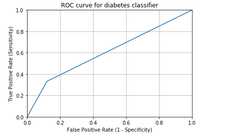
so my question how can I plot ROC for 5 fold cross valdiation with regression classifer in right way. This figure is not right beacuse it is only show one point.
10 0.8 0.6 0.4 E 0.2 0.0 0.0 ROC curve for diabetes classifier 0.4 0.2 0.6 0.8 False Positive Rate (1 Specificity) 10
Step by Step Solution
There are 3 Steps involved in it

Get step-by-step solutions from verified subject matter experts