Question: Plotting data of this size is tricky just because the sheer number of datapoints. For instance, you can try on your own to plot (

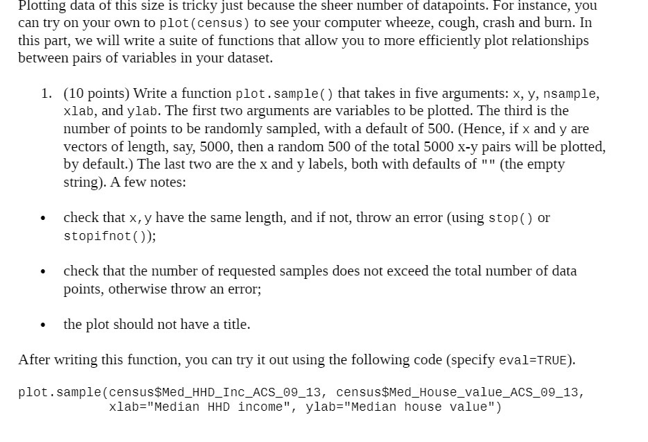
Plotting data of this size is tricky just because the sheer number of datapoints. For instance, you can try on your own to plot ( census) to see your computer wheeze, cough, crash and born. In this part, we will write a suite of functions that allow you to more efficiently plot relationships between pairs of variables in your dataset. 1. (10 points) Write a function plot . sample() that takes in five arguments: x, y, nsample, xlab, and ylab. The first two arguments are variables to be plotted. The third is the number of points to be randomly sampled, with a default of 500. (Hence, if x and y are vectors of length, say, 5000, then a random 500 of the total 5000 X-y pairs will be plotted, by default.) The last two are the x and y labels, both with defaults of " " (the empty string). A few notes: - check that x, y have the same length, and if not, throw an error (using stop() or stopifnot ( )); - check that the number of requested samples does not exceed the total number of data points, otherwise throw an error; - the plot should not have a title. After writing this function, you can try it out using the following code (specify eva1=TRU E). plot.sample(census$Hed_HHD_Inc_ACS_BQ_13, census$Med House value AC5 89 13, xlab="Median HHD income", ylab=\"Median house value")
Step by Step Solution
There are 3 Steps involved in it

Get step-by-step solutions from verified subject matter experts


