

Question: Plotting X , Y Graph in Excel Copy the example worksheet data into a blank worksheet. Select the data you want to plot in the
Plotting XY Graph in Excel
Copy the example worksheet data into a blank worksheet.
Select the data you want to plot in the scatter chart.
Click the Insert tab, and then click Insert Scatter X Y
Click Scatter.
Click the chart area of the chart to display the Design and Format tabs
Click the Design tab, and then click the chart style you want to use.
Click the chart title and type the text you want.
To change the font size of the chart title, rightclick the title, click Font, and then enter the size that you want in the Size box. Click OK
Click the chart area of the chart.
On the Design tab, click Add Chart Element Axis Titles, and then do the following:
To add a horizontal axis title, click Primary Horizontal.
To add a vertical axis title, click Primary Vertical.
Click each title, type the text that you want, and then press Enter.
For more title formatting options, on the Format tab, in the Chart Elements box, select the title from the list, and then click Format Selection. A Format Title pane
will appear. Click Size & Properties, and then you can choose Vertical alignment, Text direction, or Custom angle.
Plotting The Derivative Graph in Excel
Create a new worksheet in excel.
Copy and paste the Data in the new worksheet as columns A and
Label Column A as VNaOH and Column B as pH
Label Column C as and Column D as
In C and D insert
In C insert the formula
Drag the corner of the cell for C down until the entire column is filled in with the pHformula.
In D insert the formula BB
Drag the corner of the cell for D down until the entire column is filled in with the Vformula.
Label Column E as Derivative.
In E insert
In E insert the formula
Drag the corner of the cell for E down until the entire column is filled in with the derivative formula.
Plot the VNaOH Column A vs the Derivative column E
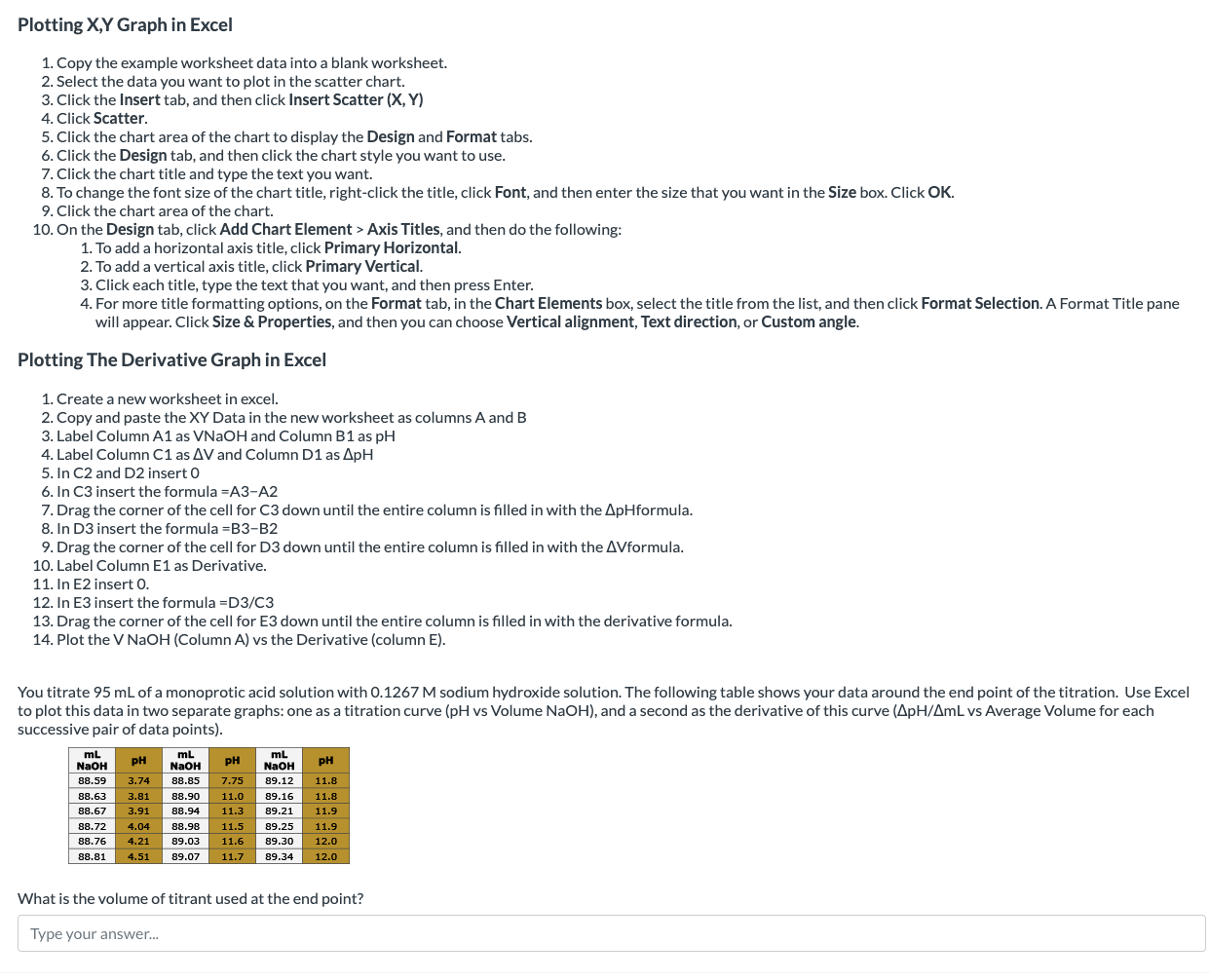
You titrate mL of a monoprotic acid solution with M sodium hydroxide solution. The following table shows your data around the end point of the titration. Use Excel
to plot this data in two separate graphs: one as a titration curve pH vs Volume NaOH and a second as the derivative of this curve vs Average Volume for each
successive pair of data points
What is the volume of titrant used at the end point?
Type your answer...
Step by Step Solution
There are 3 Steps involved in it
1 Expert Approved Answer
Step: 1 Unlock

Question Has Been Solved by an Expert!
Get step-by-step solutions from verified subject matter experts
Step: 2 Unlock
Step: 3 Unlock