

Question: plz someone help anything will be appreciated Lab Report: Using Excel for Graphical Analysis of Data Turn in the graphs you made for ALL three
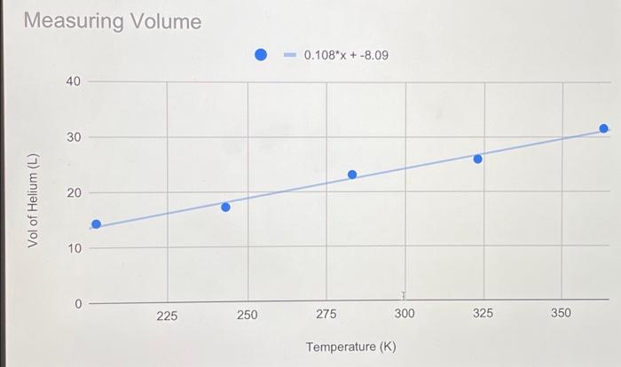
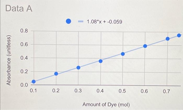
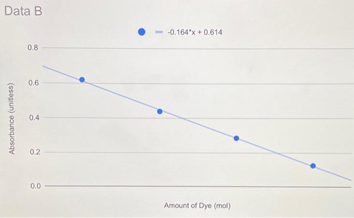
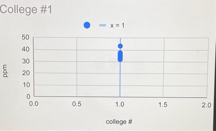
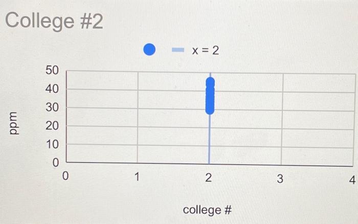
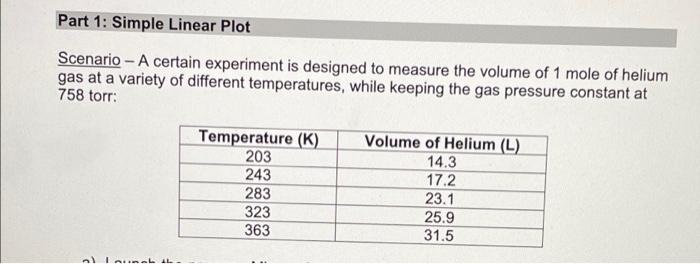
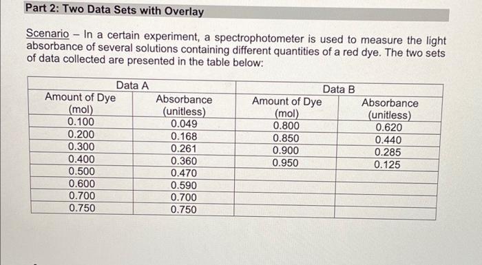
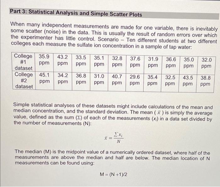
Lab Report: Using Excel for Graphical Analysis of Data Turn in the graphs you made for ALL three parts in this assignment. For each graph make sure the following components are in the printout: 1. Title for the graph 2. Labels for x and y axes (along with appropriate units when applicable) 3. Line equation and R2 when appropriate. Part 1: Simple Linear Plot Which set of data is plotted on the y-axis? the x-axis? Record the following information: The equation of the fitted trendline The value of the slope of this line The value of the y-intercept of this line Is the fit of the trendline to your data good (circle one)? Yes/No Explain why you think the line is a good fit to the data. . Determine the temperature (in K) of the gas in the cold room when it has a measured volume of 10.5 L using a) Extrapolation and eyeballing" b) The equation of the trendline Show your calculations for b) below. Part 2: Two Data Sets and Overlay . Record the equations of the trendlines fitted to Data set A: Data set B: . Perform a simultaneous equations calculation to determine the x and y values for the point of intersection between these lines. Show your work below. Part 3: Statistical Analysis and Simple Scatter Plots For the College #1 data set, record the following values (determined using Excel): the mean SO 2 concentration the median SO 2 concentration the standard deviation in the data set Calculate the standard deviation in the College #1 data set by hand. Show all your work below. Continue your work on an attached page if you require more space. . Are there any outliers in the College #1 data set (circle one)? Yes/No If yes, which measurements are the outliers? Show the calculations you used to identify the outliers (or, if none, how you determined that there were none) Re-calculate the following values (using Excel) excluding the outliers: the mean SO2 concentration the median SO2 concentration the standard deviation in the data set Create a scatter plot showing both the College #1 and College #2 data. Attach a printout of your graph to this report . Be sure that your axes are properly labeled, and that your graph has an appropriate title. Examine your plotted data. Which data set: has the larger standard deviation? contains the more precise measurements? Measuring Volume 0.108*x + -8.09 40 30 20 Vol of Helium (L) 10 225 250 275 300 325 350 Temperature (K) Data A 1.08*x + -0.059 0.8 0.6 0.4 Absorbance (unitless) 0.2 0.0 0.1 0.2 0.3 0.4 0.5 0.6 0.7 Amount of Dye (mol) Data B -0.164*x + 0.614 0.8 0.6 Absorbance (unitless) 0.4 0.2 0.0 Amount of Dye (mol) College #1 x = 1 50 40 30 ppm 20 10 0 0.0 0.5 1.0 1.5 2.0 college # College #2 x = 2 50 40 udd 30 20 10 0 0 1 2 3 4 college # Part 1: Simple Linear Plot Scenario - A certain experiment is designed to measure the volume of 1 mole of helium gas at a variety of different temperatures, while keeping the gas pressure constant at 758 torr: Temperature (K) 203 243 283 323 363 Volume of Helium (L) 14.3 17.2 23.1 25.9 31.5 lain.IL Part 2: Two Data Sets with Overlay Scenario - In a certain experiment, a spectrophotometer is used to measure the light absorbance of several solutions containing different quantities of a red dye. The two sets of data collected are presented in the table below: Data A Amount of Dye (mol) 0.100 0.200 0.300 0.400 0.500 0.600 0.700 0.750 Absorbance (unitless) 0.049 0.168 0.261 0.360 0.470 0.590 0.700 0.750 Data B Amount of Dye (mol) 0.800 0.850 0.900 0.950 Absorbance (unitless) 0.620 0.440 0.285 0.125 Part 3: Statistical Analysis and Simple Scatter Plots When many independent measurements are made for one variable, there is inevitably some scatter (noise) in the data. This is usually the result of random errors over which the experimenter has little control. Scenario - Ten different students at two different colleges each measure the sulfate ion concentration in a sample of tap water: 43.2 ppm 33.5 ppm 35.1 ppm 32.8 ppm 37.6 ppm 31.9 ppm 36.6 ppm 35.0 ppm 32.0 ppm College 35.9 #1 ppm dataset College 45.1 #2 ppm dataset 34.2 ppm 36.8 ppm 31.0 ppm 40.7 ppm 29.6 ppm 35.4 ppm 32.5 ppm 43.5 ppm 38.8 ppm Simple statistical analyses of these datasets might include calculations of the mean and median concentration, and the standard deviation. The mean ( x ) is simply the average value, defined as the sum (E) of each of the measurements (x) in a data set divided by the number of measurements (N): x= N The median (M) is the midpoint value of a numerically ordered dataset, where half of the measurements are above the median and half are below. The median location of N measurements can be found using: M = (N+1)/2
Step by Step Solution
There are 3 Steps involved in it

Get step-by-step solutions from verified subject matter experts