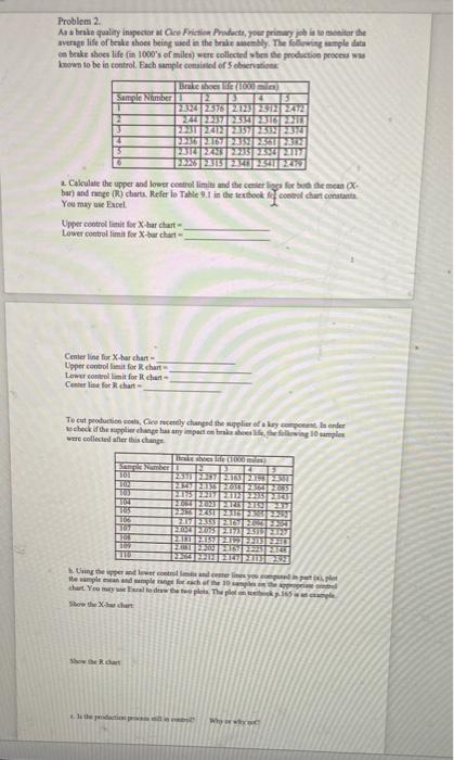
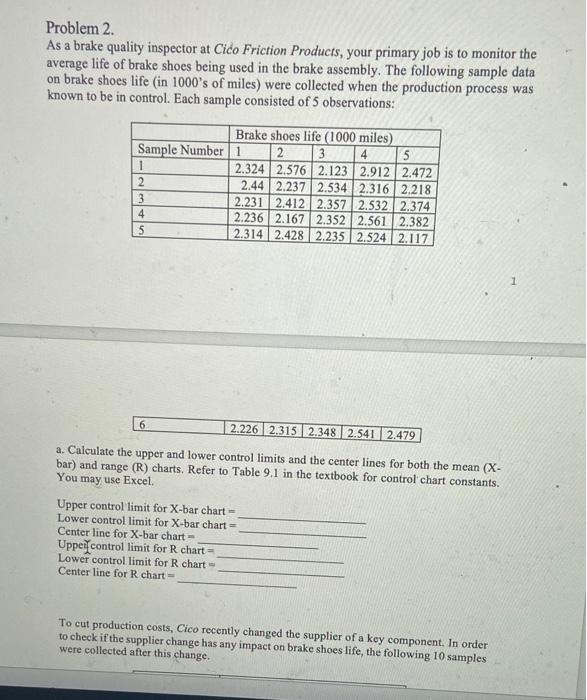
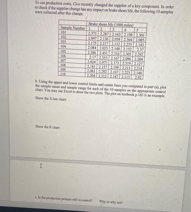
Question: Problem 2. As a brake quality inspector at Cico Friction Products, your primary job is to monitor the average life of brake shoes being used

Problem 2. As a brake quality inspector at Cico
Problem 2. As a brake quality inspector at Cico Friction Products, your primary job is to monitor the average life of brake shoes being used in the brake assembly. The following sample data on brake shoes life (in 1000's of miles) were collected when the production process was known to be in control. Each sample consisted of 5 observations: Brake shoes life (1000 miles) Sample Number 1 2 3 4 5 2.324 2.576 2.123 2.912 2.472 2 2.44 2.237 2.534 2.316 2.218 3 2.231 2.412 2.357 2.532 2.374 2.236 2.167 2.352 2.561 2.382 2.314 2.428 2.235 2.524 2.117 1 4 S 1 6 2.226 2.315 2.348 2.541 2.479 a. Calculate the upper and lower control limits and the center lines for both the mean (X- bar) and range (R) charts. Refer to Table 9.1 in the textbook for control chart constants. You may use Excel Upper control limit for X-bar chart - Lower control limit for X-bar chart Center line for X-bar chart Uppeil control limit for R chart Lower control limit for R chart Center line for R chart = To cut production costs, Cico recently changed the supplier of a key component. In order to check if the supplier change has any impact on brake shoes life, the following 10 samples were collected after this change. To cut production costs, Cico recently changed the supplier of a key component. In order to check if the supplier change has any impact on brake shoes life, the following 10 samples were collected after this change. Brake shoes life (1000 miles) Sample Number 1 2 3 4 5 101 2.371 2287 2.163 2.198 2.301 102 2.847 2.136 2.038 2.364 2.085 103 2.175 2.217 2.112 2.235 2.143 104 2.084 2.023 2.148 2.152 2.37 105 2.286 2.451 2.316 2.305 2.292 106 2.17 2.353 2.167 2.096 2.204 107 2.024 2.075 2.173 2.519 2.127 108 2.181 2.157 2.199 2.213 2.218 109 2.081 2.202 2.167 2.223 2.148 110 2264 2212 2.147 2.113 2.92 b. Using the upper and lower control limits and center lines you computed in part (a), plot the sample mean and sample range for each of the 10 samples on the appropriate control chart. You may use Excel to draw the two plots. The plot on textbook p.165 is an example. Show the X-bar chart: Show the R chart: 2 I c. is the production process still in control? Why or why not

Step by Step Solution

There are 3 Steps involved in it

1 Expert Approved Answer
Step: 1 Unlock blur-text-image
Question Has Been Solved by an Expert!

Get step-by-step solutions from verified subject matter experts

Step: 2 Unlock
Step: 3 Unlock

Students Have Also Explored These Related General Management Questions!