

Question: Python - I am stuck with visualizing my data using matplotlib. Please see my attempt below and the error message. How do I load the
Python - I am stuck with visualizing my data using matplotlib. Please see my attempt below and the error message. How do I load the file into df? and the index_col should be 0?!?! set it as null? like , header = None? How do I use the plot() function and setting the Displ on the x-axis and 'City MPG' on the y-axis? In the csv file the column is called 'City MPG' but Python is not allowing space so I am calling it 'CityMPG' and it cannot be found. Please help. You can see a sample of the data below.
SCRIPT:
#PART 1
import numpy as np import pandas as pd import matplotlib.pyplot as plt
df =pd.read_csv('C:\\Users\\xxxxx\\Desktop\\Notebook\\all_alpha_19.csv',header="infer")
df.query('Stnd == "T3B125"', inplace = True)
df.query('Fuel == "Gasoline" or Fuel == "Diesel"' ,inplace = True)
cols =[ 'Model','Displ','Fuel','City MPG','Hwy MPG','Cmb MPG','Greenhouse Gas Score']
new_df = df[cols]
new_df.reset_index(drop=True)
new_df['City MPG'] = new_df['City MPG'].astype(float) new_df['Hwy MPG'] = new_df['Hwy MPG'].astype(float) new_df['Cmb MPG'] = new_df['Cmb MPG'].astype(float)
def mpg_to_kml(mpg): return mpg*0.42514
new_df =new_df.assign(CityKML=mpg_to_kml(df['City MPG'])) new_df =new_df.assign(HwyKML=mpg_to_kml(df['Hwy MPG'])) new_df =new_df.assign(CmbKML=mpg_to_kml(df['Cmb MPG']))
new_df.to_csv("car_data.csv")
import numpy as np import pandas as pd import matplotlib.pyplot as plt #%matplotlib inline #For jupyter notebook only.
#PART2 df =pd.read_csv(''C:\\Users\\xxxxx\\Desktop\\Notebook\\all_alpha_19.csv'')
plt.scatter(df.Displ, df.CityMPG, alpha=0.5) plt.title('Scatter plot Displ Vs City MPG') plt.xlabel('City MPG') plt.ylabel('Displ') plt.show()
ERROR MESSAGE:

SAMPLE OF THE ALPHA FILE:
| Model | Displ | Cyl | Trans | Drive | Fuel | Cert Region | Stnd | Stnd Description | Underhood ID | Veh Class | Air Pollution Score | City MPG | Hwy MPG | Cmb MPG | Greenhouse Gas Score | SmartWay | Comb CO2 |
| ACURA ILX | 2.4 | 4 | AMS-8 | 2WD | Gasoline | CA | L3ULEV125 | California LEV-III ULEV125 | KHNXV02.4KH3 | small car | 3 | 24 | 34 | 28 | 6 | No | 316 |
| ACURA ILX | 2.4 | 4 | AMS-8 | 2WD | Gasoline | FA | T3B125 | Federal Tier 3 Bin 125 | KHNXV02.4KH3 | small car | 3 | 24 | 34 | 28 | 6 | No | 316 |
| ACURA MDX | 3 | 6 | AMS-7 | 4WD | Gasoline | CA | L3ULEV125 | California LEV-III ULEV125 | KHNXV03.0AH3 | small SUV | 3 | 26 | 27 | 27 | 6 | No | 330 |
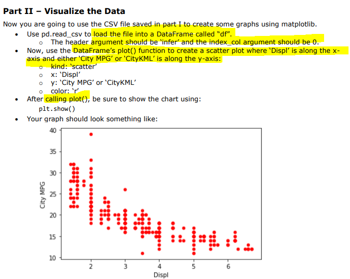
Part II - Visualize the Data Now you are going to use the CSV file saved in part I to create some graphs using matplotlib. Use pd.read_csv to load the file into a DataFrame called "df". The header argument should be 'infer' and the index_col argument should be 0. Now, use the DataFrame's plot() function to create a scatter plot where 'Displ' is along the x- axis and either 'City MPG' or 'CityKML' is along the y-axis: o kind: 'scatter' ox: 'Displ' oy: 'City MPG' or 'CityKML o color: V After calling plot(), be sure to show the chart using: plt.show() Your graph should look something like: 40 35 30 City MPG ( 4 + is pm 20 15 10 N 3 U- Displ AttributeError: 'DataFrame' object has no attribute 'CityMPG
Step by Step Solution
There are 3 Steps involved in it

Get step-by-step solutions from verified subject matter experts