

Question: python ( this is an introduction class) . Istanbul's monthly dam water level data from 2005 to present is provided in a CSV file named
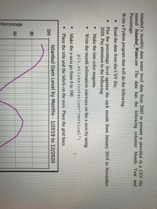
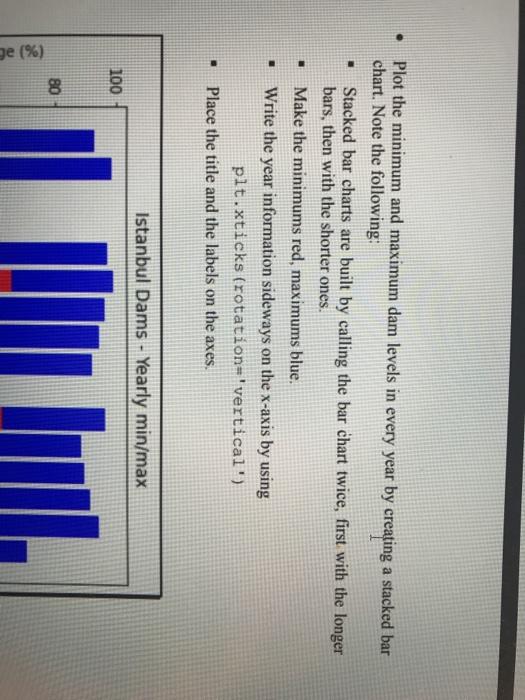
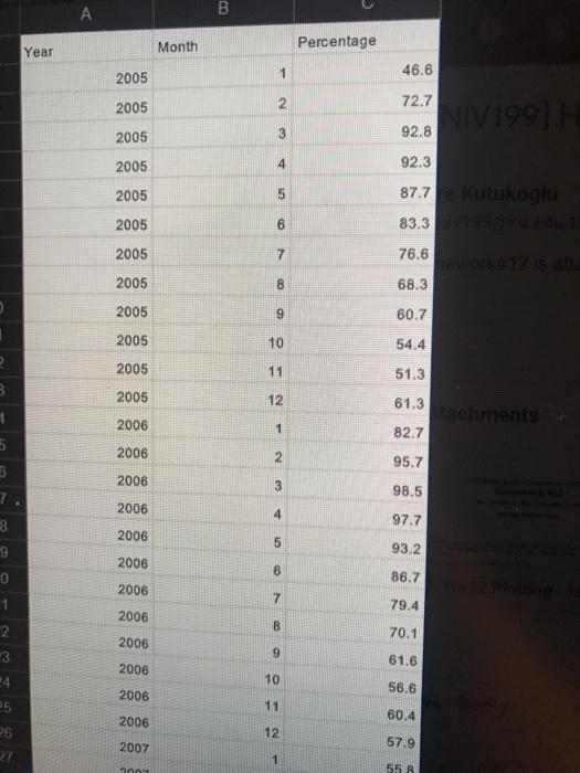
. Istanbul's monthly dam water level data from 2005 to present is provided in a CSV file named Istanbul_Water.csy. The data has the following columns: Month, Year and Percentage Write a Python program that will do the following: Read the data from the CSV file, Plot the percentage level against the each month from January 2019 to November 2020. Pay attention to the following: Make the line color magenta Write the month information sideways on the x-axis by using plt.xticks (rotation='vertical) I Make the y-axis go from 0 to 100. Place the title and the labels on the axes. Place the grid lines. . . Istanbul Dam Level by Months - 1/2019 to 12/2020 100 80 60 Percentage . Plot the minimum and maximum dam levels in every year by creating a stacked bar chart. Note the following: Stacked bar charts are built by calling the bar chart twice, first with the longer bars, then with the shorter ones. Make the minimums red, maximums blue. Write the year information sideways on the x-axis by using plt.xticks (rotation='vertical') Place the title and the labels on the axes. . Istanbul Dams - Yearly min/max 100 80 ge (%) . B Year Month Percentage 2005 46.6 1 2 72.7 2005 V1991 2005 3 92.8 2005 4 2005 92.3 87.7 kutukogu 83.39 2005 6 6 7 8 2005 76.6 2005 68.3 2005 9 60.7 2005 10 54.4 2 2005 11 51.3 3 2005 12 61.3 achments 82.7 2006 1 2006 2 95.7 5 3 7 8 2006 3 98.5 2006 4 97.7 2006 5 9 93.2 2006 6 86.7 2006 7 79.4 2006 1 2 3 70.1 2006 9 61.6 2006 4 10 56.6 2006 11 5 26 2006 60.4 12 2007 57.9 27 1 001 55 B
Step by Step Solution
There are 3 Steps involved in it

Get step-by-step solutions from verified subject matter experts