

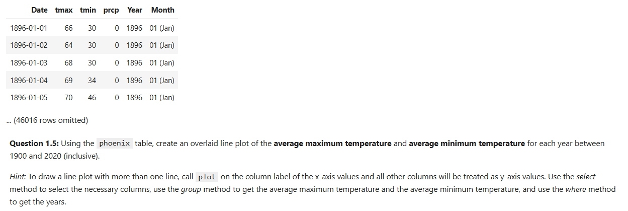
Question: Question 1 . 5 : Using the phoenix table, create an overlaid line plot of the average maximum temperature and average minimum temperature for each
Question : Using the phoenix table, create an overlaid line plot of the average maximum temperature and average minimum temperature for each year between and inclusive
Hint: To draw a line plot with more than one line, call plot on the column label of the x axis values and all other columns will be treated as y axis values. Use the select method to select the necessary columns, use the group method to get the average maximum temperature and the average minimum temperature, and use the where method to get the years.
Step by Step Solution
There are 3 Steps involved in it
1 Expert Approved Answer
Step: 1 Unlock

Question Has Been Solved by an Expert!
Get step-by-step solutions from verified subject matter experts
Step: 2 Unlock
Step: 3 Unlock