

Question: Question 2 0.5 pts The scatterplot shown at this first link :3- is adapted from a study exploring the cross-cultural relationship between parental investment in

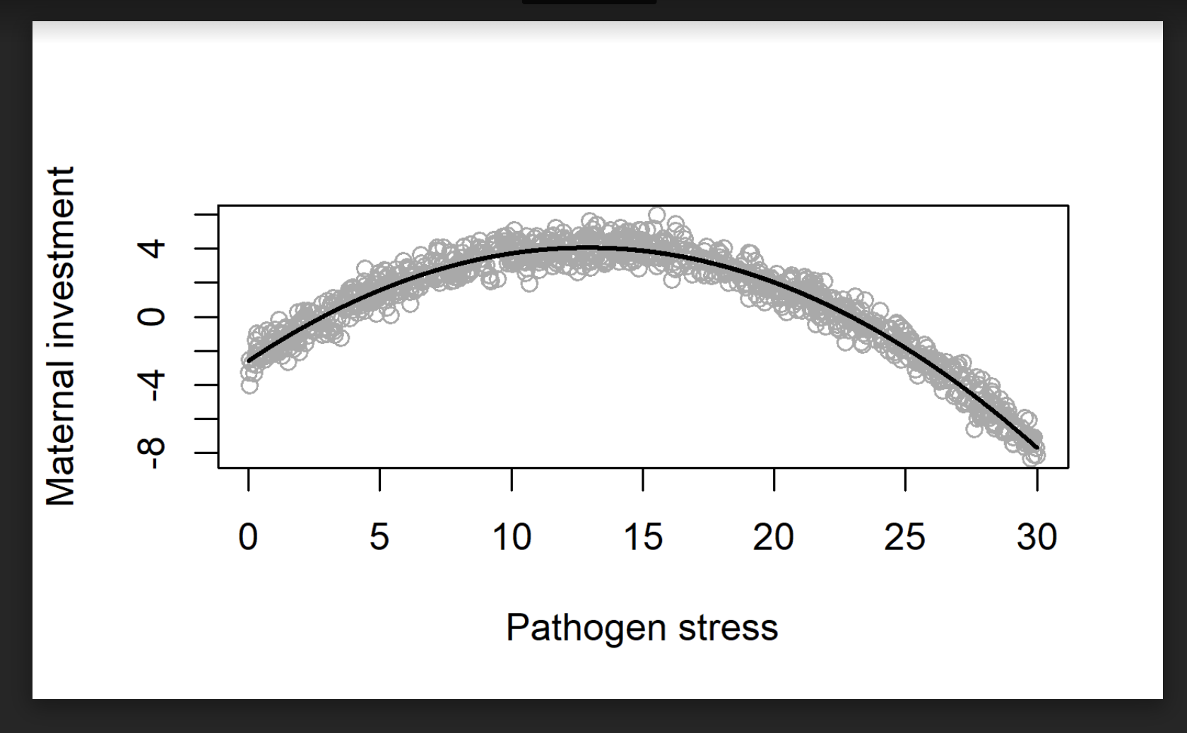
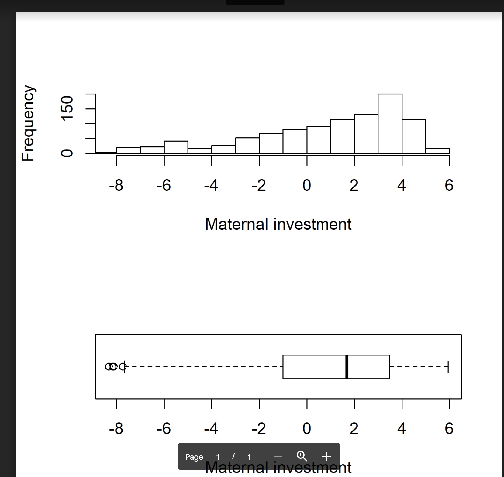
Question 2 0.5 pts The scatterplot shown at this first link :3- is adapted from a study exploring the cross-cultural relationship between parental investment in children and the level of environmental risks faced by children (specically the total burden of infectious diseases). The variable on the X axis measures infectious disease burden experienced by children in a cross-cultural sample of children. The variable on the Y axis is a measure of maternal investment in children. Each gray circle represents the infectious disease burden and maternal investment measured for a single cultural group in the sample. There are 1000 observational units (groups) represented here. The black line describes the general trend in maternal investment as pathogen stress changes. This graph suggests a nonmonotonic association between disease burden and maternal investment. The two graphs shown at this second link :2.- both describe the sample distribution of the maternal investment variable for the same dataset, ignoring the infectious disease burden variable. The top graph at the second link is . V [Select] box plot histogram The bottom graph at the second lin The bottom graph at the second link is a v [ Select ] box plot histogramQuestion 3 0.5 pts You can determine how many modes 3 sample has using a histogram. 0 True 0 False Question 4 0.5 pts You can determine how many modes a sample has using a box plot. 0 True 0 False
Step by Step Solution
There are 3 Steps involved in it

Get step-by-step solutions from verified subject matter experts