

Question: Question 2 - 1 8 marks Adriane is comparing the C O 2 outputs of the top 1 9 energy suppliers in 2 0 1
Question marks
Adriane is comparing the outputs of the top energy suppliers in with the same energy suppliers in The data are recorded in Table
Table output of Energy suppliers in and
tabletable output to nearest whole numberg per kWh table output to nearest whole numberg per kWh
page of
ai Enter the values from Table above into two new lists in Dataplotter. Copy and complete the table below, rounding values,
where necessary, to one decimal place. The mean, rounded to where necessary, to one decimal place. The mean, rounded to one
decimal place, is given for you as a check that you have entered the data correctly.
tabletable output g per kWhtable output g per kWh MinMedianMaxMeanSDIQ range,,Range
ii Use the two measures of location to say which year had a greater output per kWh on average
iii Use all three measures of spread to say which year had the greater
variability in output per kWh Create boxplots for fer kWh
bi Create boxplots for these two datasets either drawn by hand or using Dataplotter, or a suitable computer package and include
them with the rest of your EMA. Include information required for drawing boxplots as set out in Subsection of Unit
The summary values can be displayed on the boxplots themselves or in a table to the side of the chart, as they appear in Dataplotter.
ii Use the boxplot for the responses from the year to say whether the data are symmetric or skewed. If the data are skewed,
then state whether they are skewed to the left or skewed then state whether they are skewed to the left or skewed to the dataset for the year iii Adriane tries to summarise what the boxplots are telling her. Are the following statements true or false? In each case justify your answer
In about threequarters of the top energy companies produced more than g of output per kWh more than g of output per kWh
page of
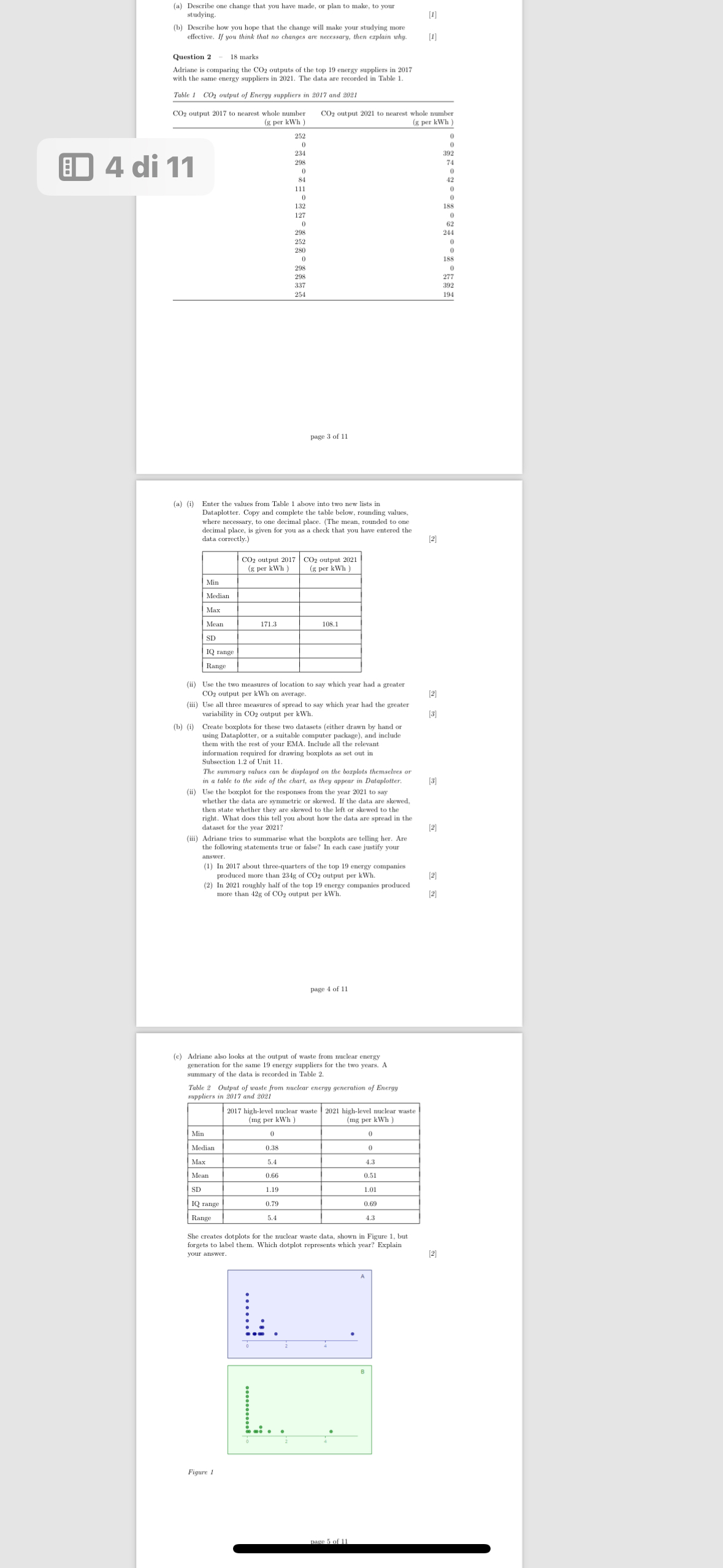
c Adriane also looks at the output of waste from nuclear energy generation for the same energy suppliers for
summary of the data is recorded in Table
Table Output of waste from nuclear energy generation of Energy
suppliers in and
tabletable highlevel nuclear wastemg per kWh table highlevel nuclear wastemg per kWh MinMedianMaxMeanSDIQ range,Range
She creates dotplots for the nuclear waste data, shown in Figure but forgets to label them. Which dotplot represents which year? Explain your answer.
Step by Step Solution
There are 3 Steps involved in it
1 Expert Approved Answer
Step: 1 Unlock

Question Has Been Solved by an Expert!
Get step-by-step solutions from verified subject matter experts
Step: 2 Unlock
Step: 3 Unlock