

Question: Questions about Tableau 1. Sample - Superstore ordinarily is installed when one downloads Tableau. It should be located under Saved Data Sources in the Connect
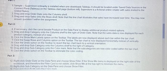
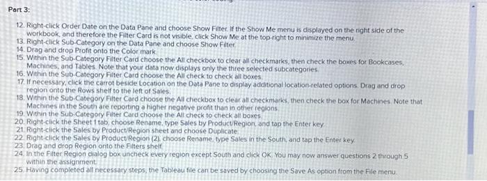
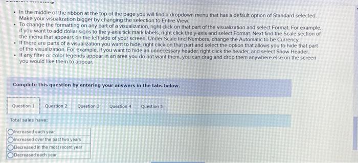
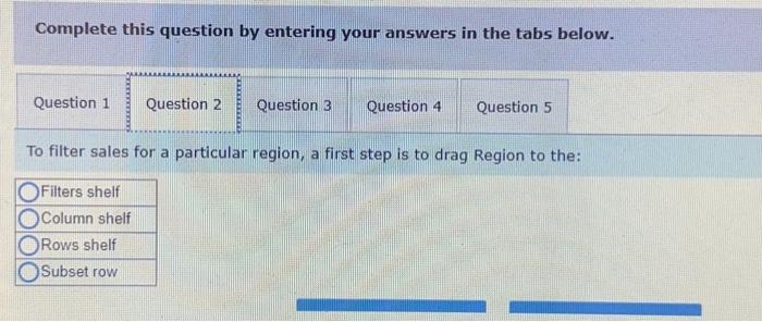
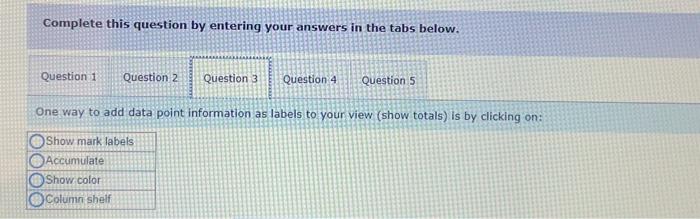
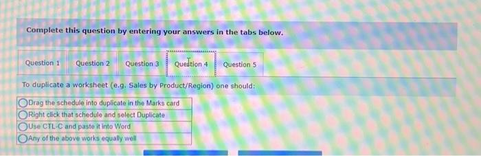
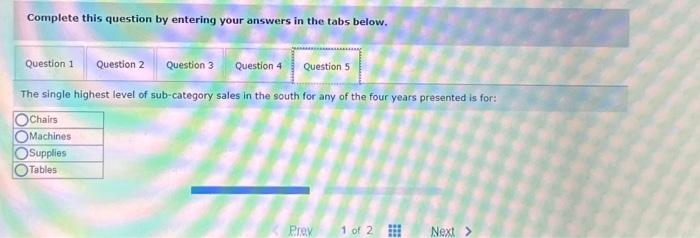
1. Sample - Superstore ordinarily is installed when one downloads Tableau. It should be located under Saved Data Sources in the Connect Pane (Tableau) on the Tableau start page (bottom left). Superstore is a fictional online retailer with sales limited to the United States 2. Drag and drop Order Date onto the Columns shelf. 3. Drag and drop Sales onto the Rows shelf Note that thas line chart illustrates that sales have increased over time. You may now answer question 1 within the assignment Part 2. 4. If necessary, click the carrot beside Product on the Data Pane to display additional product-related options. 5. Drag and drop Category onto the Columns sheif to the right of Order Date. Note that the sales data is now displayed for each product category. instead of in total 6. Click the Show Mark Labels option on the Toolbat. The labels are now displayed above each bar within the bar chart. 7 Click the Swap Rows and Columns option on the Toolbar The bar chart is now displayed horizontally instead of verocally 8. Click the Undo option on the footbar to revert the bar chart back to a vertical orientation 9. Drog and drop Sub-Category onto the Columns shelf to the right of Category 10. Drag and drop Sub-Category onto the Color mark. Note that the subcategories are now color coded within the bar chart. 11. Click the Undo option on the Toolbar to eliminate the color coding Part 3: 12 Right-click Order Date on the Data Pane and choose Shiow File If the Snow Me menu is displayed on the right side of the workbook, and therefore the Fiter Card is not visible click Show Me at the fop-right to minimize the menu 13. Right-click Sub Category on the Data Pane and choose Show Filter 14 Hran and dirnn Prntio nonte the Foline mark 12. Right-click Order Date on the Data Pane and choose Show Filter. If the Show Me menu is displayed on the tight side of the workbook, and therefore the Filter Card is not visible, click Show Me at the top-right to minimize the menu 13. Right-click Sub-Category on the Data Pane and choose Show Filter 14. Drag and drop Profit onto the Color mark 15. Within the Sub-Category Filter Card choose the All checkbox to clear all checkmarks, then check the boxes for Bookcases, Machines, and Tables. Note that your data now displays only the three selected subcategories 16. Within the Sub-Category Filter Card choose the All check to check all boxes. 17. If necessary, click the carrot beside Location on the Data Pane to display acdditionallocation-related options. Drag and drop region onto the Rows sheif to the left of Sales. 18. Within the Sub-Category Filter Card choose the All checkbox to clear all checkmarks, then check the box for Machines Note that Machines in the South are reporting a higher negative profit than in other regions. 19. Within the Sub-Category Fitter Card choose the All check to check al boxes 20. Right-click the Sheet 1 tab, choose Rename, type Sales by ProductRegion, and tap the Enter key 21. Right-click the Sales by Product/Region sbeet and choose Duplicate 22 Right-click the Sales by Product Region (2) choose Rename, type Sales in the South, and tap the Enter key 23. Drag and drop Region onto the Filters shelf 24. In the Filter Region dialog box uncheck every region except South and click Ok You may now answer questions 2 through 5 within the assignment 25. Having completed all necessary steps, the Tableau file can be saved by choosing the Save As option from the Fle menu - In the middle of the ribbon at the top of the page you wil find a dropdown menu that has a default option of Standard selected Make your visualization bigger by changing the selection to Entire View - To change the formatting on any part of a visualization, right click on that part of the visualization and select Format. For example. if you want to add dollar signs to the y-axis tick mark labels, right click the y axis and select Format. Next find the Scale section of the menu that appears on the left side of your screen. Under Scale find Numbers, change the Automatic to be Currency. - If there are parts of a visualization you want to hide, right click on that part and select the option that allows you to hide that part. of the visualization. For example, if you want to hide an unnecessary header, tight click the header, and select Show Header - If any fitter or color legends appear in an area you do not want them, you can drag and drop them anywhere else on the screen you would like them to appear. Complete this question by entering your answers in the tabs below. Total sales have: Complete this question by entering your answers in the tabs below. To filter sales for a particular region, a first step is to drag Region to the: Filters shelf Complete this question by entering your answers in the tabs below. One way to add data point information as labels to your view (show totals) is by clicking on: Show mark labels Complete this question by entering your answers in the tabs below. To duplicate a worksheet (e,g. Sales by Product/Region) one should: Complete this question by entering your answers in the tabs below. The single highest level of sub-category sales in the south for any of the four years presented is for: 1. Sample - Superstore ordinarily is installed when one downloads Tableau. It should be located under Saved Data Sources in the Connect Pane (Tableau) on the Tableau start page (bottom left). Superstore is a fictional online retailer with sales limited to the United States 2. Drag and drop Order Date onto the Columns shelf. 3. Drag and drop Sales onto the Rows shelf Note that thas line chart illustrates that sales have increased over time. You may now answer question 1 within the assignment Part 2. 4. If necessary, click the carrot beside Product on the Data Pane to display additional product-related options. 5. Drag and drop Category onto the Columns sheif to the right of Order Date. Note that the sales data is now displayed for each product category. instead of in total 6. Click the Show Mark Labels option on the Toolbat. The labels are now displayed above each bar within the bar chart. 7 Click the Swap Rows and Columns option on the Toolbar The bar chart is now displayed horizontally instead of verocally 8. Click the Undo option on the footbar to revert the bar chart back to a vertical orientation 9. Drog and drop Sub-Category onto the Columns shelf to the right of Category 10. Drag and drop Sub-Category onto the Color mark. Note that the subcategories are now color coded within the bar chart. 11. Click the Undo option on the Toolbar to eliminate the color coding Part 3: 12 Right-click Order Date on the Data Pane and choose Shiow File If the Snow Me menu is displayed on the right side of the workbook, and therefore the Fiter Card is not visible click Show Me at the fop-right to minimize the menu 13. Right-click Sub Category on the Data Pane and choose Show Filter 14 Hran and dirnn Prntio nonte the Foline mark 12. Right-click Order Date on the Data Pane and choose Show Filter. If the Show Me menu is displayed on the tight side of the workbook, and therefore the Filter Card is not visible, click Show Me at the top-right to minimize the menu 13. Right-click Sub-Category on the Data Pane and choose Show Filter 14. Drag and drop Profit onto the Color mark 15. Within the Sub-Category Filter Card choose the All checkbox to clear all checkmarks, then check the boxes for Bookcases, Machines, and Tables. Note that your data now displays only the three selected subcategories 16. Within the Sub-Category Filter Card choose the All check to check all boxes. 17. If necessary, click the carrot beside Location on the Data Pane to display acdditionallocation-related options. Drag and drop region onto the Rows sheif to the left of Sales. 18. Within the Sub-Category Filter Card choose the All checkbox to clear all checkmarks, then check the box for Machines Note that Machines in the South are reporting a higher negative profit than in other regions. 19. Within the Sub-Category Fitter Card choose the All check to check al boxes 20. Right-click the Sheet 1 tab, choose Rename, type Sales by ProductRegion, and tap the Enter key 21. Right-click the Sales by Product/Region sbeet and choose Duplicate 22 Right-click the Sales by Product Region (2) choose Rename, type Sales in the South, and tap the Enter key 23. Drag and drop Region onto the Filters shelf 24. In the Filter Region dialog box uncheck every region except South and click Ok You may now answer questions 2 through 5 within the assignment 25. Having completed all necessary steps, the Tableau file can be saved by choosing the Save As option from the Fle menu - In the middle of the ribbon at the top of the page you wil find a dropdown menu that has a default option of Standard selected Make your visualization bigger by changing the selection to Entire View - To change the formatting on any part of a visualization, right click on that part of the visualization and select Format. For example. if you want to add dollar signs to the y-axis tick mark labels, right click the y axis and select Format. Next find the Scale section of the menu that appears on the left side of your screen. Under Scale find Numbers, change the Automatic to be Currency. - If there are parts of a visualization you want to hide, right click on that part and select the option that allows you to hide that part. of the visualization. For example, if you want to hide an unnecessary header, tight click the header, and select Show Header - If any fitter or color legends appear in an area you do not want them, you can drag and drop them anywhere else on the screen you would like them to appear. Complete this question by entering your answers in the tabs below. Total sales have: Complete this question by entering your answers in the tabs below. To filter sales for a particular region, a first step is to drag Region to the: Filters shelf Complete this question by entering your answers in the tabs below. One way to add data point information as labels to your view (show totals) is by clicking on: Show mark labels Complete this question by entering your answers in the tabs below. To duplicate a worksheet (e,g. Sales by Product/Region) one should: Complete this question by entering your answers in the tabs below. The single highest level of sub-category sales in the south for any of the four years presented is for
Step by Step Solution
There are 3 Steps involved in it

Get step-by-step solutions from verified subject matter experts