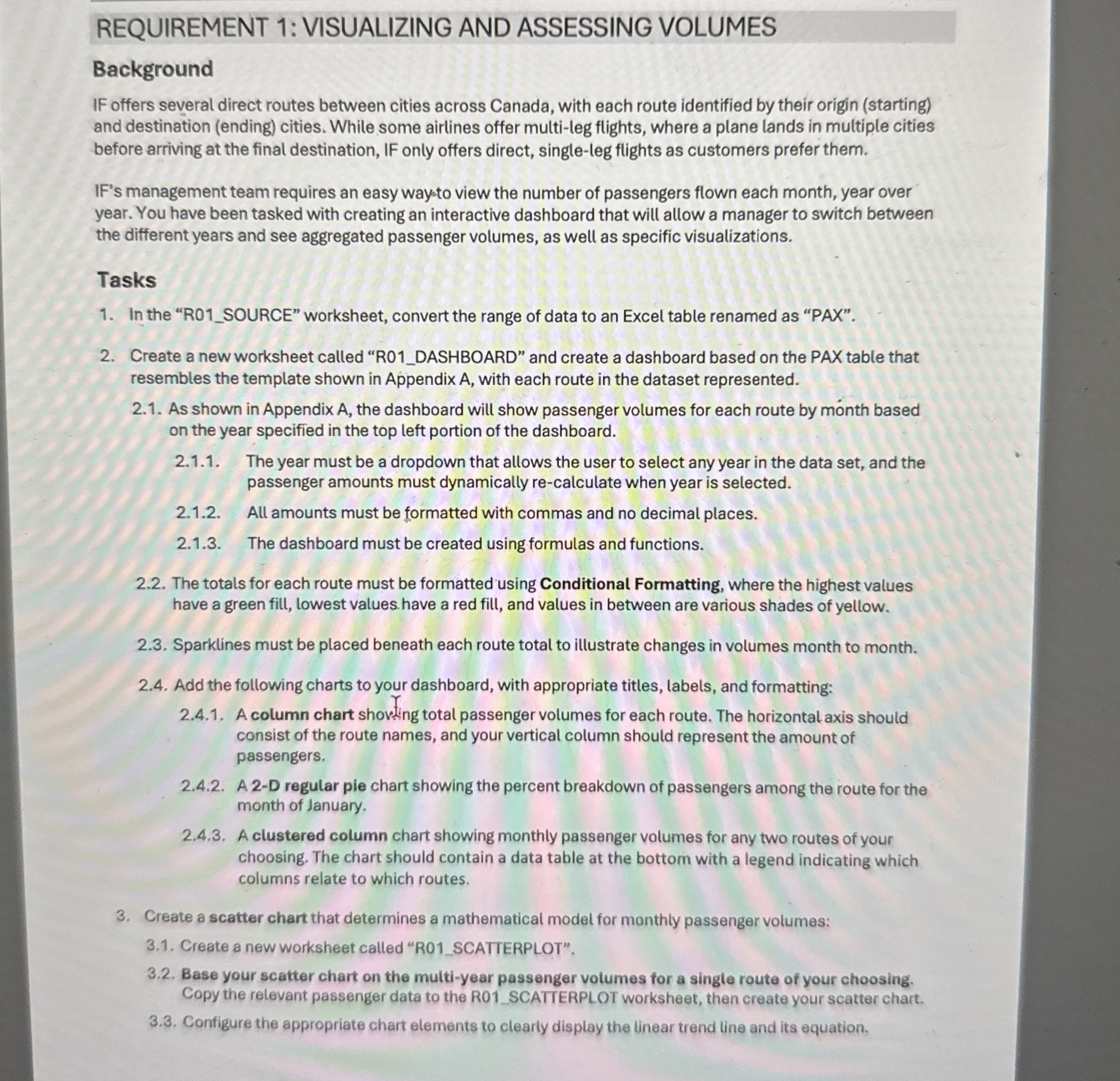
Question: REQUIREMENT 1 :VISUALIZING AND ASSESSING VOLUMES Background IF offers several direct routes between cities across Canada, with each route identified by their origin ( starting
REQUIREMENT :VISUALIZING AND ASSESSING VOLUMES
Background
IF offers several direct routes between cities across Canada, with each route identified by their origin starting and destination ending cities. While some airlines offer multileg flights, where a plane lands in multiple cities before arriving at the final destination, IF only offers direct, singleleg flights as customers prefer them.
IF's management team requires an easy waysto view the number of passengers flown each month, year over year. You have been tasked with creating an interactive dashboard that will allow a manager to switch between the different years and see aggregated passenger volumes, as well as specific visualizations.
Tasks
In the RSOURCE" worksheet, convert the range of data to an Excel table renamed as "PAX".
Create a new worksheet called RDASHBOARD" and create a dashboard based on the PAX table that resembles the template shown in Appendix with each route in the dataset represented.
As shown in Appendix A the dashboard will show passenger volumes for each route by month based on the year specified in the top left portion of the dashboard.
The year must be a dropdown that allows the user to select any year in the data set, and the passenger amounts must dynamically recalculate when year is selected.
All amounts must be formatted with commas and no decimal places.
The dashboard must be created using formulas and functions.
The totals for each route must be formatted using Conditional Formatting, where the highest values have a green fill, lowest values have a red fill, and values in between are various shades of yellow.
Sparklines must be placed beneath each route total to illustrate changes in volumes month to month.
Add the following charts to your dashboard, with appropriate titles, labels, and formatting:
A column chart shoving total passenger volumes for each route. The horizontal axis should consist of the route names, and your vertical column should represent the amount of passengers.
A D regular pie chart showing the percent breakdown of passengers among the route for the month of January.
A clustered column chart showing monthly passenger volumes for any two routes of your choosing. The chart should contain a data table at the bottom with a legend indicating which columns relate to which routes.
Create a scatter chart that determines a mathematical model for monthly passenger volumes:
Create a new worksheet called RSCATTERPLOT".
Base your scatter chart on the multiyear passenger volumes for a single route of your choosing. Copy the relevant passenger data to the R SCATTERPLOT worksheet, then create your scatter chart.
Configure the appropriate chart elements to clearly display the linear trend line and its equation. NONE OF THE FORMULAS WORK FOR ME HELP ME STEP BY STEP

Step by Step Solution
There are 3 Steps involved in it
1 Expert Approved Answer
Step: 1 Unlock


Question Has Been Solved by an Expert!
Get step-by-step solutions from verified subject matter experts
Step: 2 Unlock
Step: 3 Unlock


