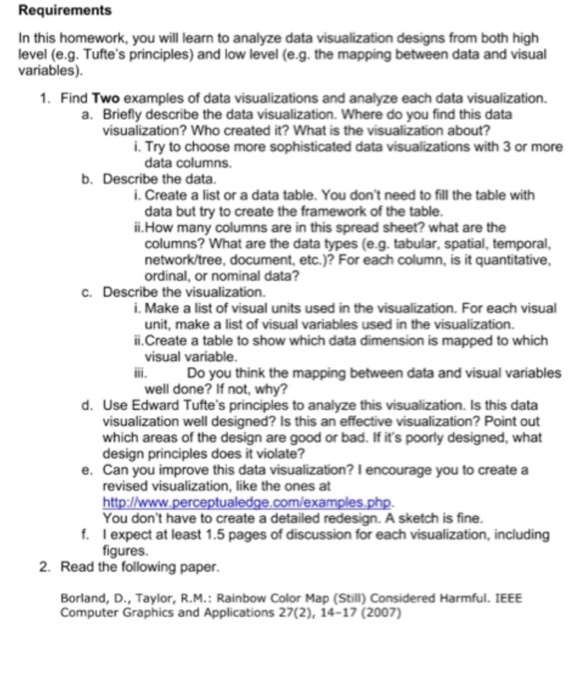
Question: Requirements In this homework, you will learn to analyze data visualization designs from both high level (e.g. Tufte's principles) and low level (e.g. the mapping


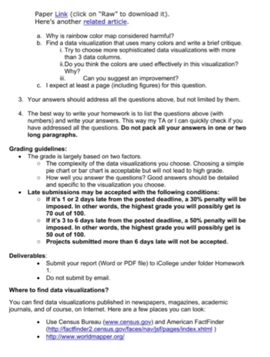
Requirements In this homework, you will learn to analyze data visualization designs from both high level (e.g. Tufte's principles) and low level (e.g. the mapping between data and visual variables) 1. Find Two examples of data visualizations and analyze each data visualization. a. Briefly describe the data visualization. Where do you find this data visualization? Who created it? What is the visualization about? i. Try to choose more sophisticated data visualizations with 3 or more data columns. b. Describe the data i. Create a list or a data table. You don't need to fill the table with data but try to create the framework of the table ii.How many columns are in this spread sheet? what are the columns? What are the data types (e.g. tabular, spatial, temporal, network/tree, document, etc.)? For each column, is it quantitative c. Describe the visualization. i. Make a list of visual units used in the visualization. For each visual unit, make a list of visual variables used in the visualization. i.Create a table to show which data dimension is mapped to which Do you think the mapping between data and visual variables well done? If not, why? d. Use Edward Tufte's principles to analyze this visualization. Is this data visualization well designed? Is this an effective visualization? Point out which areas of the design are good or bad. If it's poorly designed, what e. Can you improve this data visualization? 1 encourage you to create a revised visualization, like the ones at You don't have to create a detailed redesign. A sketch is fine. expect at least 1.5 pages of discussion for each visualization, including f. Borland, D., Taylor, R.M.: Rainbow Color Map (Still) Considered Harmful. IEEE Computer Graphics and Applications 27(2), 14-17 (2007 Requirements In this homework, you will learn to analyze data visualization designs from both high level (e.g. Tufte's principles) and low level (e.g. the mapping between data and visual variables) 1. Find Two examples of data visualizations and analyze each data visualization. a. Briefly describe the data visualization. Where do you find this data visualization? Who created it? What is the visualization about? i. Try to choose more sophisticated data visualizations with 3 or more data columns. b. Describe the data i. Create a list or a data table. You don't need to fill the table with data but try to create the framework of the table ii.How many columns are in this spread sheet? what are the columns? What are the data types (e.g. tabular, spatial, temporal, network/tree, document, etc.)? For each column, is it quantitative c. Describe the visualization. i. Make a list of visual units used in the visualization. For each visual unit, make a list of visual variables used in the visualization. i.Create a table to show which data dimension is mapped to which Do you think the mapping between data and visual variables well done? If not, why? d. Use Edward Tufte's principles to analyze this visualization. Is this data visualization well designed? Is this an effective visualization? Point out which areas of the design are good or bad. If it's poorly designed, what e. Can you improve this data visualization? 1 encourage you to create a revised visualization, like the ones at You don't have to create a detailed redesign. A sketch is fine. expect at least 1.5 pages of discussion for each visualization, including f. Borland, D., Taylor, R.M.: Rainbow Color Map (Still) Considered Harmful. IEEE Computer Graphics and Applications 27(2), 14-17 (2007
Step by Step Solution
There are 3 Steps involved in it

Get step-by-step solutions from verified subject matter experts


