

Question: Saved Question 1 (1 point) The below chart presents the results of a survey assessing the percentage of the population who reported suffering from noise
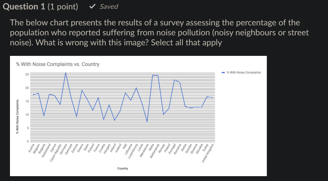
Saved Question 1 (1 point) The below chart presents the results of a survey assessing the percentage of the population who reported suffering from noise pollution (noisy neighbours or street noise). What is wrong with this image? Select all that apply % With Noise Complaints vs. Country % With Noise Complaints 25 20 15 % With Noise Complaints m Irelan Icelan Hungary Croatic France Finland Spal tonia Greece Germany Denmark Cyprus Bulgaria Relaium Switzerland Czech Republic Austria Italy Latvia Lithuania pembourg Macedonia Malta Norway Poland Portugal Netherlands Serbia Swede Slovenia Slovakia Turkey United Kingdom Country Labels in chart area make the data hard to read Unnecessary precision on y-axis Gridlines too prominent Would be better as a bar chart Would be better as a pie chart Angled text Unnecessary 3D Line chart should not be used for categorical data
Step by Step Solution
There are 3 Steps involved in it

Get step-by-step solutions from verified subject matter experts